 Surma [X](https://twitter.com/dassurma) [GitHub](https://github.com/surma) [Homepage](https://surma.dev/) Custom scrollbars are extremely rare and that's mostly due to the fact that scrollbars are one of the remaining bits on the web that are pretty much unstylable (I'm looking at you, date picker). You can use JavaScript to build your own, but that's expensive, low fidelity and can feel laggy. In this article, we will leverage some unconventional CSS matrices to build a custom scroller that doesn't require any JavaScript while scrolling, just some setup code.
## TL;DR
You don't care about the little things? You just want to look at the
[Nyan cat demo](https://googlechromelabs.github.io/ui-element-samples/custom-scrollbar/)
and get the library? You can find the demo's code in our
[GitHub repo](https://github.com/GoogleChromeLabs/ui-element-samples/tree/gh-pages/custom-scrollbar).
## LAM;WRA (Long and mathematical; will read anyways)
> [!NOTE]
> **Note:** This article does some weird stuff with homogeneous coordinates as well as matrix calculations. It is good to have some basic understanding of these concepts if you want to understand the intricate details of this trick. However, we hope that -- even if you don't enjoy matrix math -- you can still follow along and see how we used them.
A while ago, we built a parallax scroller (Did you read
[that article](https://developer.chrome.com/blog/performant-parallaxing)?
It's really good, well worth your time!). By pushing elements back using CSS 3D
transforms, elements moved *slower* than our actual scrolling speed.
## Recap
Let's start off with a recap of how the parallax scroller worked.
As shown in the animation, we achieved the parallax effect by pushing elements
"backwards" in 3D space, along the Z axis. Scrolling a document is effectively a
translation along the Y axis. So if we scroll *down* by, say 100px, every
element will be translated *upwards* by 100px. That applies to *all* elements,
even the ones that are "further back". But *because* they are farther away from
the camera, their *observed* on-screen movement will be less than 100px, yielding
the desired parallax effect.
Of course, moving an element back in space will also make it appear smaller,
which we correct by scaling the element back up. We figured out the exact math
when we built the
[parallax scroller](https://developer.chrome.com/blog/performant-parallaxing),
so I won't repeat all the details.
## Step 0: What do we wanna do?
Scrollbars. That's what we are going to build. But have you ever really thought
about what they do? I certainly didn't. Scrollbars are an indicator of
*how much* of the available content is currently visible and *how much progress*
you as the reader have made. If you scroll down, so does the scrollbar to
indicate that you are making progress towards the end. If all the content fits
into the viewport the scrollbar is usually hidden.
If the content has 2x the height of the viewport, the
scrollbar fills ½ of the height of the viewport. Content worth 3x the height of
the viewport scales the scrollbar to ⅓ of the viewport etc. You see the pattern.
Instead of scrolling, you can also click-and-drag the scrollbar to move through
the site faster. That's a surprising amount of behavior for an inconspicuous
element like that. Let's fight one battle at a time.
## Step 1: Putting it in reverse
Okay, we can make elements move slower than the scrolling speed with CSS 3D
transforms as outlined in the parallax scrolling article. Can we also reverse
the direction? It turns out we can and that's our way in for building a
frame-perfect, custom scrollbar. To understand how this works we need to cover a
few CSS 3D basics first.
To get any kind of perspective projection in the mathematical sense, you'll most
likely end up using
[homogeneous coordinates](https://en.wikipedia.org/wiki/Homogeneous_coordinates).
I'm not going into detail what they are and why they work, but you can think of
them like 3D coordinates with an additional, fourth coordinate called *w* . This
coordinate should be 1 except if you want to have perspective distortion. We
don't need to worry about the details of *w* as we are not going to use any
other value than 1. Therefore all points are from now on 4-dimensional vectors
\[x, y, z, w=1\] and consequently matrices need
to be 4x4 as well.
One occasion where you can see that CSS uses homogeneous coordinates under the
hood is when you define your own 4x4 matrices in a transform property using the
`matrix3d()` function. `matrix3d` takes 16 arguments (because the matrix is
4x4), specifying one column after the other. So we can use this function to
manually specify rotations, translations, etc. But what it also allows us to do
is mess around with that *w* coordinate!
Before we can make use of `matrix3d()`, we need a 3D context -- because without a
3D context there wouldn't be any perspective distortion and no need for
homogeneous coordinates. To create a 3D context, we need a container with a
`perspective` and some elements inside that we can transform in the newly
created 3D space. For
[example](https://googlechromelabs.github.io/ui-element-samples/custom-scrollbar/step-1.html):

The elements inside a perspective container are processed by the CSS engine
as follows:
- Turn each corner (vertex) of an element into homogeneous coordinates `[x,y,z,w]`, relative to the perspective container.
- Apply all of the element's transforms as matrices from *right to left*.
- If the perspective element is scrollable, apply a scroll matrix.
- Apply the perspective matrix.
The scroll matrix is a translation along the y axis. If we *scroll down* by
400px, all elements need to be *moved up* by 400px. The perspective matrix is a
matrix that "pulls" points closer to the vanishing point the further back in 3D
space they are. This achieves both effects of making things appear smaller when
they are farther back and also makes them "move slower" when being translated.
So if an element is pushed back, a translation of 400px will cause the element
to only move 300px on the screen.
If you want to know *all* the details, you should read the
[spec](https://drafts.csswg.org/css-transforms-2/#transform-rendering) on the CSS's
transform rendering model, but for the sake of this article, I simplified the
algorithm above.
Our box is inside a perspective container with value p for the `perspective`
attribute, and let's assume the container is scrollable and is scrolled down by
n pixels.
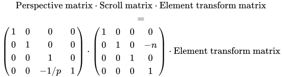
The first matrix is the perspective matrix, the second matrix is the scroll
matrix. To recap: The scroll matrix's job is to make an element *move up* when we
are *scrolling down*, hence the negative sign.
For our scrollbar, however, we want the *opposite* -- we want our element to
*move down* when we are scrolling *down* . Here's where we can use a trick:
Inverting the *w* coordinate of the corners of our box. If the *w* coordinate is
-1, all translations will take effect in the opposite direction. So how do we do
that? The CSS engine takes care of converting the corners of our box to
homogeneous coordinates, and sets w to 1. It's time for `matrix3d()` to shine!
.box {
transform:
matrix3d(
1, 0, 0, 0,
0, 1, 0, 0,
0, 0, 1, 0,
0, 0, 0, -1
);
}
This matrix will do nothing else than negating *w* . So when the CSS engine has
turned each corner into a vector of the form `[x,y,z,1]`, the matrix will
convert it into `[x,y,z,-1]`.
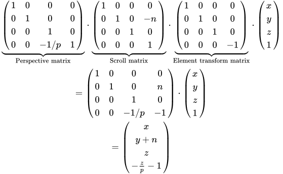
I listed an intermediate step to show the effect of our element transform
matrix. If you are not comfortable with matrix math, that is okay. The Eureka
moment is that in the last line we end up adding the scroll offset n to our y
coordinate instead of subtracting it. The element will be translated *downwards*
if we scroll *down*.
However, if we just put this matrix in our
[example](https://googlechromelabs.github.io/ui-element-samples/custom-scrollbar/step-2.html),
the element will not be displayed. This is because the CSS spec requires that any
vertex with *w* \< 0 blocks the element from being rendered. And since our z
coordinate is currently 0, and p is 1, *w* will be -1.
Luckily, we can choose the value of z! To make sure we end up with w=1, we need
to set z = -2.
.box {
transform:
matrix3d(
1, 0, 0, 0,
0, 1, 0, 0,
0, 0, 1, 0,
0, 0, 0, -1
)
translateZ(-2px);
}
Lo and behold, our
[box is back](https://googlechromelabs.github.io/ui-element-samples/custom-scrollbar/step-3.html)!
## Step 2: Make it move
Now our box is there and is looking the same way it would have without any
transforms. Right now the perspective container is not scrollable, so we can't
see it, but *we know* that our element will go the *other direction* when
scrolled. So let's make the container scroll, shall we? We can just add a
spacer element that takes up space:
And now
[scroll the box](https://googlechromelabs.github.io/ui-element-samples/custom-scrollbar/step-4.html)!
The red box moves down.
## Step 3: Give it a size
We have an element that moves down when the page scrolls down. That's the hard
bit out of the way, really. Now we need to style it to look like a scrollbar and
make it a bit more interactive.
A scrollbar usually consists of a "thumb" and a "track", while the track isn't
always visible. The thumb's height is directly proportional to how much of the
content is visible.
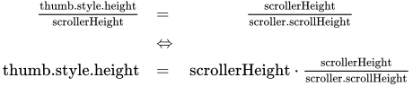
`scrollerHeight` is the height of the scrollable element, while
`scroller.scrollHeight` is the total height of the scrollable content.
`scrollerHeight/scroller.scrollHeight` is the fraction of the content that is
visible. The ratio of vertical space the thumb covers should be equal to the
ratio of content that is visible:
> [!NOTE]
> **Note:** We need to adjust `right` so our custom scrollbar is visible on systems with permanent native scrollbars. We will completely hide the native scrollbars later with a trick.
The size of the thumb is
[looking good](https://googlechromelabs.github.io/ui-element-samples/custom-scrollbar/step-5.html),
but it's moving way too fast. This is where we can grab our technique from the
parallax scroller. If we move the element further back, it will move slower while
scrolling. We can correct the size by scaling it up. But how much should we push
it back exactly? Let's do some -- you guessed it -- math! This is the last time, I
promise.
The crucial bit of information is that we want the bottom edge of the thumb to
line up with the bottom edge of the scrollable element when scrolled all the way
down. In other words: If we have scrolled
`scroller.scrollHeight - scroller.height` pixels, we want our thumb to be
translated by `scroller.height - thumb.height`. For every pixel of scroller, we
want our thumb to move a fraction of a pixel:

That's our scaling factor. Now we need to convert the scaling factor into a
translation along the z axis, which we already did in the parallax scrolling
article. According to the
[relevant section in the spec](https://drafts.csswg.org/css-transforms-2/#perspective):
The scaling factor is equal to p/(p − z). We can solve this equation for z to
figure out how much we we need to translate our thumb along the z axis. But keep
in mind that due to our w coordinate shenanigans, we need to translate an
additional `-2px` along z. Also note that an element's transforms are applied
right to left, meaning that all translations before our special matrix will not
be inverted, all translations after our special matrix, however, will! Let's
codify this!
We have a
[scrollbar](https://googlechromelabs.github.io/ui-element-samples/custom-scrollbar/step-6.html)!
And it's just a DOM element that we can style however we like. One thing that is
important to do in terms of accessibility is to make the thumb respond to
click-and-drag, as many users are used to interacting with a scrollbar that way.
For the sake of not making this blog post even longer, I am not going to explain
the details for that part. Take a look at the
[library code](https://github.com/GoogleChromeLabs/ui-element-samples/blob/gh-pages/custom-scrollbar/scrollbar.js#L5-L25)
for details if you want to see how it's done.
## What about iOS?
Ah, my old friend iOS Safari. As with the parallax scrolling, we run into an
issue here. Because we are scrolling on an element, we need to specify
`-webkit-overflow-scrolling: touch`, but that causes 3D flattening and our entire
scrolling effect stops working. We solved this problem in the parallax scroller
by detecting iOS Safari and relying on `position: sticky` as a workaround, and
we'll do exactly the same thing here. Take a look at the
[parallaxing article](https://developer.chrome.com/blog/performant-parallaxing)
to refresh your memory.
## What about the browser scrollbar?
On some systems, we will have to deal with a permanent, native scrollbar.
Historically, the scrollbar can't be hidden (except with a
[non-standard pseudo-selector](https://developer.mozilla.org/docs/Web/CSS/::-webkit-scrollbar)).
So to hide it, we have to resort to some (math-free) hackery. We wrap our
scrolling element in a container with `overflow-x: hidden` and make the
scrolling element wider than the container. The browser's native scrollbar is
now out of view.
## Fin
Putting it all together, we can now build a frame-perfect custom
scrollbar -- like the one in our
[Nyan cat demo](https://googlechromelabs.github.io/ui-element-samples/custom-scrollbar/).
If you can't see Nyan cat, you are experiencing
[a bug that we found and filed](https://crbug.com/699140)
while building this demo (click the thumb to make Nyan cat appear).
Chrome is really good at avoiding unnecessary work
like painting or animating things that are off-screen. The bad news is that our
matrix shenanigans make Chrome think the Nyan cat gif is actually off-screen.
Hopefully this will get fixed soon.
There you have it. That was a lot of work. I applaud you for reading the entire
thing. This is some
real trickery to get this working and it's probably rarely worth the effort,
except when a customized scrollbar is an essential part of the experience. But
good to know that it is possible, no? The fact that it is this hard to do a
custom scrollbar shows that there's work to be done on CSS's side. But fear not!
In the future,
[Houdini](https://developer.chrome.com/web/updates/2016/05/houdini)'s
[AnimationWorklet](https://surma.dev/things/animworklet/) is going to make
frame-perfect scroll-linked effects like this a lot easier.