
CSS Color 4 brings wide gamut color tools and capabilities to the web: more colors, manipulation functions, and better gradients.

For over 25 years, sRGB
(standard red green blue) has been the only color
gamut for CSS gradients and colors, with color space
offerings within it like rgb(), hsl() and hex. It is the most common color
gamut capability amongst displays; a common denominator. We've grown very accustomed to specifying colors within this gamut.
As displays become more capable of showing a wide range of colors, CSS needs a way to specify colors from within these wider ranges. The current color formats have no language for wide color ranges.
If CSS never updated, it would be stuck in the 90s color ranges forever, forced never to match the wide gamut offerings found in images and video. Trapped, only showing 30% of the colors the human eye can see. Thank CSS Color Level 4 for helping us escape this trap; written primarily by Lea Verou and Chris Liley.
From Chrome 111 is support for CSS Color 4
gamuts and color spaces, joining Safari who's had support for display-p3 since
2016. CSS can now support HD (high definition) displays, specifying colors from
HD gamuts while also offering color spaces with specializations. This guide will
explain how you can start to take advantage of this new world of color.
Try it for yourself
In supporting browsers, there's 50% more colors to pick from! You thought 16 million colors sounded like a lot, wait until you see how many colors some of these new spaces can show. Also, think about all those gradients that banded because there wasn't enough bit-depth, that's resolved too.
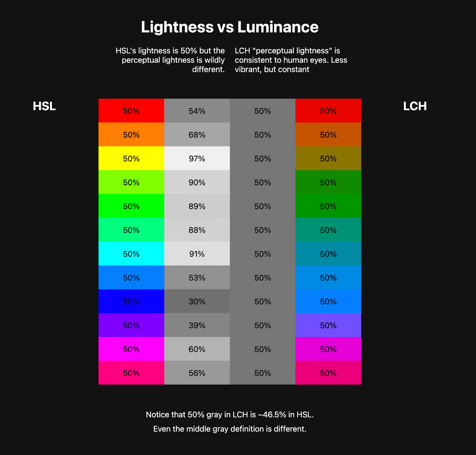
In addition to more colors, arguably the most vivid colors the display is capable of, new color spaces provide unique tools and methods for managing and creating color systems. For example, before now we had HSL and its "lightness" channel, which was the best web developers had. Now in CSS, we have LCH's "perceptual lightness."
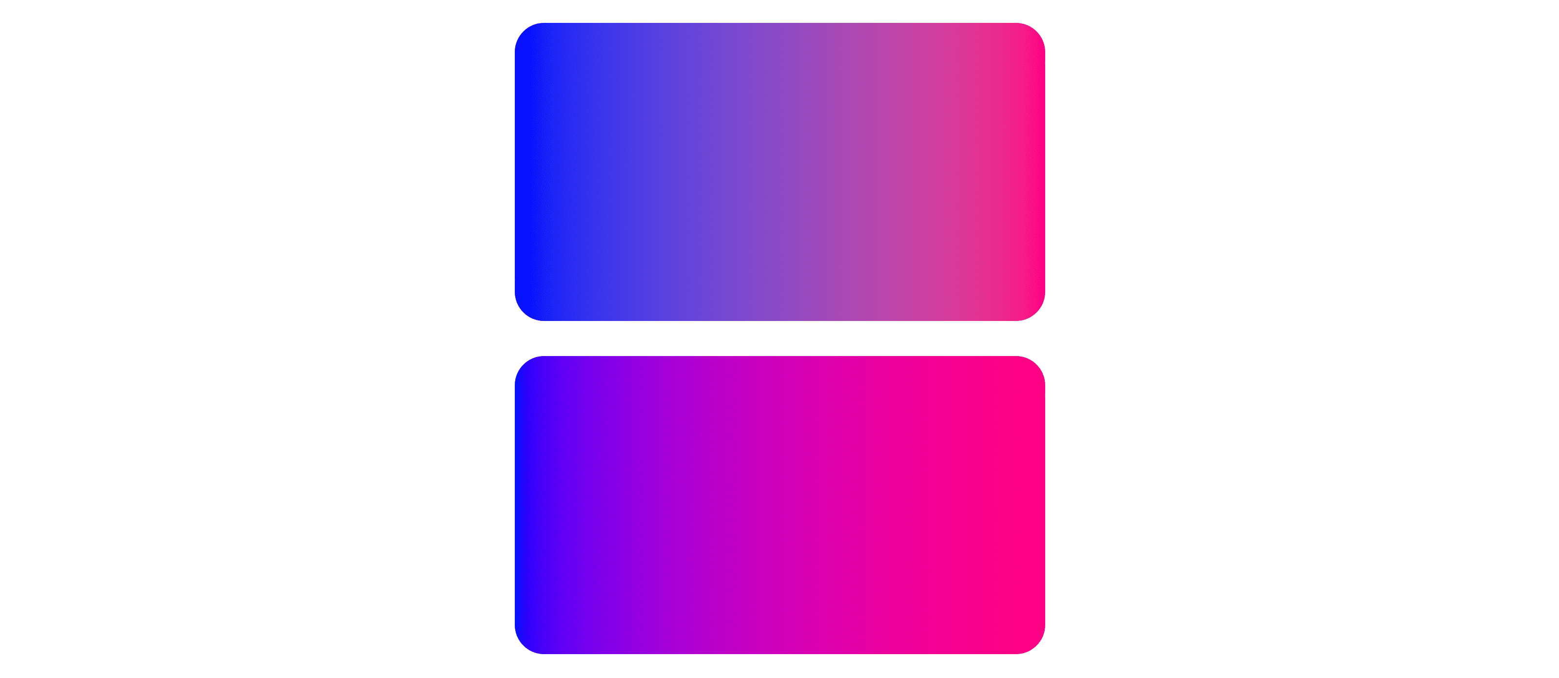
Furthermore, gradients and mixing get some upgrades: color space support, hue interpolation options, and less banding. The following image shows some of the mixing upgrades. The top two color mixes are in sRGB. The bottom two color mixes are in display p3. Display p3 has more vivid color and the mixes result in complete black and white in the middle. Where sRGB looks a bit desaturated and the mixes in the middle aren't complete black or white results.

https://codepen.io/web-dot-dev/pen/poZgXQb
This guide will cover where color has been, where it is going, and how CSS will enable and support web developers to manage color.
Overview
The problem with color and the web is that CSS is not high definition ready, while the displays most folks have in their pockets, laps or mounted on walls are wide gamut, high definition color ready. The color capability of displays grew faster than CSS, now CSS is here to catch up.
There's much more than just "more colors" too. By the end of this article you'll be able to specify more colors, enhance gradients, and pick the best color spaces and color gamuts for each task.
What is a color gamut?
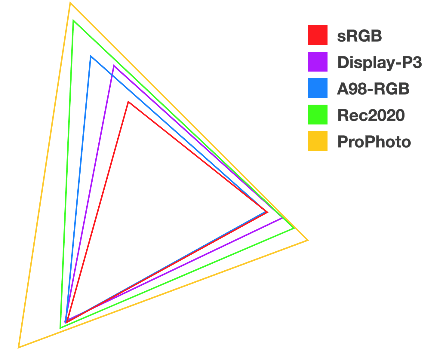
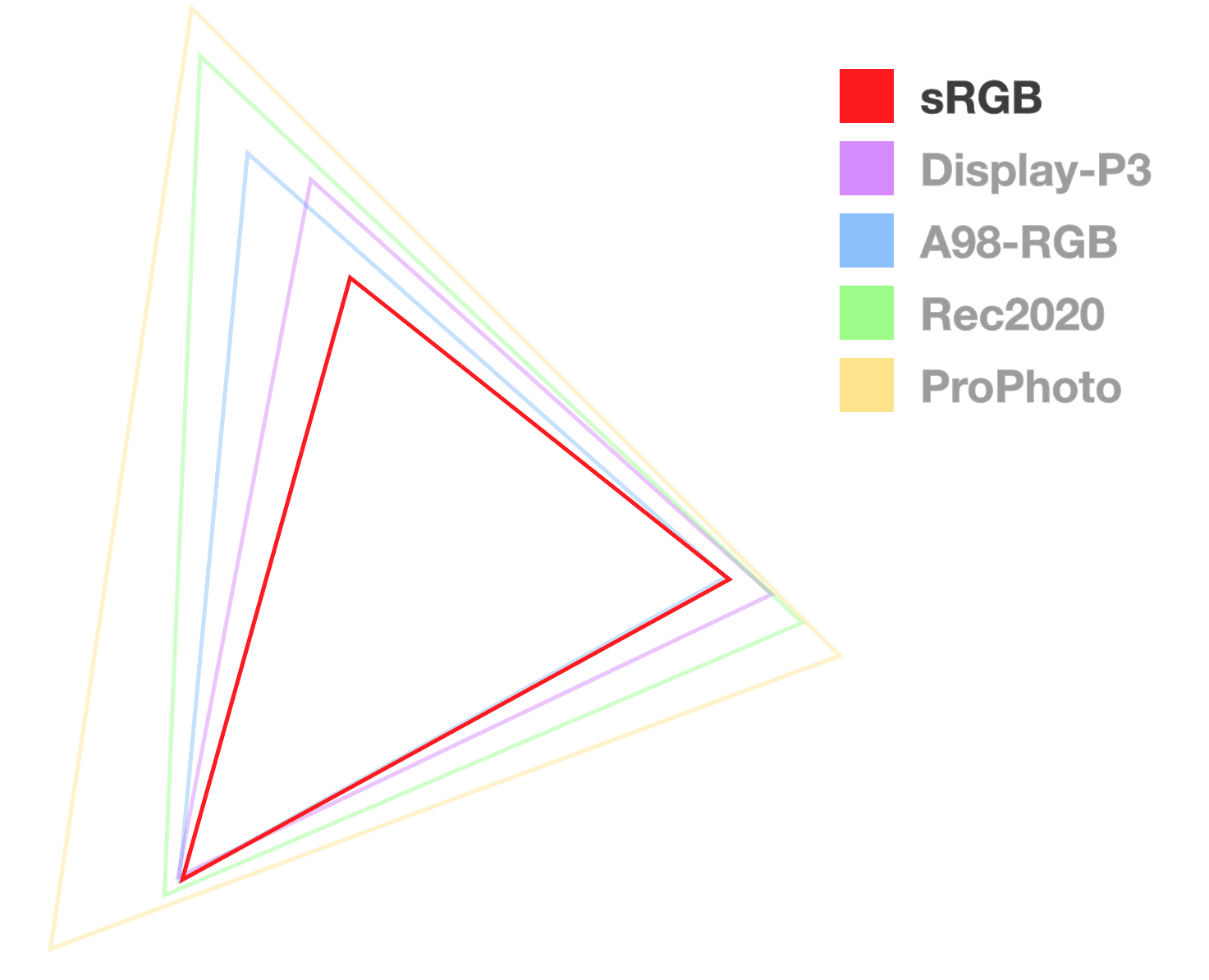
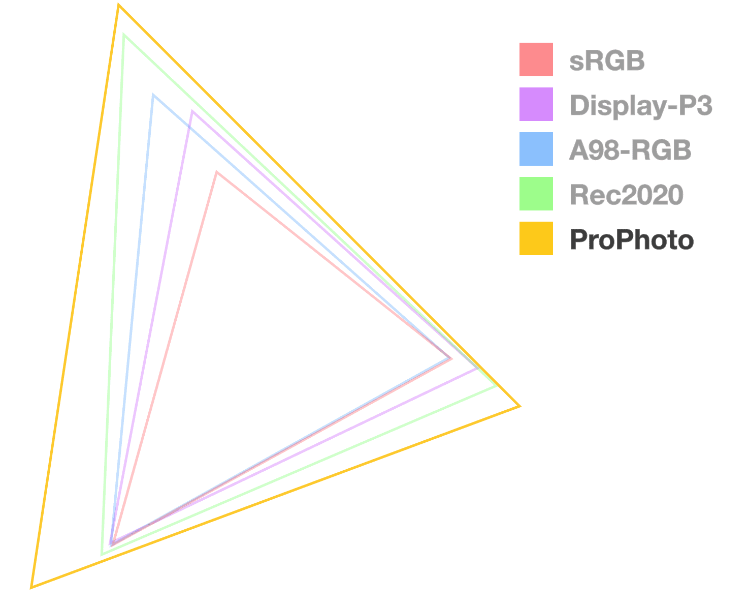
A gamut represents the size of something. The phrase "millions of colors" is a comment about the gamut of a display, or the range of colors it has to choose from. In the following image, three gamuts are compared, and the larger the size the more colors it offers.

A color gamut can also have a name. Like a basketball versus a baseball or a vente coffee cup versus a grande; a name for the size can help people communicate. Learning these color gamut names helps you communicate and quickly understand a range of colors.
This article will introduce you to seven new gamuts, all with wider range than sRGB, and describe their different features to help you choose which to use:
Human visual gamut
Color gamuts are often compared against the human visual gamut; the entirety of color we believe the human eye can see. HVS is often portrayed with a chromaticity diagram, like this:

The outermost shape is what we can see as humans, and the inner triangle is the
rgb() functions range, aka the sRGB color space.
As you saw triangles above, comparing gamut sizes, so will you find triangles below. This is the industry's way of communicating about color gamuts and comparing them.
What is a color space?
Color spaces are arrangements of a gamut, establishing a shape and a method of accessing colors. Many are simple 3D shapes like cubes or cylinders. This color arrangement determines which colors are next to each other, and how accessing and interpolating colors will work.
RGB is like a rectangular color space, where colors are accessed by specifying coordinates on 3 axes. HSL is a cylindrical color space, where colors are accessed with a hue angle and coordinates on 2 axes

The level 4 specification introduces 12 new color spaces for looking up colors from the 7 new gamuts shared previously:
These are in addition to the 4 color spaces previously available:
Color gamut and color space summary
A color space is a mapping of colors where a color gamut is a range of colors. Consider a color gamut as a total of particles and a color space as a bottle made to hold that range of particles.
Here's an interactive visual by Alexey Ardov that demonstrates color spaces. Point, drag, and zoom around in this demo. Change the color space to see a visualization of other spaces.
- Use color gamuts to talk about a range of colors, like low range or narrow gamut versus high range or wide gamut.
- Use color spaces to talk about arrangements of color, syntax used to specify a color, manipulate color and interpolate through color.

How to access more colors, new spaces, and debug results
CSS Color 4 outlines a bunch of new features and tools for CSS and color. First, a recap of where color was before these new features. Then an overview of the new color spaces, syntaxes and tools.
The following Codepen shows all the new and old color syntaxes together:
A review of the classic color spaces
Since the 2000s, you have been able to use the following for any CSS properties
that accept a color as a value: hexadecimal (hex numbers), rgb(), rgba(), by
name like hotpink, or with keywords like
currentColor.
Around 2010, depending on your browser, CSS could use
hsl() colors. Then in 2017,
hex with alpha appeared. Last, only
recently, hwb() started getting
support in browsers.
All of these classic color spaces reference color within the same gamut, sRGB.
HEX
The hex colorspace specifies R, G, B and A with hexadecimal numbers. The following code examples show all the ways this syntax can specify red, green and blue plus opacity.
.valid-css-hex-colors {
  /* classic */
  --3-digits: #49b;
  --6-digits: #4499bb;

  /* hex with opacity */
  --4-digits-opaque: #f9bf;
  --8-digits-opaque: #ff99bbff;
  --4-digits-with-opacity: #49b8;
  --8-digits-with-opacity: #4499bb88;
}
RGB
The RGB color space features direct access to the red, green and blue channels. It allows specifying an amount between 0 and 255 or as a percentage 0 to 100. This syntax was around before some syntax normalization was in the specifications, so you'll see comma and no-comma syntaxes in the wild. Moving forward, commas are no longer required.
.valid-css-rgb-colors {
  --classic: rgb(64, 149, 191);
  --modern: rgb(64 149 191);
  --percents: rgb(25% 58% 75%);

  --classic-with-opacity-percent: rgba(64, 149, 191, 50%);
  --classic-with-opacity-decimal: rgba(64, 149, 191, .5);

  --modern-with-opacity-percent: rgb(64 149 191 / 50%);
  --modern-with-opacity-decimal: rgb(64 149 191 / .5);

  --percents-with-opacity-percent: rgb(25% 58% 75% / 50%);
  --percents-with-opacity-decimal: rgb(25% 58% 75% / 50%);

  --empty-channels: rgb(none none none);
}
HSL
One of the first color spaces to orient itself towards human language and communication, HSL (hue saturation and lightness) offers all the colors in the sRGB gamut while not requiring your brain to know how red, green and blue interact. Like RGB, it also originally had commas in the syntax, but moving forward, commas are no longer required.
.valid-css-hsl-colors {
  --classic: hsl(200deg, 50%, 50%);
  --modern: hsl(200 50% 50%);

  --classic-with-opacity-percent: hsla(200deg, 50%, 50%, 50%);
  --classic-with-opacity-decimal: hsla(200deg, 50%, 50%, .5);

  --modern-with-opacity-percent: hsl(200 50% 50% / 50%);
  --modern-with-opacity-decimal: hsl(200 50% 50% / .5);

  /* hueless and no saturation */
  --empty-channels-white: hsl(none none 100%);
  --empty-channels-black: hsl(none none 0%);
}
HWB
Another sRGB gamut color space oriented at how humans describe color is HWB (hue, whiteness, blackness). Authors can choose a hue and mix in white or black to find their desired color.
.valid-css-hwb-colors {
  --modern: hwb(200deg 25% 25%);
  --modern2: hwb(200 25% 25%);

  --modern-with-opacity-percent: hwb(200 25% 25% / 50%);
  --modern-with-opacity-decimal: hwb(200 25% 25% / .5);

  /* hueless and no saturation */
  --empty-channels-white: hwb(none 100% none);
  --empty-channels-black: hwb(none none 100%);
}
Meet the new web color spaces
The following color spaces offer access to larger gamuts than sRGB. The display-p3 color space offers almost twice as many colors as RGB, while Rec2020 offers almost twice as many as display-p3. That's a lot of colors!
The color() function
The new
color()
function can be used for any color space that specifies colors with R, G and B
channels. color() takes a color space parameter first, then a series of
channel values for RGB and optionally some alpha.
You'll find many of the new color spaces use this function because having
specialized functions like rgb, srgb, hsl, hwb, etc, was growing to a
long list, easier to have the colorspace be a parameter.
Pros
- A normalized space for accessing color spaces that use RGB channels.
- Can scale up to any wide gamut RGB based color space.
Cons
- Doesn't work with HSL, HWB, LCH, okLCH, or okLAB
.valid-css-color-function-colors {
  --srgb: color(srgb 1 1 1);
  --srgb-linear: color(srgb-linear 100% 100% 100% / 50%);
  --display-p3: color(display-p3 1 1 1);
  --rec2020: color(rec2020 0 0 0);
  --a98-rgb: color(a98-rgb 1 1 1 / 25%);
  --prophoto: color(prophoto-rgb 0% 0% 0%);
  --xyz: color(xyz 1 1 1);
}
sRGB via color()

This colorspace offers the same features as rgb(). It does additionally offer
decimals between 0 and 1, used exactly like 0% to 100%.
Pros
- Nearly all displays support the range of this color space.
- Design tool support.
Cons
- Not perceptually linear (like
lch()is) - No wide gamut colors.
- Gradients often go through a dead zone.
.valid-css-srgb-colors {
  --percents: color(srgb 34% 58% 73%);
  --decimals: color(srgb .34 .58 .73);

  --percents-with-opacity: color(srgb 34% 58% 73% / 50%);
  --decimals-with-opacity: color(srgb .34 .58 .73 / .5);

  /* empty */
  --empty-channels-black: color(srgb none none none);
  --empty-channels-black2: color(srgb);
}
Linear sRGB via color()
This linear alternative to RGB offers predictable channel intensity.
Pros
- Direct access to RGB channels, handy for things like game engines or light shows.
Cons
- Not perceptually linear.
- Black and white are packed at the edges.
.valid-css-srgb-linear-colors {
  --percents: color(srgb-linear 34% 58% 73%);
  --decimals: color(srgb-linear .34 .58 .73);

  --percents-with-opacity: color(srgb-linear 34% 58% 73% / 50%);
  --decimals-with-opacity: color(srgb-linear .34 .58 .73 / .5);

  /* empty */
  --empty-channels-black: color(srgb-linear none none none);
  --empty-channels-black2: color(srgb-linear);
}
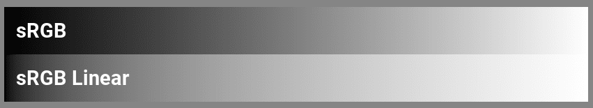
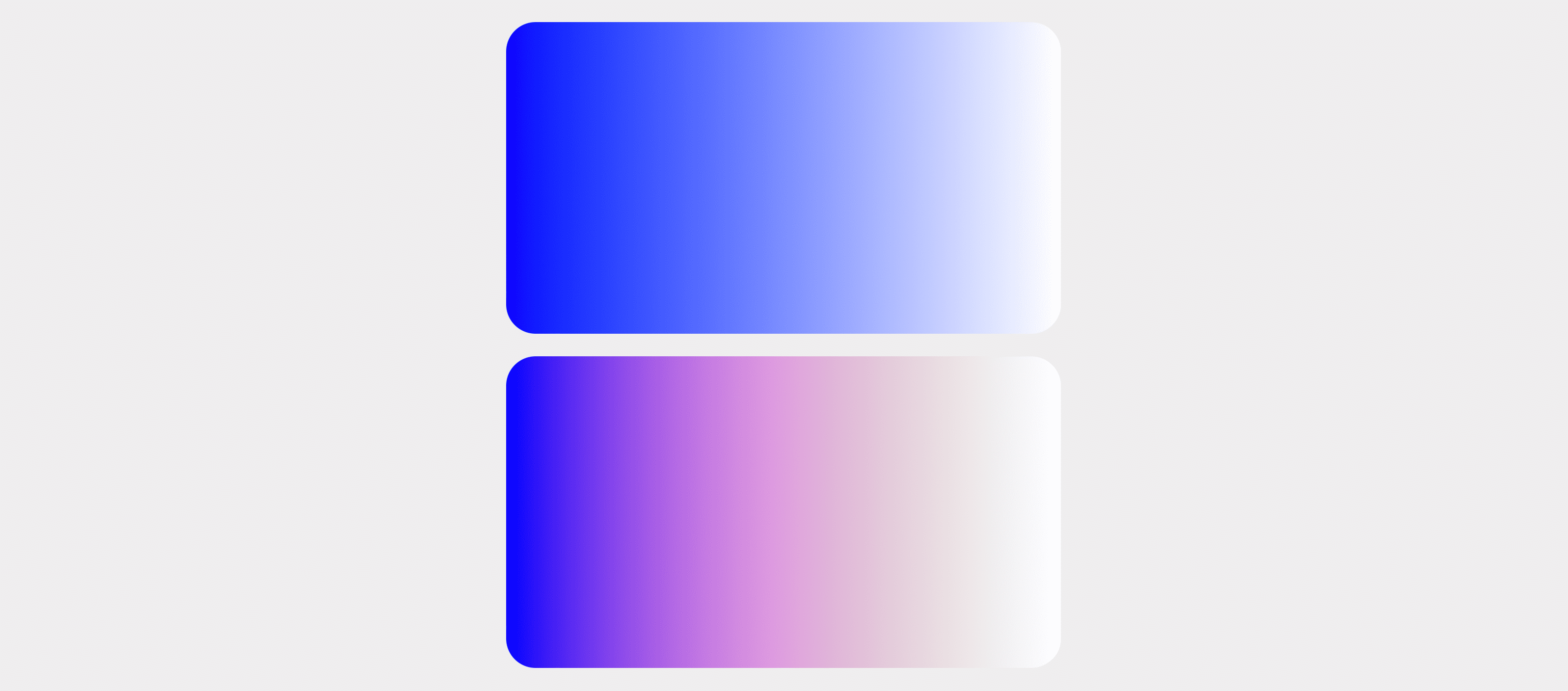
Gradients are discussed in detail later,
but quickly it's meaningful to see a srgb and linear-srgb black to white
gradient to illustrate their differences:
LCH
The first space of this post to introduce syntax for accessing colors outside the RGB gamut! It is also the first to make it very easy to create out of gamut color for a display. This is because any CIE space colors (lch, oklch, lab, oklab) are capable of representing the entire human visible color spectrum.
This colorspace is modeled after human vision and offers syntax to specify any of those colors and more. The LCH channels are lightness, chroma and hue. Hue being an angle, like in HSL and HWB. Lightness is a value between 0 and 100, but not like HSL's lightness, it's a special, “perceptually linear”, human-centric lightness. Chroma is similar to saturation; can range from 0 to 230 but is also technically unbounded.
Pros
- Predictable color manipulation thanks to being perceptually linear, mostly (see oklch).
- Uses familiar channels.
- Often has vibrant gradients.
Cons
- Easy to go out of gamut.
- On rare occasions the gradient may need an adjustment middle point to prevent hue shift.
.valid-css-lch-colors {
  --percent-and-degrees: lch(58% 32 241deg);
  --just-the-degrees: lch(58 32 241deg);
  --minimal: lch(58 32 241);

  --percent-opacity: lch(58% 32 241 / 50%);
  --decimal-opacity: lch(58% 32 241 / .5);

  /* chromaless and hueless */
  --empty-channels-white: lch(100 none none);
  --empty-channels-black: lch(none none none);
}
LAB
Another color space made to access the CIE gamut, again with a perceptually linear lightness (L) dimension. The A and B in LAB represent the unique axes of human color vision: red-green, and blue-yellow. When A is given a positive value it adds red, and adds green when it's below 0. When B is given a positive number it adds yellow, where negative values are toward blue.
Pros
- Perceptually consistent gradients.
- High dynamic range.
Cons
- Potential for hue shift.
- Difficult to hand author or guess a color when reading values.
.valid-css-lab-colors {
  --percent-and-degrees: lab(58% -16 -30);
  --minimal: lab(58 -16 -30);

  --percent-opacity: lab(58% -16 -30 / 50%);
  --decimal-opacity: lab(58% -16 -30 / .5);

  /* chromaless and hueless */
  --empty-channels-white: lab(100 none none);
  --empty-channels-black: lab(none none none);
}
OKLCH
This color space is corrective to LCH. And like LCH, (L) continues to represent perceptually linear lightness, C for chroma and the H for hue.
This space feels familiar if you've worked with HSL or LCH. Pick an angle on the color wheel for H, choose a lightness or darkness amount by adjusting L, but then we have chroma instead of saturation. They're fairly identical except that adjustments to lightness and chroma tend to come in pairs, or else it can be easy to ask for high chroma colors that go outside of a target gamut.
Pros
- No surprises when working with blue and purple hues.
- Perceptually linear lightness.
- Uses familiar channels.
- High dynamic range.
- Has a modern color picker - by Evil Martians.
Cons
- Easy to go out of gamut.
- New and relatively unexplored.
- Few color pickers.
.valid-css-oklch-colors {
  --percent-and-degrees: oklch(64% .1 233deg);
  --just-the-degrees: oklch(64 .1 233deg);
  --minimal: oklch(64 .1 233);

  --percent-opacity: oklch(64% .1 233 / 50%);
  --decimal-opacity: oklch(64% .1 233 / .5);

  /* chromaless and hueless */
  --empty-channels-white: oklch(100 none none);
  --empty-channels-black: oklch(none none none);
}
OKLAB
This space is corrective to LAB. It's claimed as a space optimized for image processing quality also, which for us in CSS means gradients and color function manipulation quality.
Pros
- Default space for animations and interpolations.
- Perceptually linear lightness.
- No hue shift like LAB.
- Perceptually consistent gradients.
Cons
- New and relatively unexplored.
- Few color pickers.
.valid-css-oklab-colors {
  --percent-and-degrees: oklab(64% -.1 -.1);
  --minimal: oklab(64 -.1 -.1);

  --percent-opacity: oklab(64% -.1 -.1 / 50%);
  --decimal-opacity: oklab(64% -.1 -.1 / .5);

  /* chromaless and hueless */
  --empty-channels-white: oklab(100 none none);
  --empty-channels-black: oklab(none none none);
}
Display P3
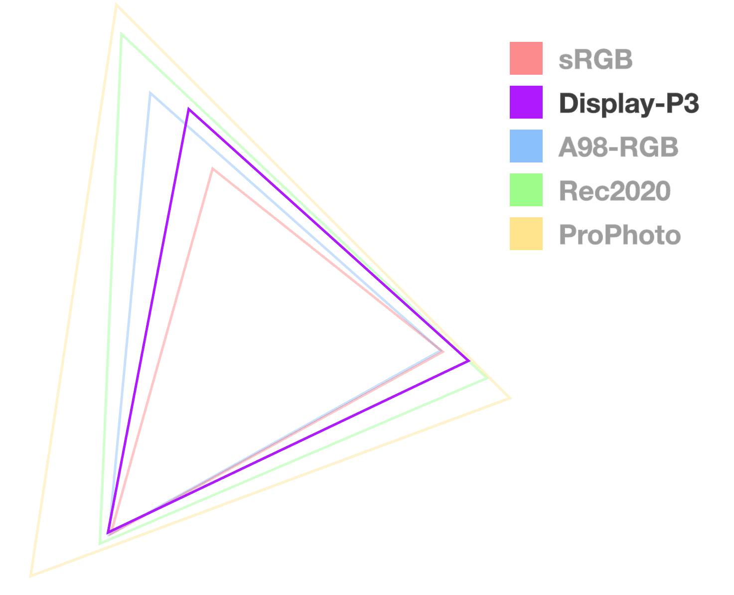
The display P3 gamut and color space have become popular since Apple supported them since 2015 on their iMac. Apple also supported display-p3 in web pages via CSS since 2016, five years ahead of any other browser. If coming from sRGB, this is a great color space to begin working within as you move styles to a higher dynamic range.
Pros
- Great support, considered the baseline for HDR displays.
- 50% more colors than sRGB.
- DevTools offer a great color picker.
Cons
- Will eventually be surpassed by Rec2020 and CIE spaces.
.valid-css-display-p3-colors {
  --percents: color(display-p3 34% 58% 73%);
  --decimals: color(display-p3 .34 .58 .73);

  --percent-opacity: color(display-p3 34% 58% 73% / 50%);
  --decimal-opacity: color(display-p3 .34 .58 .73 / .5);

  /* chromaless and hueless */
  --empty-channels-black: color(display-p3 none none none);
  --empty-channels-black2: color(display-p3);
}
Rec2020
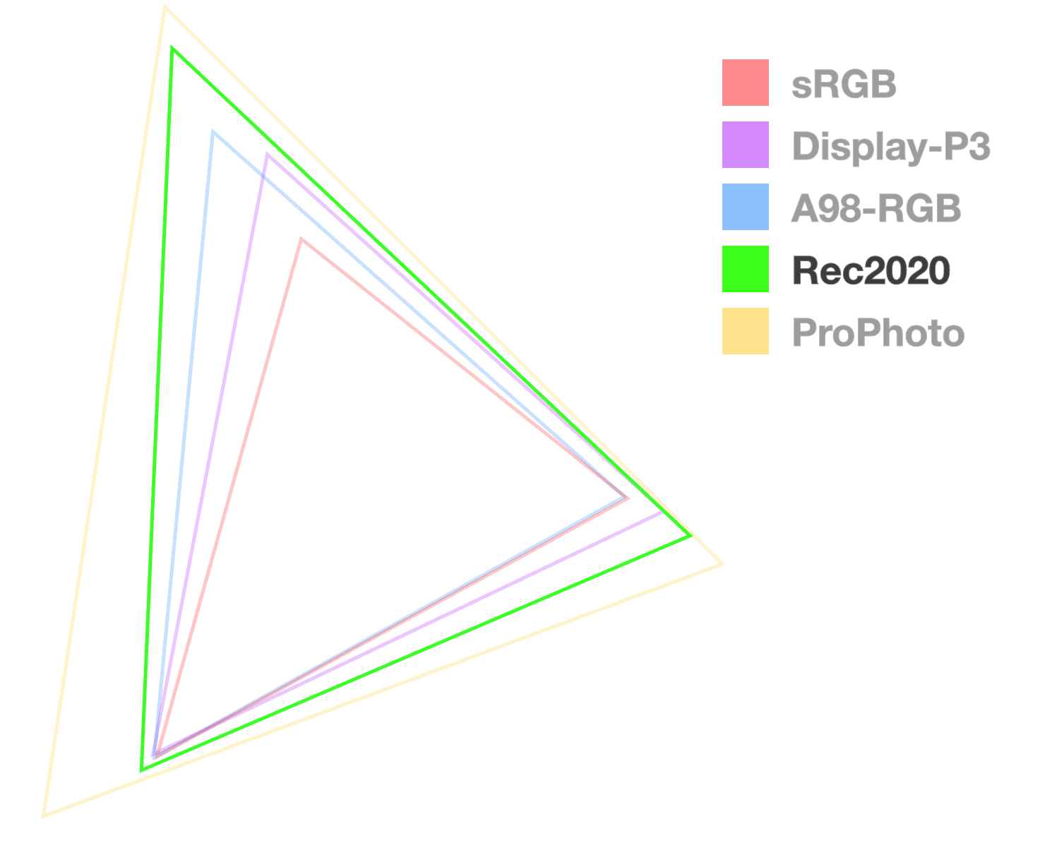
Rec2020 is part of the movement to UHDTV (ultra-high-definition television), providing a wide range of colors for use in 4k and 8k media. Rec2020 is another RGB based gamut, larger than display-p3, but not nearly as common amongst consumers as Display P3.
Pros
- Ultra HD colors.
Cons
- Not as common among consumers (yet).
- Not commonly found in handhelds or tablets.
.valid-css-rec2020-colors {
  --percents: color(rec2020 34% 58% 73%);
  --decimals: color(rec2020 .34 .58 .73);

  --percent-opacity: color(rec2020 34% 58% 73% / 50%);
  --decimal-opacity: color(rec2020 .34 .58 .73 / .5);

  /* chromaless and hueless */
  --empty-channels-black: color(rec2020 none none none);
  --empty-channels-black2: color(rec2020);
}
A98 RGB
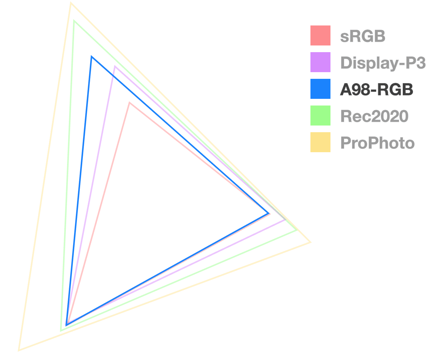
Short for Adobe 1998 RGB, A98 RGB was created by Adobe to feature most of the colors achievable from CMYK printers. It offers more colors than sRGB, notably in the cyan and green hues.
Pros
- Larger than the sRGB and Display P3 color spaces.
Cons
- Not a common space worked within by digital designers.
- Not many folks are porting palettes from CMYK.
.valid-css-a98-rgb-colors {
  --percents: color(a98-rgb 34% 58% 73%);
  --decimals: color(a98-rgb .34 .58 .73);

  --percent-opacity: color(a98-rgb 34% 58% 73% / 50%);
  --decimal-opacity: color(a98-rgb .34 .58 .73 / .5);

  /* chromaless and hueless */
  --empty-channels-black: color(a98-rgb none none none);
  --empty-channels-black2: color(a98-rgb);
}
ProPhoto RGB
Created by Kodak, this wide gamut space uniquely offers ultra wide range primary colors and features minimal hue shifts when changing lightness. It also claims to cover 100% of real-world surface colors as documented by Michael Pointer in 1980.
Pros
- Minimal hue shifts when changing lightness.
- Vibrant primary colors.
Cons
- Around 13% of its colors offered are imaginary, meaning they're not within the human visible spectrum.
.valid-css-prophoto-rgb-colors {
  --percents: color(prophoto-rgb 34% 58% 73%);
  --decimals: color(prophoto-rgb .34 .58 .73);

  --percent-opacity: color(prophoto-rgb 34% 58% 73% / 50%);
  --decimal-opacity: color(prophoto-rgb .34 .58 .73 / .5);

  /* chromaless and hueless */
  --empty-channels-black: color(prophoto-rgb none none none);
  --empty-channels-black2: color(prophoto-rgb);
}
XYZ, XYZ-d50, XYZ-d65
The CIE XYZ color space encompasses all colors that are visible to a person with average eyesight. This is why it is used as a standard reference for other color spaces. Y is luminance, X and Z are possible chromas within the given Y luminance.
The difference between d50 and d65 is the white point, where d50 uses the d50 white points and d65 uses the d65 white point.
Pros
- Linear-light access has handy use cases.
- Great for physical color mixing.
Cons
- Not perceptually linear like lch, oklch, lab and oklab are.
.valid-css-xyz-colors {
  --percents: color(xyz 22% 26% 53%);
  --decimals: color(xyz .22 .26 .53);

  --percent-opacity: color(xyz .22 .26 .53 / 50%);
  --decimal-opacity: color(xyz .22 .26 .53 / .5);

  /* chromaless and hueless */
  --empty-channels-black: color(xyz none none none);
  --empty-channels-black2: color(xyz);
}
.valid-css-xyz-d50-colors {
  --percents: color(xyz-d50 22% 26% 53%);
  --decimals: color(xyz-d50 .22 .26 .53);

  --percent-opacity: color(xyz-d50 .22 .26 .53 / 50%);
  --decimal-opacity: color(xyz-d50 .22 .26 .53 / .5);

  /* chromaless and hueless */
  --empty-channels-black: color(xyz-d50 none none none);
  --empty-channels-black2: color(xyz-d50);
}
.valid-css-xyz-d65-colors {
  --percents: color(xyz-d65 22% 26% 53%);
  --decimals: color(xyz-d65 .22 .26 .53);

  --percent-opacity: color(xyz-d65 .22 .26 .53 / 50%);
  --decimal-opacity: color(xyz-d65 .22 .26 .53 / .5);

  /* chromaless and hueless */
  --empty-channels-black: color(xyz-d65 none none none);
  --empty-channels-black2: color(xyz-d65);
}
Custom color spaces
The CSS Color 5 specification also has a path for teaching the browser a custom color space. This is an ICC profile that tells the browser how to resolve colors.
@color-profile --foo {
  src: url(path/to/custom.icc);
}
Once loaded, access colors from this custom profile with the color() function
and specify the channel values for it.
.valid-css-color-from-a-custom-profile {
  background: color(--foo 1 0 0);
}
Color interpolation
Transitioning from one color to another is found in animation, gradients and color mixing. This transition is typically specified as a starting color and an ending color, where the browser is expected to interpolate between them. Interpolate in this case means to generate a series of in-between colors to create a smooth transition instead of an instant one.
With a gradient, the interpolation is a series of colors along a shape. With animation it's a series of colors over time.
@keyframes bg {
  0%, 100% {
    background: orange;
  }
  25% {
    background: magenta;
  }
  50% {
    background: lime;
  }
  75% {
    background: cyan;
  }
}

.circle {
  animation: bg 5s ease-in-out infinite;
}
With a gradient, the in-between colors are shown all at once:
What's new in color interpolation
With the addition of new gamuts and color spaces, there are new additional
options for interpolation. Transitioning a color in hsl from blue to white
results in something very different from sRGB.
.classic-gradient-in-srgb {
  background: linear-gradient(to right, blue, white);
}

.new-gradient-in-hsl {
  background: linear-gradient(in hsl to right, blue, white);
}
Can't see the Codepen demo?
Then what happens if you transition from a color in one space to a color in a completely different space:
.gradient {
  /* oklab will be the common space */
  background: linear-gradient(to right, lch(29.6 131 301), hsl(330 100% 50%));
}

.lch {
  /* lch is specified */
  background: linear-gradient(in lch to right, lch(29.6 131 301), hsl(330 100% 50%));
}
Can't see the Codepen demo?
Luckily for you, the Color 4
specification has instructions for the browsers on how to handle these cross
color space interpolations. In the above case for .gradient, browsers will
notice the differentiating color spaces and use the default color space oklab.
You may think the browser would use lch as the color space, since that's the
first color, but it doesn't and that's why I show a second comparison gradient
.lch. The .lch gradient is a gradient from the lch color space.
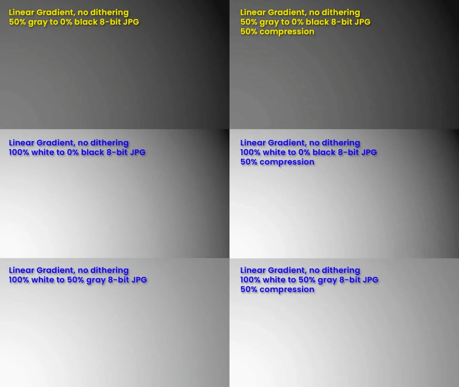
Less banding thanks to 16-bit color
Before this color work, all colors were saved in one 32-bit integer to represent all four channels; red, green, blue and alpha. This is 8-bits per channel and 2^ 24 possible colors (ignoring alpha). 2 ^ 24 = 16,777,216, "millions of colors."
After this color work, four 16-bit floating point values, each channel has its own float instead of being lumped together. This is 64-bits of data total, resulting in many more than millions of colors.
This work is required to support HD color. This increases the amount of color information that can be stored, which has a nice side effect of meaning there's more colors for the browser to use in a gradient.
Gradient banding is when there aren't enough colors to create a smooth gradient and "strips" of color become visible. Banding is heavily mitigated with the upgrade to higher resolution color.
Controlling interpolation
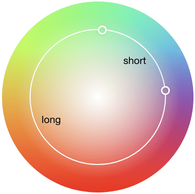
The shortest distance between two points is always a straight line. With color interpolation, browsers take the short route by default. Consider a scenario where there are two points in an HSL color cylinder. A gradient acquires its color steps by traveling along the line between the two points.
linear-gradient(to right, #94e99c, #e06242)
Top down view, of an HSL cylinder with a line between the color stops
The above gradient line goes straight between the greenish color to the reddish color, passing through the center of the color space. While the above is great to help with initial understanding, it's not exactly what happens. Here is the gradient in the following Codepen, and it's clearly not white in the middle like the mock demonstration showed.
The middle area of the gradient has lost its vibrance though. This is because the most vibrant colors are at the edge of the color space shape, not in the center where the interpolation traveled near. This is commonly referred to as the "dead zone." There are a few ways to fix or work around this.
Specifying more gradient stops to avoid the dead zone
A technique for avoiding the dead zone today is to add additional color stops in the gradient that intentionally guide the interpolation to stay within the vibrant ranges of a color space. It is literally a work around, as the additional stops help it work around the dead zone.
There's a gradient tool created by Erik Kennedy that calculates additional color stops for you, to help you avoid the dead zone even in color spaces that tend to gravitate towards it. Using it, passing the same colors from the first example but changing the color interpolation to HSL, it produces this:
linear-gradient(90deg, #94e99c, #99e789, #ace67d, #c4e472, #e2e366, #e2bf5a, #e1934e, #e06242);

Top down view of an HSL cylinder with a curved line featuring 9 color stops
With guided stop points, the interpolation is no longer a straight line, but appears to curve around the dead zone, helping maintain saturation, resulting in a much more vibrant gradient.
While the tool does a great job, what if you could have similar or greater control right from CSS?
Directing the color interpolation
In Color 4, the ability to control the hue interpolation strategy
was added and is a new way around (:wink:) the dead zone. Think about a hue
angle and consider a 2 stop gradient that only changes the angle, going hue
shifting from 140deg to 240deg for example.
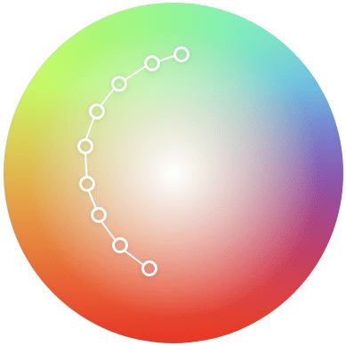
Shorter vs longer hue interpolation
The gradient will by default take the
shorter route it can unless
you specify for it to take the
longer route. Hue
interpolation options direct the angle rotation, like telling someone to turn
left instead of right (heh, Zoolander):
In the above visual example of hue interpolation distances, the short path and the long path are simulated to illustrate the difference. The short distance has less hues between it because it's traveled through the least amount of distance possible, where the long distance will have traveled over more hues.
Increasing vs decreasing hue interpolation
There are two more hue interpolation strategies in Color 4, but they are exclusive for cylindrical color spaces. Staying with the two colors from the previous examples, the visual now shows how increasing and decreasing works.
The above Codepen used ColorJS to demonstrate the expected result. The CSS you would write to achieve the same effect without a Javascript library would be:
.longer-hue-interpolation-in-css {
  background: linear-gradient(
    to right in hsl longer hue,
    hsl(180deg 100% 75%),
    hsl(240deg 100% 75%)
  );
}

.decreasing-hue-interpolation-in-css {
  background: linear-gradient(
    to right in hsl decreasing hue,
    hsl(180deg 100% 75%),
    hsl(240deg 100% 75%)
  );
}
To close out hue interpolation, here's a fun playground where you can change the hue between 2 color stops and see the effects of a hue interpolation choice as well as how color spaces change gradient results. The effects can be very different; consider this as four new tricks just went into your color toolbelt.
Gradients in different color spaces
Each color space, given its unique shape and color arrangement, will result in a different gradient. Look at the examples below, especially at "blue to white." Look at how each color space handles that differently. Notice how many go purple in the middle, that's called a "hue shift" during interpolation.
Can't see the Codepen demo?
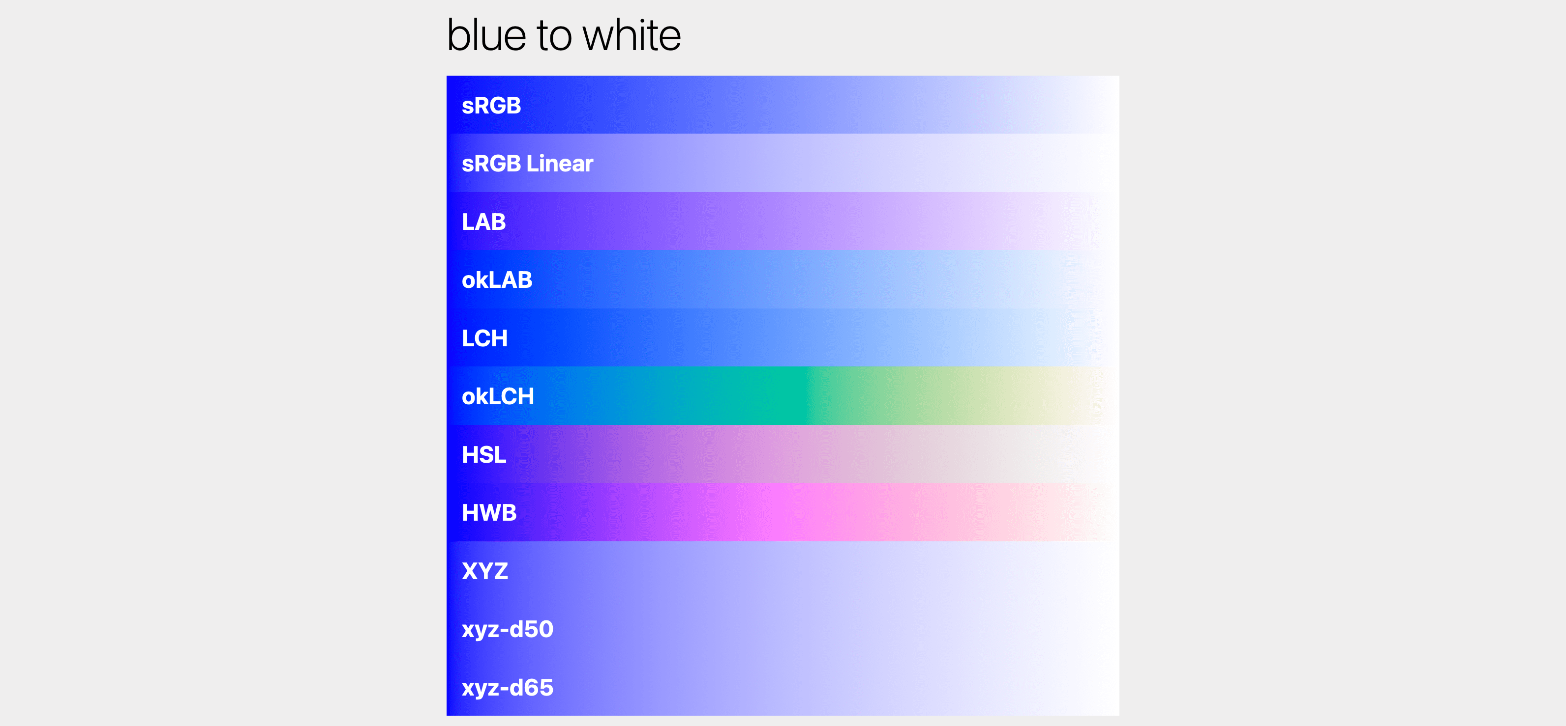
Image shown is only 1 of many examples from the Codepen. It's worth trying Canary or Safari Tech Preview to see these for yourself.
Some gradients in these spaces will be more vibrant than others or travel less
through dead zones.
Spaces like lab pack colors together in a way optimized for saturation, as
opposed to spaces optimized for humans to write color in like hwb().
.hwb {
  background: linear-gradient(to right, hwb(250 10% 10%), hwb(150 10% 10%));
}
.lab {
  background: linear-gradient(to right, lab(30 59.4 -96), lab(80 -64 36.2));
}
The above demo, while subtle in the results, does show more consistent interpolation with lab. The syntax of lab isn't simple to read though, there's negative numbers that are very unfamiliar when coming from rgb or hsl. Good news, we can use hwb for a familiar syntax but ask for the gradient to be interpolated entirely within another color space, like oklab.
.hwb {
  background: linear-gradient(in hwb to right, hwb(250 10% 10%), hwb(150 10% 10%));
}
.lab {
  background: linear-gradient(in oklab to right, hwb(250 10% 10%), hwb(150 10% 10%));
}
Can't see the Codepen demo?

This example uses the same colors in hwb but specifies the color space for
interpolation to either hwb or oklab. hwb is a great colorspace for high
vibrance but possible dead zones or bright spots (see the cyan hot spot in the
top example). oklab is great for perceptually linear gradients that stay
saturated. This feature is a lot of fun as you can try on a few different color
spaces to see which gradient you like best.
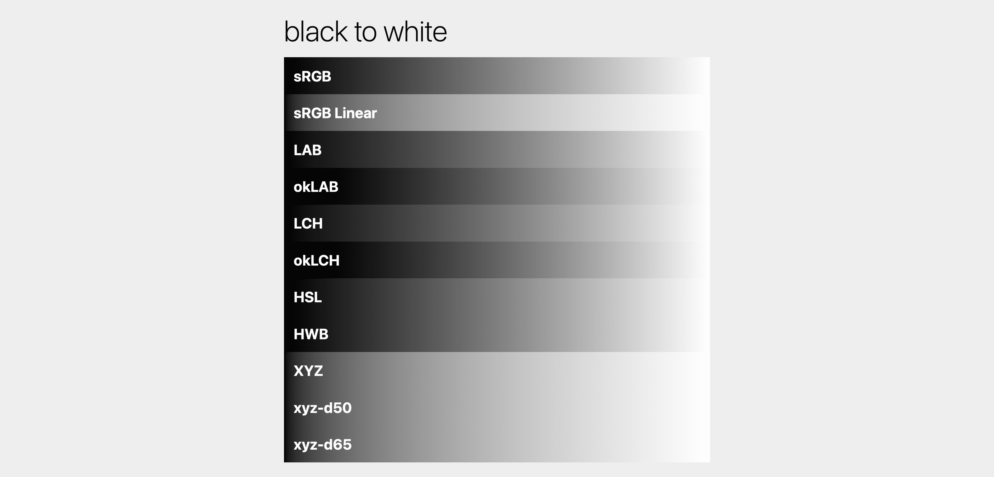
Here's a Codepen experimenting with gradients and color spaces, mixing and matching strategies to explore the possibilities. Even a transition from black to white is different in each color space!
Can't see the Codepen demo?
Gamut clamping
There exist scenarios where a color may ask for something outside of a gamut. Consider the following color:
rgb(300 255 255)
The maximum for a color channel in the rgb color space is 255, but here
300 was specified for red. What happens? Gamut clamping.
Clamping is when extra information is simply removed. 300 will become 255
internally to the color engine. The color has now been clamped within its space.
Choosing a color space
Many folks, after learning about these color spaces and their effects, feel overwhelmed and want to know which "one" to choose. From my studies and experience, I don't see one color space as the single one for all my tasks. Each has moments when they produce the desired outcome.
If there was one best space, then there wouldn't be so many new spaces being introduced.
However, I can say that the CIE spaces—lab, oklab, lch and oklch—are my
starting places. If the outcome of them isn't what I'm looking for, then I'll go
test other spaces. For mixing colors and creating gradients, I agree with the
default spec choice of oklab. For color systems and overall UI colors, I like
oklch.
Here are a couple articles where folks have shared their updated color
strategies given these new color spaces and features. For example, Andrey Sitnik
has gone all in on oklch, maybe they'll convince you to do the same:
- OKLCH in CSS: why we moved from RGB and HSL by Andrey Sitnik
- Color Formats by Josh W. Comeau
- OK, OKLCH by Chris Coyier
Migrating to HD CSS color
There are two main strategies for updating your web project color to support wide gamut displays:
Graceful degradation
Use the new color spaces and let the browser and operating system figure out which color to show based on display capabilities.Progressive enhancement
Use@supportsand@mediato assess the capabilities of the user's browser, and if conditions are met, provide wide gamut colors.
If a browser doesn't understand display-p3 color:
color: red;
color: color(display-p3 1 0 0);
If a browser does understand display-p3 color:
color: red;
color: color(display-p3 1 0 0);
There are advantages and disadvantages to each. Here's a quick list of pros and cons:
Graceful degradation
- Pros
- The simplest route.
- The browser will gamut map or clamp to sRGB if not a wide gamut display, therefore the responsibility is on the browser.
- Cons
- The browser may gamut clamp or gamut map to a color you don't love.
- The browser may not understand the color request and fail entirely. However this can be mitigated by specifying the color twice, letting the cascade fallback to the previous color it does understand.
Progressive enhancement
- Pros
- More control with managed color fidelity.
- An additive strategy that doesn't affect the current colors.
- Cons
- You need to manage two separate color syntaxes.
- You need to manage two separate color gamuts.
Checking for gamut and color space support
The browser allows checking for support for wide gamut capabilities and color syntax support from CSS and JavaScript. The exact gamut of colors the user has is not made available, a generalized answer is provided so user privacy is maintained. The exact color space support is made available though, as it's not specific to capabilities of the user's hardware like gamut is.
Color gamut support queries
The following code examples check the visiting user's range of colors in their display.
Checking from CSS
The least specific support inquiry is the
dynamic-range
media query:
@media (dynamic-range: high) {
  /* safe to use HD colors */
}
Approximate, or more, support can be inquired with the
color-gamut
media query:
@media (color-gamut: srgb) {
  /* safe to use srgb colors */
}

@media (color-gamut: p3) {
  /* safe to use p3 colors */
}

@media (color-gamut: rec2020) {
  /* safe to use rec2020 colors */
}
There are an additional two media queries for checking support:
Checking from JavaScript
For JavaScript, the
window.matchMedia()
function can be called and passed a media query for evaluation.
const hasHighDynamicRange = window
.matchMedia('(dynamic-range: high)')
.matches;

console.log(hasHighDynamicRange); // true || false

const hasP3Color = window
.matchMedia('(color-gamut: p3)')
.matches;

console.log(hasP3Color); // true || false
The above pattern can be copied for the rest of the media queries.
Color space support queries
The following code examples check the visiting user's browser and its selection of color spaces to work with.
Checking from CSS
Individual color space support can be inquired using an
@supports query:
@supports (background: rgb(0 0 0)) {
  /* rgb color space supported */
}


@supports (background: color(display-p3 0 0 0)) {
  /* display-p3 color space supported */
}


@supports (background: oklch(0 0 0)) {
  /* oklch color space supported */
}
Checking from JavaScript
For JavaScript, the
CSS.supports()
function can be called and passed a property and value pair to see if the
browser understands.
CSS.supports('background: rgb(0 0 0)')
CSS.supports('background: color(display-p3 0 0 0)')
CSS.supports('background: oklch(0 0 0)')
Putting the hardware and parsing checks together
While waiting for each browser to implement these new color features, it's a good idea to check for both hardware capability and color parsing capability. This is often what I use when progressively enhancing colors to high definition:
:root {
  --neon-red: rgb(100% 0 0);
  --neon-blue: rgb(0 0 100%);
}

/* is the display HD? */
@media (dynamic-range: high) {

  /* does this browser understand display-p3? */
  @supports (color: color(display-p3 0 0 0)) {

    /* safe to use display-p3 colors */
    --neon-red: color(display-p3 1 0 0);
    --neon-blue: color(display-p3 0 0 1);
  }
}
Debugging color with Chrome DevTools
Chrome DevTools is updated and equipped with new tools to help developers create, convert and debug HD color.
Updated color picker
The color picker now supports all the new color spaces. Allowing authors to interact with channel values just as they would have.
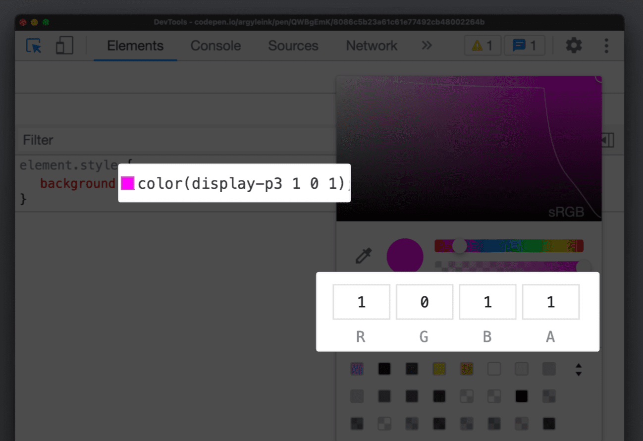
Gamut boundaries
A gamut boundary line has also been added, drawing a line between srgb and display-p3 gamuts. Making it clear which gamut the selected color is within.
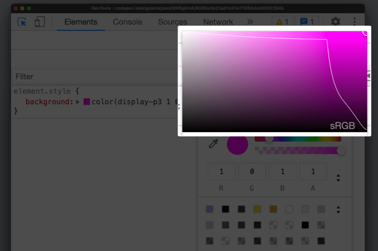
This helps authors visually differentiate between HD colors and non-HD colors.
It's especially helpful when working with the color() function and the new
color spaces because they're capable of producing both non-HD and HD colors. If
you want to check which gamut your color is in, pop up the color picker and see!
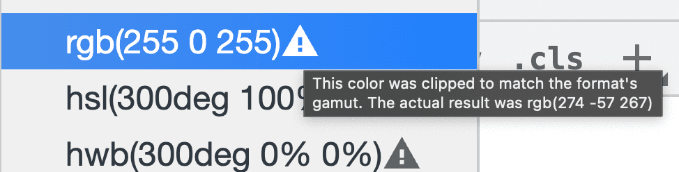
Converting colors
DevTools has been able to convert colors between supported formats like hsl,
hwb, rgb and hex for many years. shift + click on a square color swatch in the
Styles pane to perform this conversion. The new color tools don't just cycle
through conversions, they yield a popup where authors can see and pick the
conversion they want.
When converting, it's important to know if the conversion was clipped to fit the space. DevTools now have a warning icon to the converted color that alerts you to this clipping.
Discover more CSS debugging feature in DevTools in their recent announcement.
Conclusion
Non-sRGB color spaces on the web are in their early days but I believe we'll see an increase in usage from designers and developers over time. Knowing which color space to build a design system on, for example, is a strong tool to be in a creators toolbelt. Each color space offers unique features and a reason it was added to the CSS specification, and it is ok to start small with these and add as needed.
Enjoy playing with these new color toys! More vibrance, consistent manipulations and interpolations and overall deliver a more colorful experience to your users.
Additional reading
- https://lea.verou.me/2020/04/lch-colors-in-css-what-why-and-how/
- https://www.w3.org/Graphics/Color/Workshop/slides/lilley/lilley.html
- https://darker.ink/writings/Towards-richer-colors-on-the-Web
- https://bottosson.github.io/posts/colorpicker/
- https://www.w3.org/Graphics/Color/Workshop/slides/Erias.pdf
- https://atmos.style/blog/lch-color-space
- https://stripe.com/blog/accessible-color-systems
- https://cran.r-project.org/web/packages/colordistance/vignettes/color-spaces.html
- https://afc163.github.io/color3d/
- https://github.com/nschloe/colorio#gamut-visualization
- https://www.learnui.design/tools/gradient-generator.html
- https://webkit.org/blog/10042/wide-gamut-color-in-css-with-display-p3/
- https://www.w3.org/TR/css-color-4/
- https://www.w3.org/TR/css-color-5/
- https://en.wikipedia.org/wiki/CIE_1931_color_space
- https://www.joshwcomeau.com/css/color-formats/
- https://ciechanow.ski/color-spaces/