

Published: March 20, 2025
From Chrome 135, you can use features from the CSS Overflow 5 specification that have been designed to create scroll and carousel experiences.
This post is an overview of many different scroll and carousel experiences made using these new features, and without JavaScript. Watch the following video and get excited for what can now be achieved.
Shown in the video is a harmony of scroll buttons, scroll markers, scroll driven animation, scroll-state() queries, :has(), grid, anchor and so much more.
Even more impressive is the accessibility story.
Carousel best practices are handled by the browser, thanks to the engineering and accessibility teams working together. It'd be very difficult to make a more accessible carousel than this.
Meet ::scroll-button() and ::scroll-marker()
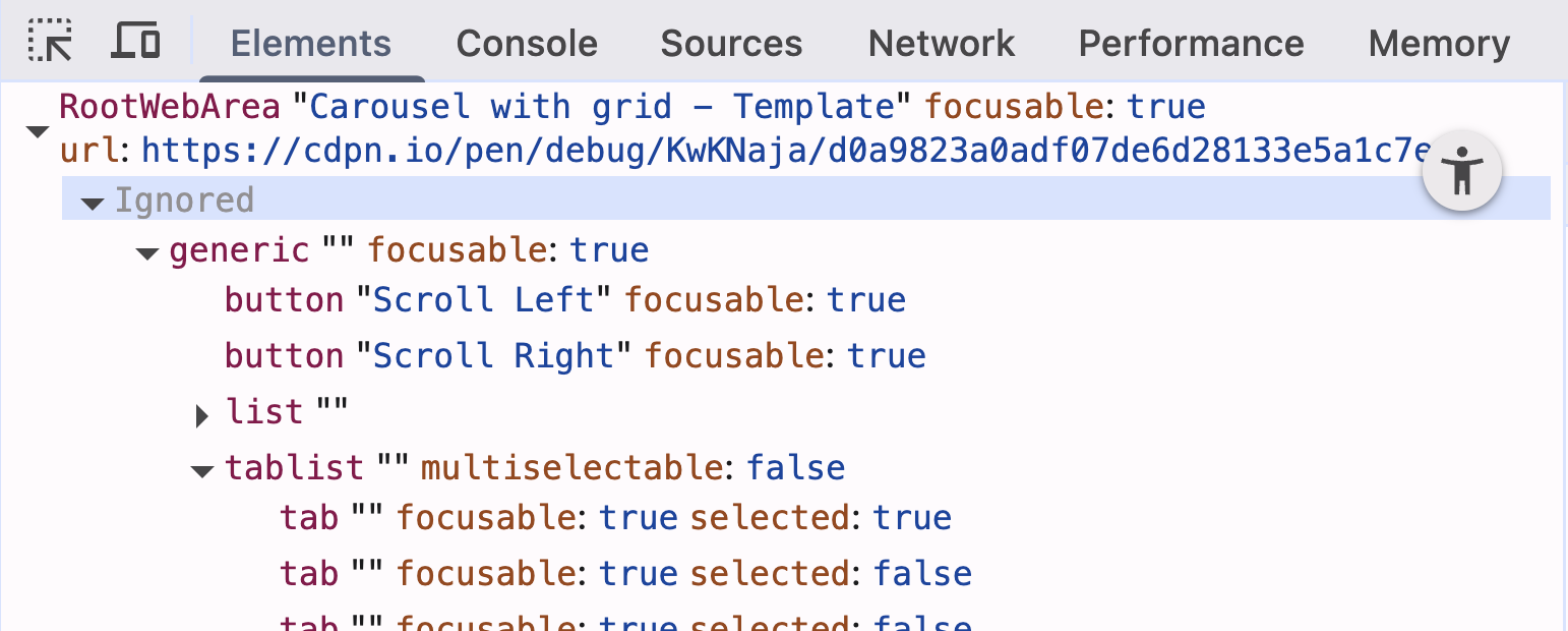
A carousel is a scroll area with up to two added UI affordances—buttons and markers.
In version one of CSS carousel features, the buttons and markers are created from CSS. The browser places the elements as siblings, with the proper roles, in the proper tab order, and maintains their state. This makes developing an accessible carousel easier.
Scroll Buttons
Browser provided, stateful, and interactive scroll affordance<button>elements that aids in content access and scroll 85% of a scroll area when pressed.Scroll Markers
Browser provided, stateful navigation<a>elements that aid in content access for any requested item in the scroll area.
The rest of this post demonstrates how to build up a carousel using these new features.
Start with a scroller
You can add buttons and markers to any scroll area on your site.
The following CSS creates a basic scroll area for use in later steps to add buttons and markers to. Scroll snapping is not required for a carousel, but in this example it is used. Carousels also work for vertical scrollers and bidirectional scrollers.
.carousel {
  overflow-x: auto;
  scroll-snap-type: x mandatory;

  > li {
    scroll-snap-align: center;
  }
}
Add scroll buttons with ::scroll-button()
Depending on your operating system, there may already be scroll buttons around your scrollbars. Built in scrollbar buttons tend to nudge a scroll area, while CSS scroll buttons page 85% of the scroll area.
' d='M96 183a64 64 0 0 1-23-23L17 64a128 128 0 0 0 111 192l55-96a64 64 0 0 1-87 23Z'/%3E%3Cpath fill='url(%23b)' d='M192 128a64 64 0 0 1-9 32l-55 96A128 128 0 0 0 239 64H128a64 64 0 0 1 64 64Z'/%3E%3Ccircle cx='128' cy='128' r='52' fill='%231a73e8'/%3E%3Cpath fill='url(%23c)' d='M96 73a64 64 0 0 1 32-9h111a128 128 0 0 0-222 0l56 96a64 64 0 0 1 23-87Z'/%3E%3C/svg%3E)
' xlink:href='%23A'%3E%3Cstop offset='.76' stop-opacity='0'/%3E%3Cstop offset='.95' stop-opacity='.5'/%3E%3Cstop offset='1'/%3E%3C/radialGradient%3E%3CradialGradient id='F' cx='2523' cy='4680' r='20243' gradientTransform='matrix(-.03715 .99931 -2.12836 -.07913 13579 3530)' xlink:href='%23A'%3E%3Cstop offset='0' stop-color='%2335c1f1'/%3E%3Cstop offset='.11' stop-color='%2334c1ed'/%3E%3Cstop offset='.23' stop-color='%232fc2df'/%3E%3Cstop offset='.31' stop-color='%232bc3d2'/%3E%3Cstop offset='.67' stop-color='%2336c752'/%3E%3C/radialGradient%3E%3CradialGradient id='G' cx='24247' cy='7758' r='9734' gradientTransform='matrix(.28109 .95968 -.78353 .22949 24510 -16292)' xlink:href='%23A'%3E%3Cstop offset='0' stop-color='%2366eb6e'/%3E%3Cstop offset='1' stop-color='%2366eb6e' stop-opacity='0'/%3E%3C/radialGradient%3E%3Cpath id='H' d='M24105 20053a9345 9345 0 01-1053 472 10202 10202 0 01-3590 646c-4732 0-8855-3255-8855-7432 0-1175 680-2193 1643-2729-4280 180-5380 4640-5380 7253 0 7387 6810 8137 8276 8137 791 0 1984-230 2704-456l130-44a12834 12834 0 006660-5282c220-350-168-757-535-565z'/%3E%3Cpath id='I' d='M11571 25141a7913 7913 0 01-2273-2137 8145 8145 0 01-1514-4740 8093 8093 0 013093-6395 8082 8082 0 011373-859c312-148 846-414 1554-404a3236 3236 0 012569 1297 3184 3184 0 01636 1866c0-21 2446-7960-8005-7960-4390 0-8004 4166-8004 7820 0 2319 538 4170 1212 5604a12833 12833 0 007684 6757 12795 12795 0 003908 610c1414 0 2774-233 4045-656a7575 7575 0 01-6278-803z'/%3E%3Cpath id='J' d='M16231 15886c-80 105-330 250-330 566 0 260 170 512 472 723 1438 1003 4149 868 4156 868a5954 5954 0 003027-839 6147 6147 0 001133-850 6180 6180 0 001910-4437c26-2242-796-3732-1133-4392-2120-4141-6694-6525-11668-6525-7011 0-12703 5635-12798 12620 47-3654 3679-6605 7996-6605 350 0 2346 34 4200 1007 1634 858 2490 1894 3086 2921 618 1067 728 2415 728 2952s-271 1333-780 1990z'/%3E%3Cuse fill='url(%23B)' xlink:href='%23H'/%3E%3Cuse fill='url(%23D)' opacity='.35' xlink:href='%23H'/%3E%3Cuse fill='url(%23C)' xlink:href='%23I'/%3E%3Cuse fill='url(%23E)' opacity='.4' xlink:href='%23I'/%3E%3Cuse fill='url(%23F)' xlink:href='%23J'/%3E%3Cuse fill='url(%23G)' xlink:href='%23J'/%3E%3C/svg%3E)
' gradientUnits='userSpaceOnUse'%3E%3Cstop offset='.2' stop-color='%239059ff' stop-opacity='0'/%3E%3Cstop offset='.3' stop-color='%238c4ff3' stop-opacity='.1'/%3E%3Cstop offset='.8' stop-color='%237716a8' stop-opacity='.5'/%3E%3Cstop offset='1' stop-color='%236e008b' stop-opacity='.6'/%3E%3C/radialGradient%3E%3CradialGradient id='ff-g' cx='239.1' cy='34.6' r='171.6' gradientUnits='userSpaceOnUse'%3E%3Cstop offset='0' stop-color='%23ffe226'/%3E%3Cstop offset='.1' stop-color='%23ffdb27'/%3E%3Cstop offset='.3' stop-color='%23ffc82a'/%3E%3Cstop offset='.5' stop-color='%23ffa930'/%3E%3Cstop offset='.7' stop-color='%23ff7e37'/%3E%3Cstop offset='.8' stop-color='%23ff7139'/%3E%3C/radialGradient%3E%3CradialGradient id='ff-h' cx='374' cy='-74.3' r='732.2' gradientUnits='userSpaceOnUse'%3E%3Cstop offset='.1' stop-color='%23fff44f'/%3E%3Cstop offset='.5' stop-color='%23ff980e'/%3E%3Cstop offset='.6' stop-color='%23ff5634'/%3E%3Cstop offset='.7' stop-color='%23ff3647'/%3E%3Cstop offset='.9' stop-color='%23e31587'/%3E%3C/radialGradient%3E%3CradialGradient id='ff-i' cx='304.6' cy='7.1' r='536.4' gradientTransform='rotate(84 303 4)' gradientUnits='userSpaceOnUse'%3E%3Cstop offset='0' stop-color='%23fff44f'/%3E%3Cstop offset='.1' stop-color='%23ffe847'/%3E%3Cstop offset='.2' stop-color='%23ffc830'/%3E%3Cstop offset='.3' stop-color='%23ff980e'/%3E%3Cstop offset='.4' stop-color='%23ff8b16'/%3E%3Cstop offset='.5' stop-color='%23ff672a'/%3E%3Cstop offset='.6' stop-color='%23ff3647'/%3E%3Cstop offset='.7' stop-color='%23e31587'/%3E%3C/radialGradient%3E%3CradialGradient id='ff-j' cx='235' cy='98.1' r='457.1' gradientUnits='userSpaceOnUse'%3E%3Cstop offset='.1' stop-color='%23fff44f'/%3E%3Cstop offset='.5' stop-color='%23ff980e'/%3E%3Cstop offset='.6' stop-color='%23ff5634'/%3E%3Cstop offset='.7' stop-color='%23ff3647'/%3E%3Cstop offset='.9' stop-color='%23e31587'/%3E%3C/radialGradient%3E%3CradialGradient id='ff-k' cx='355.7' cy='124.9' r='500.3' gradientUnits='userSpaceOnUse'%3E%3Cstop offset='.1' stop-color='%23fff44f'/%3E%3Cstop offset='.2' stop-color='%23ffe141'/%3E%3Cstop offset='.5' stop-color='%23ffaf1e'/%3E%3Cstop offset='.6' stop-color='%23ff980e'/%3E%3C/radialGradient%3E%3ClinearGradient id='ff-a' x1='446.9' y1='76.8' x2='47.9' y2='461.8' gradientUnits='userSpaceOnUse'%3E%3Cstop offset='.1' stop-color='%23fff44f'/%3E%3Cstop offset='.1' stop-color='%23ffe847'/%3E%3Cstop offset='.2' stop-color='%23ffc830'/%3E%3Cstop offset='.4' stop-color='%23ff980e'/%3E%3Cstop offset='.4' stop-color='%23ff8b16'/%3E%3Cstop offset='.5' stop-color='%23ff672a'/%3E%3Cstop offset='.5' stop-color='%23ff3647'/%3E%3Cstop offset='.7' stop-color='%23e31587'/%3E%3C/linearGradient%3E%3ClinearGradient id='ff-l' x1='442.1' y1='74.8' x2='102.6' y2='414.3' gradientUnits='userSpaceOnUse'%3E%3Cstop offset='.2' stop-color='%23fff44f' stop-opacity='.8'/%3E%3Cstop offset='.3' stop-color='%23fff44f' stop-opacity='.6'/%3E%3Cstop offset='.5' stop-color='%23fff44f' stop-opacity='.2'/%3E%3Cstop offset='.6' stop-color='%23fff44f' stop-opacity='0'/%3E%3C/linearGradient%3E%3C/defs%3E%3Cpath d='M479 166c-11-25-32-52-49-60a249 249 0 0 1 25 73c-27-68-73-95-111-155a255 255 0 0 1-8-14 44 44 0 0 1-4-9 1 1 0 0 0 0-1 1 1 0 0 0-1 0c-60 35-81 101-83 134a120 120 0 0 0-66 25 71 71 0 0 0-6-5 111 111 0 0 1-1-58c-25 11-44 29-58 44-9-12-9-52-8-60l-8 4a175 175 0 0 0-24 21 210 210 0 0 0-22 26 203 203 0 0 0-32 73l-1 2-2 15a229 229 0 0 0-4 34v1a240 240 0 0 0 477 40l1-9c5-41 0-84-15-121zM202 355l3 1-3-1zm55-145zm198-31z' fill='url(%23ff-a)'/%3E%3Cpath d='M479 166c-11-25-32-52-49-60 14 26 22 53 25 72v1a207 207 0 0 1-206 279c-113-3-212-87-231-197-3-17 0-26 2-40-2 11-3 14-4 34v1a240 240 0 0 0 477 40l1-9c5-41 0-84-15-121z' fill='url(%23ff-b)'/%3E%3Cpath d='M479 166c-11-25-32-52-49-60 14 26 22 53 25 72v1a207 207 0 0 1-206 279c-113-3-212-87-231-197-3-17 0-26 2-40-2 11-3 14-4 34v1a240 240 0 0 0 477 40l1-9c5-41 0-84-15-121z' fill='url(%23ff-c)'/%3E%3Cpath d='m362 195 1 1a130 130 0 0 0-22-29C266 92 322 5 331 0c-60 35-81 101-83 134l9-1c45 0 84 25 105 62z' fill='url(%23ff-d)'/%3E%3Cpath d='M257 210c-1 6-22 26-29 26-68 0-80 41-80 41 3 35 28 64 57 79l4 2 7 3a107 107 0 0 0 31 6c120 6 143-143 57-186 22-4 45 5 58 14-21-37-60-62-105-62l-9 1a120 120 0 0 0-66 25l17 16c16 16 58 33 58 35z' fill='url(%23ff-e)'/%3E%3Cpath d='M257 210c-1 6-22 26-29 26-68 0-80 41-80 41 3 35 28 64 57 79l4 2 7 3a107 107 0 0 0 31 6c120 6 143-143 57-186 22-4 45 5 58 14-21-37-60-62-105-62l-9 1a120 120 0 0 0-66 25l17 16c16 16 58 33 58 35z' fill='url(%23ff-f)'/%3E%3Cpath d='m171 151 5 3a111 111 0 0 1-1-58c-25 11-44 29-58 44 1 0 36 0 54 11z' fill='url(%23ff-g)'/%3E%3Cpath d='M18 261a242 242 0 0 0 231 197 207 207 0 0 0 206-279c8 56-20 110-64 146-86 71-169 43-186 31l-3-1c-50-24-71-70-67-110-42 0-57-35-57-35s38-28 89-4c46 22 90 4 90 4 0-2-42-19-58-35l-17-16a71 71 0 0 0-6-5l-5-3c-18-11-52-11-54-11-9-12-9-51-8-60l-8 4a175 175 0 0 0-24 21 210 210 0 0 0-22 26 203 203 0 0 0-32 73c0 1-9 38-5 57z' fill='url(%23ff-h)'/%3E%3Cpath d='M341 167a130 130 0 0 1 22 29 46 46 0 0 1 4 3c55 50 26 121 24 126 44-36 72-90 64-146-27-68-73-95-111-155a255 255 0 0 1-8-14 44 44 0 0 1-4-9 1 1 0 0 0 0-1 1 1 0 0 0-1 0c-9 5-65 92 10 167z' fill='url(%23ff-i)'/%3E%3Cpath d='M367 199a46 46 0 0 0-4-3l-1-1c-13-9-36-18-58-15 86 44 63 193-57 187a107 107 0 0 1-31-6 131 131 0 0 1-11-5c17 12 99 39 186-31 2-5 31-76-24-126z' fill='url(%23ff-j)'/%3E%3Cpath d='M148 277s12-41 80-41c7 0 28-20 29-26s-44 18-90-4c-51-24-89 4-89 4s15 35 57 35c-4 40 16 85 67 110l3 1c-29-15-54-44-57-79z' fill='url(%23ff-k)'/%3E%3Cpath d='M479 166c-11-25-32-52-49-60a249 249 0 0 1 25 73c-27-68-73-95-111-155a255 255 0 0 1-8-14 44 44 0 0 1-4-9 1 1 0 0 0 0-1 1 1 0 0 0-1 0c-60 35-81 101-83 134l9-1c45 0 84 25 105 62-13-9-36-18-58-14 86 43 63 192-57 186a107 107 0 0 1-31-6 131 131 0 0 1-11-5l-3-1 3 1c-29-15-54-44-57-79 0 0 12-41 80-41 7 0 28-20 29-26 0-2-42-19-58-35l-17-16a71 71 0 0 0-6-5 111 111 0 0 1-1-58c-25 11-44 29-58 44-9-12-9-52-8-60l-8 4a175 175 0 0 0-24 21 210 210 0 0 0-22 26 203 203 0 0 0-32 73l-1 2-2 15a279 279 0 0 0-4 34v1a240 240 0 0 0 477 40l1-9c5-41 0-84-15-121zm-24 13z' fill='url(%23ff-l)'/%3E%3C/svg%3E)
' xlink:href='%23s-b'%3E%3Cstop offset='0' stop-color='%2324a5f3' stop-opacity='0' /%3E%3Cstop offset='1' stop-color='%231e8ceb' /%3E%3C/radialGradient%3E%3CradialGradient id='s-j' cx='109.3' cy='13.8' r='93.1' gradientTransform='matrix(-.02 1.1 -1.04 -.02 137 -115)' xlink:href='%23s-b'%3E%3Cstop offset='0' stop-opacity='0' /%3E%3Cstop offset='1' stop-color='%235488d6' stop-opacity='0' /%3E%3Cstop offset='1' stop-color='%235d96eb' /%3E%3C/radialGradient%3E%3C/defs%3E%3Crect width='220' height='220' x='22' y='-107' fill='url(%23s-a)' ry='49' transform='matrix(.57 0 0 .57 187 256)' /%3E%3Cg transform='translate(194 190)'%3E%3Ccircle cx='67.8' cy='67.7' fill='url(%23s-c)' paint-order='stroke fill markers' r='54' /%3E%3Ccircle cx='-69.9' cy='69.3' fill='url(%23s-i)' transform='translate(138 -2)' r='54' /%3E%3C/g%3E%3Cellipse cx='120' cy='14.2' fill='url(%23s-j)' rx='93.1' ry='93.7' transform='matrix(.58 0 0 .58 192 250)' /%3E%3Cg transform='matrix(.58 0 0 .57 197 182)'%3E%3Cpath fill='%23cac7c8' d='M46 192h1l72-48-7-9-66 57Z' /%3E%3Cpath fill='%23fbfffc' d='M46 191v1l66-57-7-9-59 65Z' /%3E%3Cpath fill='url(%23s-d)' d='m119 144-7-9 66-57-59 66Z' /%3E%3Cpath fill='%23fb645c' d='m105 126 7 9 66-57-1-1-72 49Z' /%3E%3C/g%3E%3Cpath stroke='%23fff' stroke-linecap='round' stroke-miterlimit='1' stroke-width='1.3' d='m287 278 3-2m-12-17 8-2m-8-3h4m-4-13 8 2m-8 3h4m-1-13 7 3m-4-11 7 4m-2-11 6 6m0-12 6 7m1-11 4 6m4-10 3 7m5-9 2 7m15-7-1 7m10-5-3 7m11-4-4 7m11-2-5 6m16 7-7 4m10 4-7 3m10 6-8 1m8 16-8-2m5 10-7-3m4 11-7-4m2 11-6-5m0 11-5-6m-2 11-4-7m-4 11-3-8m-6 10-1-8m-16 8 2-8m-10 5 3-7m-11 4 4-7m-11 2 5-6m-8 3 3-3m4 8 2-3m5 8 2-4m6 7 1-4m8 5v-4m8 4v-4m9 3-1-4m9 1-2-4m9 0-2-4m9-2-3-3m8-4-3-2m8-5-4-2m7-6-4-1m5-8h-4m4-8h-4m3-9-4 1m1-9-4 2m-1-9-3 2m-2-9-3 3m-4-8-2 3m-5-8-2 4m-6-6-1 3m-8-5v4m-8-4v4m-9-2 1 3m-9 0 2 3m-9 1 2 3m-9 2 3 3m-8 4 3 2m-8 5 4 2m-7 6 4 1m-4 25 4-1m-2 5 7-3m-6 7 4-2m-2 6 7-4m-13-21h8m41-41v-8m0 99v-8m49-42h-8' transform='translate(-65 8)' /%3E%3C/svg%3E)
For carousels that only show one full width item at a time with scroll snap points, this will feel like an item by item amount. For long lists of items where more than one are in view at a time, it scrolls almost a full page.
To add scroll buttons with CSS:
- Add them like other pseudo-elements, with a selector:
.carousel::scroll-button(right)for a button to scroll right. - Specify
contentwith optional accessible fallback alt text.
The browser will create real buttons, with your content inside, as siblings to the scroller. You're now free to lay these buttons out, style them or anchor() them as you need. This following CSS creates two, one for a scroll left button and one for a scroll right button.
.carousel {
  …

  &::scroll-button(left) {
    content: "⬅" / "Scroll Left";
  }

  &::scroll-button(right) {
    content: "⮕" / "Scroll Right";
  }

  &::scroll-button(*):focus-visible {
    outline-offset: 5px;
  }
}
Add scroll markers with ::scroll-marker()
Similar to the scrollbar thumb element, CSS scroll markers can hint to the size of the carousel while also providing the affordance to move quickly to the end or beginning. A CSS scroll marker is different from the scrollbar because each marker is a link that can represent any item in the scroller.
An example of this distinction, consider the seasons of a TV series. Instead of making a marker for each of the 10 episodes, create 2 markers that go to the beginning of the chapter.
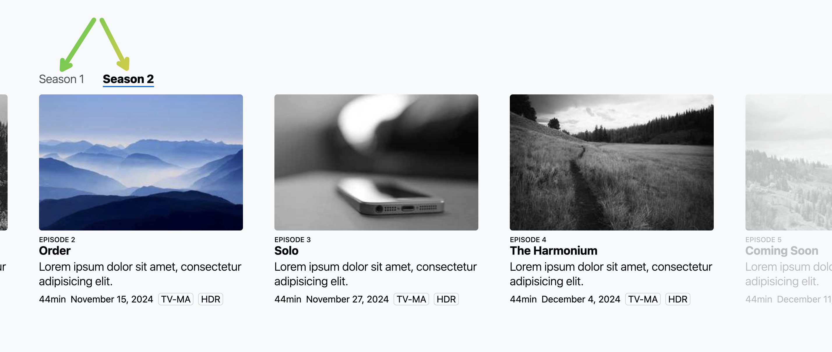
Notice these markers aren't dots, they're using the content: "Season 1" property of their pseudo-element. Markers can also be thumbnails, commonly used for gallery carousels in e-commerce or photo focused websites.
Markers are like in-page <a> links, but do have some special features:
- They include a
:target-currentstate for when the marker is in view or snapped. - Keyboard navigation is included, and behaves like a focusgroup.
- Screen reader experience is included, and reports like a tablist.
Add markers to meaningful points of interest in your scroller with the following steps:
- Define placement of the
scroll-marker-groupasbeforeorafter. - Select the points of interest with a selector
.carousel .point-of-interest::scroll-marker. - Specify
contentwith optional accessible fallback alt text; numbers, text, empty, or an image.
The browser creates all the markers and puts them into the marker group container. This example makes an empty marker for each <li>, to create a marker dot for each item.
.carousel {
  …

  scroll-marker-group: after;

  > li::scroll-marker {
    content: ' ';
  }

  > li::scroll-marker:target-current {
    background: var(--accent);
  }
}
The containing element of the markers is called a ::scroll-marker-group and it is created as a sibling of the scroller, just like the scroll buttons. This container can be styled and placed wherever you need.
Markers and buttons at the same time
Put the two together and experience looks like a carousel but have the following benefits:
- Works with JavaScript disabled.
- No hydration or lazy sizing (reduce CLS).
- Ready for all kinds of scroll animation and triggers.
- Accessibility is included.
- Touch, mouse, and keyboard friendly.
Do less, reach more, faster.
Resources
This post mostly refers to these features as "carousel," but their capabilities and usefulness extend far beyond carousel use cases. For a full picture of the potential of these new features, try the Carousel Gallery and see other components like: scrollspy, tabs, and slides.
- Web Standards
- Chrome
Carousel Configurator
For visual and interactive learners, try the Carousel Configurator.
It offers switches, for say scroll buttons, and when enabled the shown carousel immediately has buttons appear plus the associated CSS used.
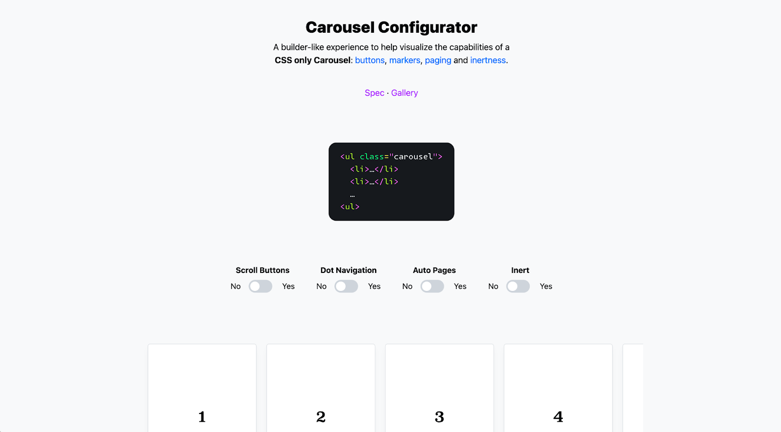
It also includes examples of more advanced concepts that are carousel adjacent:
Carousel Gallery
A showcase space for those curious about how far you can take these features, answering questions like "can it do X?". Each demo is based on a use case found around the internet. Each demo shows how to orchestrate these buttons and markers with scroll driven animation, scroll-state() queries, and much more.
Fun fact, the entire site is JavaScriptless.
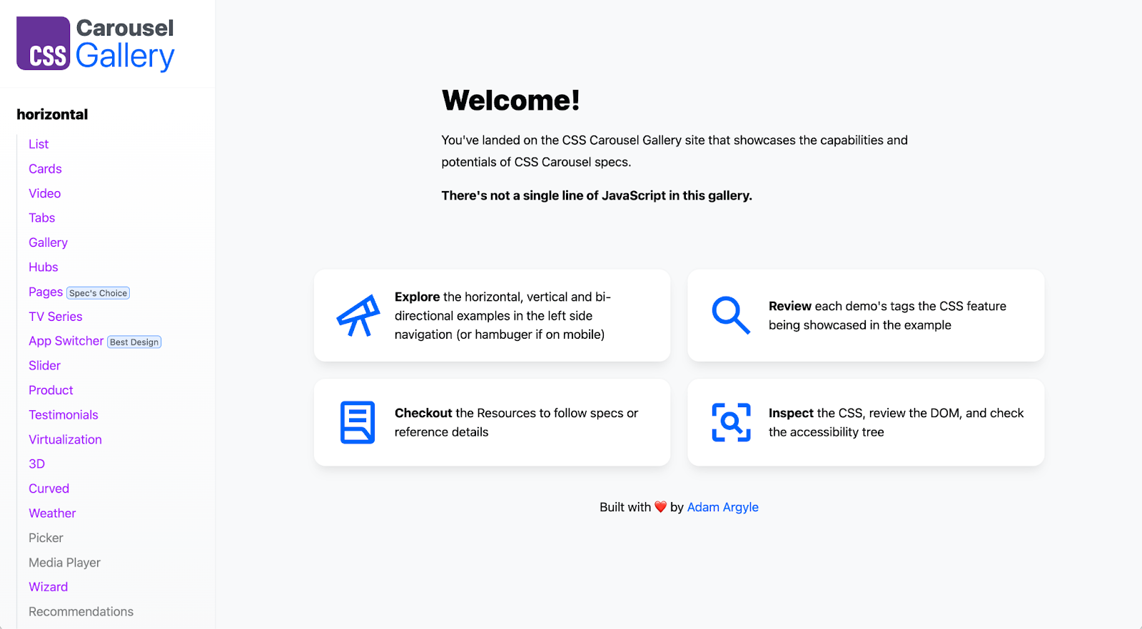
The examples range from delightfully simple to fantastically robust and feature rich. Browsing the gallery should be inspirational, reassuring, and of course be inspectable for code to take. Find and inspect @layer utilities for utilities that can help you make carousels.
Further work
We're proud of how well these features integrate with all of HTML and CSS. The accessibility of a CSS carousel is top-notch. The performance of a CSS carousel is better than any JavaScript solution. The user experience of a CSS carousel is natural, smooth and rich. However, there are ways to improve.
Bring your own elements
Work is already being done to let you add your own components for scroll buttons and markers. This means you could supply your own <a> tags that have rich content like icons. You could also bring your own multi-layered buttons built with Tailwind.
Cyclical scrolling
Many carousels wrap around on themselves when they get to the end, like a carousel ride at a fair may have. This is on our radar and we intend to provide a platform solution for it.
We hope you enjoy this feature. We look forward to all the "JavaScript disabled" web users who will get a nice scrollable experience now and all the CLS reductions to be gained from the better timed lifecycle of a built-in carousel.
Less for you to do, great user experiences, better performance.