


Published: June 11, 2025
Say goodbye to border and pseudo-element hacks, and hello to CSS gap decorations.
The Microsoft Edge team is excited to announce that CSS gap decorations, a new way to style the gaps between items in flex, grid, and multi-column layouts, is now available for developer trial in Chrome and Edge 139!
Try it out and share your feedback to help shape the future of this API.
Useful links
Problem
Styling gaps in UI components like calendars, cards, or data grids can greatly improve readability and add to the overall aesthetic. However, achieving this effect in grid and flexbox layouts has traditionally required awkward workarounds with borders, pseudo-elements, or background tricks. These workarounds can be problematic for a number of reasons.
- Unintuitive: They introduce structural dependencies for visual styling, which goes against the principles of semantic HTML.
- Accessibility-unfriendly: They often require extra DOM elements, which could interfere with assistive technologies, like screen readers.
- Difficult to maintain: They require complicated layout logic and make consistent styling across components more difficult.
- Bad for performance: These workarounds may add unnecessary elements to the DOM which can lead to performance issues.
While the web platform already supports styling gaps with the column-rule
property, this is currently limited to
multi-column
layouts only. Web developers have long requested a consistent way to style gaps
across other relevant layout types, like grid and flexbox.
The solution: CSS gap decorations
Gap decorations extend the column-rule property to work with other layout
types like grid and flexbox, and introduce a new row-rule property to
complement it. This brings consistency and new customizability to how gaps are
styled across different layout types.
CSS gap decorations bring the following benefits:
- No layout impact: The decorations are purely visual. They don't affect layout or spacing, so you can adopt them without fear of breaking existing designs.
- Repeat syntax: Similar to CSS Grid, you can use the
repeat()syntax to create patterns of decorations in different parts of a container, allowing for rich consistent designs with minimal CSS. - Cleaner markup: There's no need for extra elements or pseudo-elements—just style gaps directly.
- Customizability: New CSS properties like
*rule-break,*rule-outset, andgap-rule-paint-orderallow for more customization options beyond the traditional rule styling of width, style, and color.
With CSS gap decorations, it's easier than ever to create visually distinct, and maintainable page layouts.
Gap decorations in action
To play with CSS gap decorations today, use a browser that supports them: Edge
or Chrome, starting with version 139, and toggle the
Enable Experimental Web Platform Features flag by going to
edge://flags or chrome://flags.
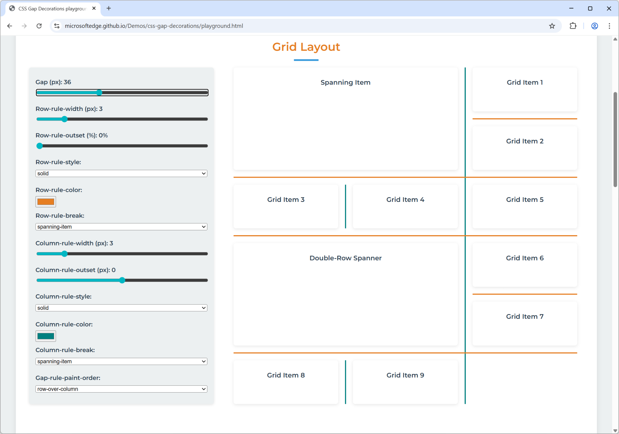
Interactive developer playground
To try the different type of layouts where CSS gap decorations are supported, and with all the new properties, give our interactive developer playground a try.
Burger menu
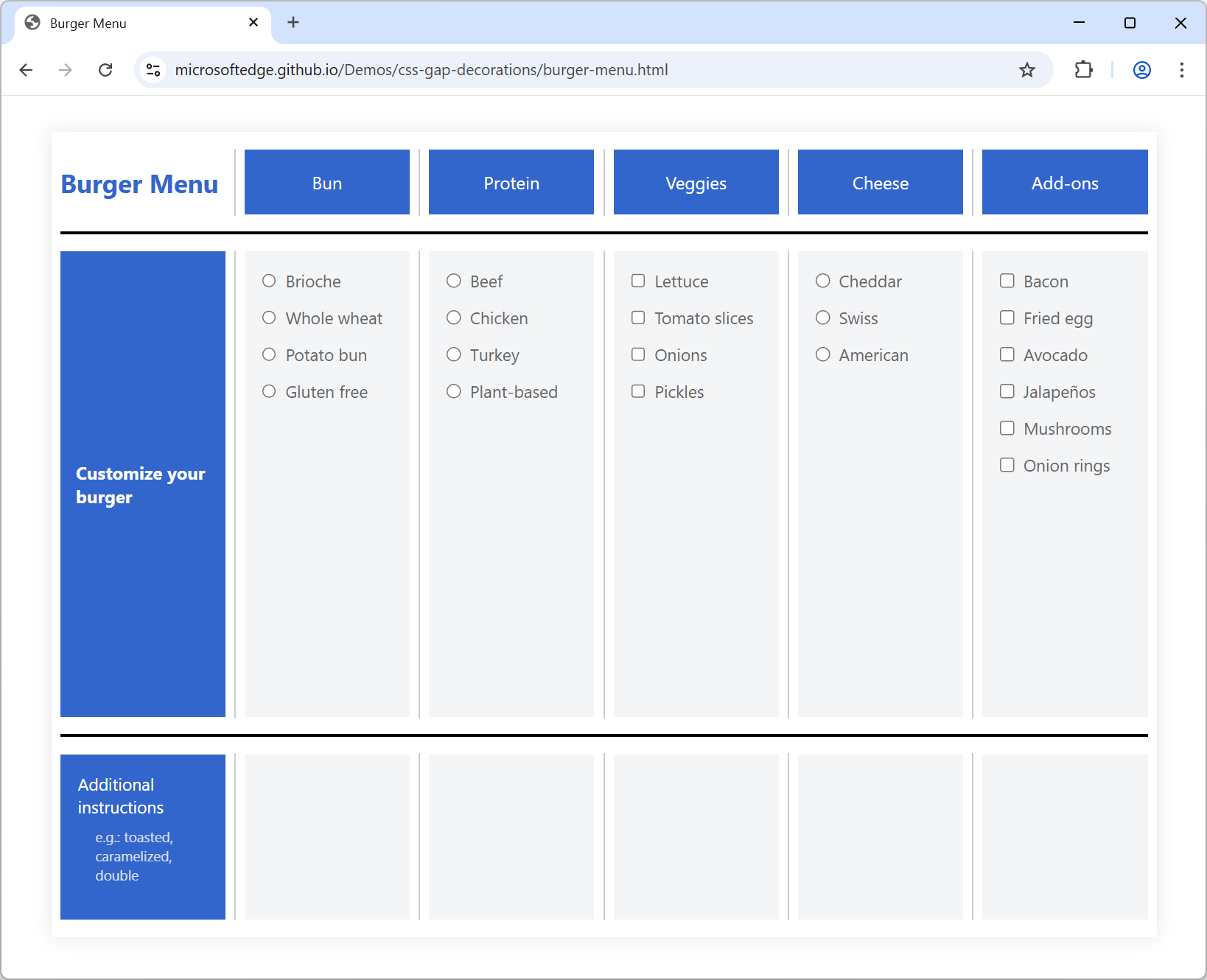
The burger menu
demo
shows how to use the column-rule-break: intersection property to break column
gap decorations at each visible intersection with row gaps.
The demo also uses column-rule-offset: -15px to adjust the length of the
decorations, pulling them away from the edges of each intersection.
Notebook
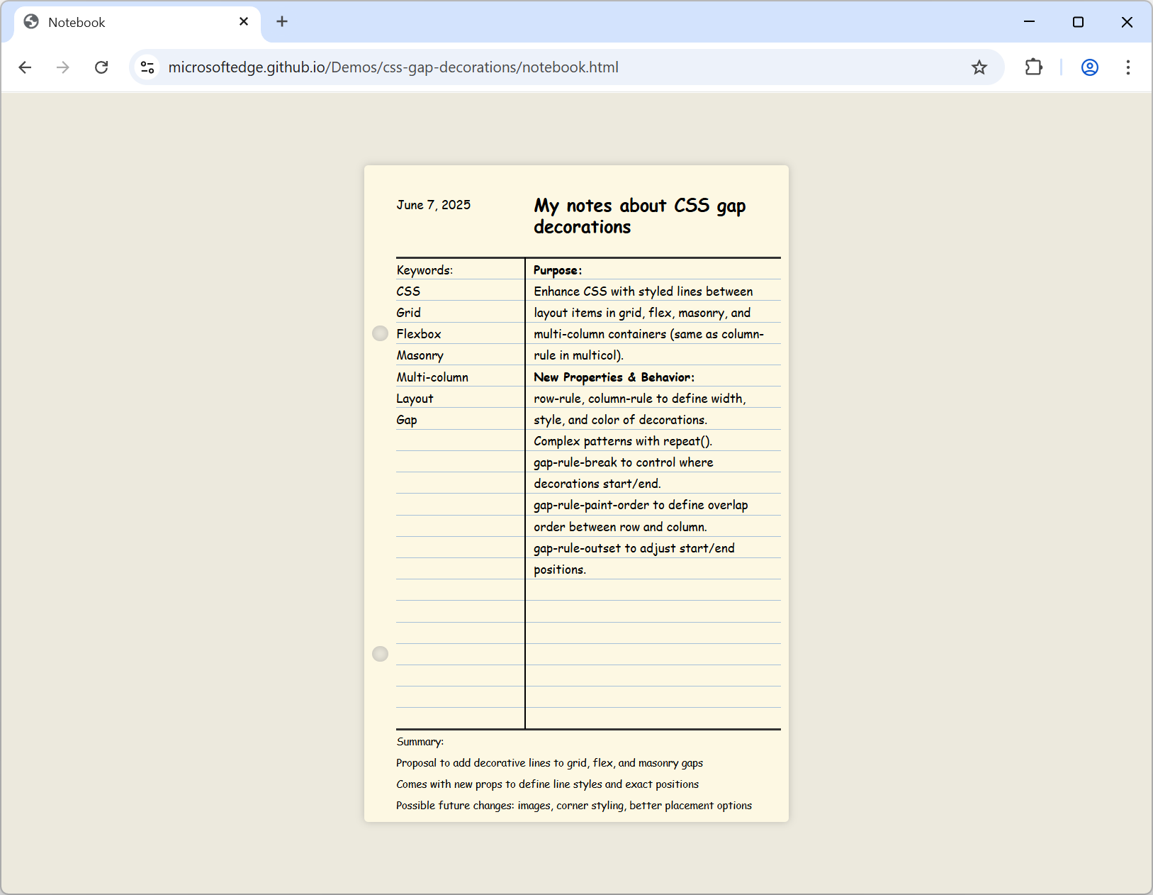
In the notebook
demo,
row-rule-break: none ensures that row decorations are not interrupted at
intersections—they run continuously from the left to the right of the container.
On the other hand, column-rule-break: spanning-item ensures that column
decorations are not painted behind spanning items—they start and stop at
spanning items forming a visible T intersection.
The row-rule property uses the repeat() function to have precise control
over how gap decorations are applied across different sections of the layout.
This enables a styling pattern where row rules are hidden in the header and
footer, thicker around the main content, and more subtle elsewhere.
Daily CSS news
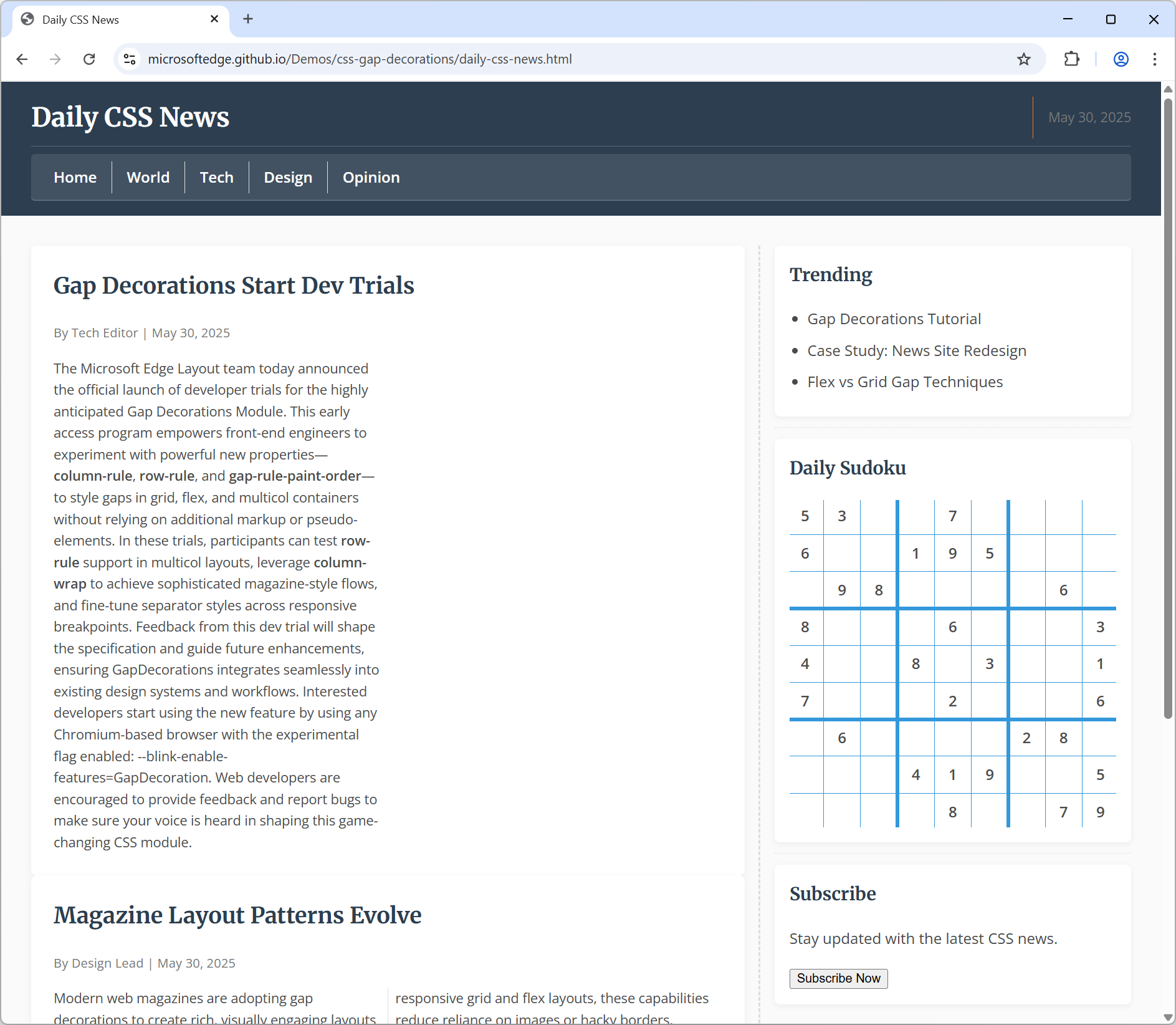
The Daily CSS News demo uses a magazine-style layout and defines CSS gap decorations across multiple grid and flexbox containers.
Notice the Sudoku game on the right, which uses a 9x9 grid and the repeat pattern to draw the thin and thick lines between rows and columns:
.sudoku {
  display: grid;
  grid-template-columns: repeat(9, 1fr);
  grid-template-rows: repeat(9, 1fr);
  gap: 6px;
  column-rule-width: repeat(2, 1px) 4px repeat(2, 1px) 4px repeat(2, 1px);
  column-rule-style: solid;
  column-rule-color: var(--secondary);
  row-rule-width: repeat(2, 1px) 4px repeat(2, 1px) 4px repeat(2, 1px);
  row-rule-style: solid;
  row-rule-color: var(--secondary);
}
Call for feedback
We're excited for you to try CSS gap decorations. We think it solves a common problem and we would love to hear your feedback about it so we can refine the feature to match your needs.
The CSS gap decorations feature is still being implemented in Chromium. If you do test it, be aware that we're still actively working on it and that you may encounter cases where it doesn't behave as expected. Some of the current limitations involve animating gap decorations and using a very large number of grid tracks.
If you find a bug, or have any thoughts about the feature, share your feedback by opening a new Chromium bug.