

Published: February 19, 2026
One of the CSS features Chrome shipped in 2025 was
corner-shape.
This lets you define the shape of a corner that has a border-radius using
keywords like bevel and scoop. You can also use a superellipse function
that receives a value between -Infinity and Infinity.
See Amit Sheen's extensive article at Frontend Masters for a great overview of the feature and how it works.
When implementing this feature during early 2025, I encountered a few interesting challenges of varying complexity. I learned a lot about superellipses, border painting in Blink, and using vector math for 2D graphics.
This document shares some of the things I learned, which might also be interesting to others.
Symmetry of convex and concave shapes
While superellipse (k) values traditionally go between 0 and Infinity, where
values between 0 and 1 are concave and the rest are convex (1 being bevel),
superellipse values in the CSS specification go between -Infinity and Infinity, and
represent 2k. This creates a symmetry as any positive value looks like
the mirror image of its negative counterpart.
However, by default, the superellipse formula doesn't work like that.
The superellipse formula is: xk + yk = 1. The inverse formula, x1/k + y1/k = 1, does not produce a visually symmetrical curve.
For example, with a k of 2:
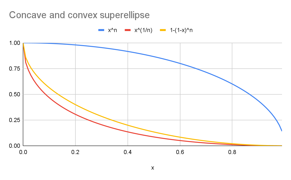
- The blue curve represents a round
superellipse(y=xn). - The red curve represents a
scoopsuperellipsewith the canonical formula (y=x1/n). - The yellow curve represents a curve that's visually symmetrical to the blue
curve (
y=1-(1-x)n).
As the chart shows, the shapes are not the same!
I won't dive deeper into the math of it, but it has to do with dual norms and how we perceive curvature.
In terms of the specification and implementation, we are representing something
visual here, so we use the symmetrical equivalents when computing concave
shapes. The rest of the math is done on convex shapes (k>=1, or positive
superellipse values).
Closed form formula
The next challenge is representing the curve, or the perimeter of the
superellipse, in closed form, a formula made of simple arithmetic operations.
This is essential for performance, which lets the system hand over the superellipse rendering to the graphics engine.
Graphics engines such as Skia are familiar with Bezier curves, so representing a superellipse with a small number of Bezier curves that
approximate its perimeter makes rendering a superellipse curve more performant.
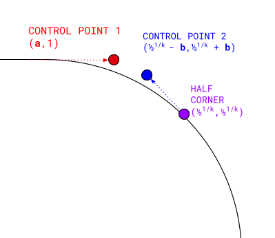
Fortunately, using symbolic regression, we can find a formula that represents half a convex corner as a single cubic Bezier curve.
A cubic Bezier curve has four points:
- The first point is (
0, 1). - The last point is the actual superellipse half-corner:
0.51/k,0.51/k. - The first control point stretches in at the same level of the starting
point: (
a, 1). - The second control point is diagonal the half-corner:
(0.51/k - b,0.51/k + b).
The half-corner value used here happens to be a very important coordinate that we're going to use for other computations down the line.
Where a and b are computed from k using symbolic regression.
Computing these four points and rendering a cubic Bezier curve between them provides a closed form convex half corner with a given k. We can then rotate the results to fill the rest of the corner, apply to other corners, and flip them to
render the concave equivalents.
Without going further into the mathematical weeds, the formula to compute a
and b is this:
p0 = 1.2430920942724248
p1 = 2.010479023614843
p2 = 0.32922901179443753
p3 = 0.2823023142212073
p4 = 1.3473704261055421
p5 = 2.9149468637949814
p6 = 0.9106507102917086

s = log2(k)
slope = p0 + (p6 - p0) * 0.5 * (1 + tanh(p5 * (s - p1)))
base = 1 / (1 + exp(slope * p1))
logistic = 1 / (1 + exp(slope * (p1 - s)))

a = (logistic - base) / (1 - base)
b =  p2 * exp(-p[3] * (s ^ p4))
Borders and shadows
In addition to computing the path of the corner's perimeter, the system also computes how it looks when offset inwards (a border or an inset box-shadow) or
outwards (an outline or a normal box-shadow). In conventional graphics libraries this is done by stroking.
However, borders and shadows in CSS have rendering characteristics that differ from stroking:
- Borders are non-uniform.
- For example, the top border can be 10 pixels and the right border 5 pixels, with the corner interpolating between them.
- Additionally, they go inwards rather than to both sides.
- Shadows and outlines don't render exactly like a stroke.
- Instead, they adjust so that corners appear sharp.
While the usual border and shadow rendering path worked well for corner-shape values that are round or more convex than that (for example,
squircle), and it can be rotated by 90 degrees for shapes more concave than a
scoop, this default doesn't work for corner-shape values between -1 and 1,
as offsetting the border or shadow parallel to the edge produces a corner that
appears to have uneven width.
For example, taking a bevel corner and offsetting the border by some pixels to
both sides creates a "belly" effect, where the middle of the corner looks wider
than the sides.
To account for that, the goal is to create an effect that works like a stroke—find
the normal of the corner curve at the start, and make it as long as the width of
the border or shadow-spread.
Luckily, this is only necessary for sub-ellipses (between bevel and round), as hyper-ellipses like squircle work as expected.
To find the normal of a sub-ellipse curve, it is sufficient to find the normal of its quadratic curve counterpart, as sub-ellipses and their quadratic curve equivalents are close to each other.
By using the same half-corner computed before, you can find a quadratic curve that has the same middle point, derive its quadratic control point, and from there computing the normal is straightforward.
The normal continues with the same length as the border-width or shadow-spread, and then clips the resulting curve with the edges (inner edge for border, outer edge for shadow) to create a continuous path.
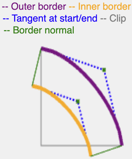
More mathematically accurate ways exist to compute a tangent for a superellipse, but this method is efficient and produces adequate results for rendering borders and shadows.
Color joins
An interesting bit of painting that happens in browsers happens to be unspecified in CSS. It renders borders that have non-uniform colors or styles. For example, where your element has a green solid top border and a yellow dotted right border. In these cases, the miter is an incision line that goes between the relevant corner of the border edge and the relevant corner of the padding edge. It creates the boundary between the adjacent edges.While not specified, the rendering is somewhat consistent between browsers.
The way this is implemented in Blink (and in other browsers) is as follows. The edge that is about to be painted is crudely clipped like a polygon that crosses at the miter, computed in such a way that it would include the relevant edge but not any of the other edges. This avoids bleeding, painting one of the other edges with the incorrect style and color.
This polygon was so far relatively simple to compute, because with regular
rounded corners the corner areas can never overlap. However, this changes with
hypo-ellipses and specifically with concave superellipses (negative
superellipse values). Those can create pretty interesting shapes that make the
naive intersection polygons very prone to overlaps and "bleeding".
Consider the following CSS:
.weird {
  width: 200px;
  height: 200px;
  corner-shape: scoop round;
  border-radius: 80% 20% / 50% 50%;
  border-width: 10px;
  border-color: orange purple black blue;
  border-style: solid dotted;
}
We want to clip each edge (orange, purple-dotted, black, blue-dotted) separately, and then draw the path.
To achieve this without overlapping any of the three other corners, careful clipping is necessary.
For example, consider the orange (top) edge.
It is difficult to find an exact polygon that includes that entire edge and not bleed into the purple, yellow, or even black edges. Some other shapes are more challenging.
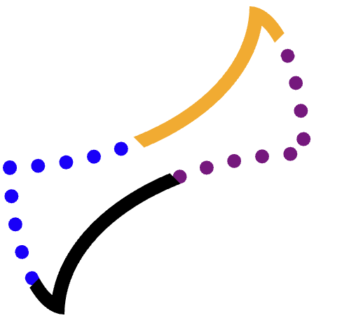
This process involves three clips.
The first clip includes the entire edge, with the full corner (without a miter). For example:

This consists of two corners (one scoop, one round), with minimal edge between them, connected at the ends.
Starting from this shape eliminates overlaps with the opposite edge, and now only the two miters remain a concern.
This is achieved by clipping out from this corner, a polygon that passes between the border-edge and padding-edge corners, and stops at the moment it is about to intersect with the edge:
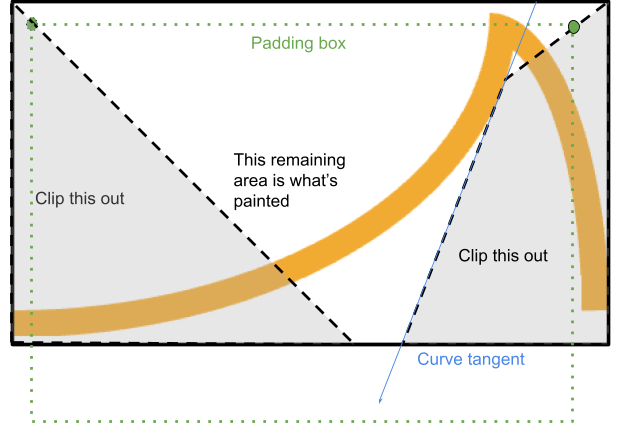
The system finds the point where a line from the border edge to the padding edge intersects with the curve's tangent from the relevant starting point (if the curve is concave).
If that point is inside the rendered area, the process stops there and continues along that tangent until it meets with the border box again, completing a quad.
Otherwise, a simple triangle can be clipped.
Summary
The web platform provides web designers and developers significant expressive power. Sometimes a CSS property that takes a single numeric value conceals significant complexity under the hood to make it render accurately and consistently.
The corner-shape feature held surprising complexity. This documentation aims to help future developers who work on this feature, in Blink, other browsers, or the specification.