

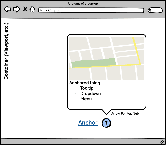
How do you currently tether one element to another? You might try tracking their positions, or use some form of wrapper element.
<!-- index.html -->
<div class="container">
  <a href="/link" class="anchor">I’m the anchor</a>
  <div class="anchored">I’m the anchored thing</div>
</div>
/* styles.css */
.container {
  position: relative;
}
.anchored {
  position: absolute;
}
These solutions often aren't ideal. They need JavaScript or introduce extra markup. The CSS anchor positioning API aims to solve this by providing a CSS API for tethering elements. It provides a means to position and size one element based on the position and size of other elements.
Browser support
You can try out the CSS anchor positioning API in Chrome Canary behind the "Experimental Web Platform Features" flag. To enable that flag, open Chrome Canary and visit chrome://flags. Then enable the "Experimental web platform features" flag.
There is also a polyfill in development by the team at Oddbird. Be sure to check the repo at github.com/oddbird/css-anchor-positioning.
You can check for anchoring support with:
@supports(anchor-name: --foo) {
  /* Styles... */
}
Note that this API is still in an experimental stage and could change. This article covers the important parts at a high level. The current implementation also isn't completely in sync with the CSS Working Group spec.
The problem
Why would you need to do this? A prominent use case would be creating tooltips or tooltip-like experiences. In that case, you often want to tether the tooltip to the content that it references. There is often a need for some way to tether an element to another. You also expect that interacting with the page doesn't break that tether—for example, if a user scrolls or resizes the UI.
Another part of the problem is if you want to make sure the tethered element remains in view—for example, if you open a tooltip and it becomes clipped by the viewport bounds. This might not be a great experience for users. You'd like the tooltip to adapt.
Current solutions
Currently, there are some different ways you could approach the issue.
First up is the rudimentary "Wrap the anchor" approach. You take both elements and wrap them in a container. Then you can use position to position the tooltip relative to the anchor.
<div class="containing-block">
  <div class="tooltip">Anchor me!</div>
  <a class="anchor">The anchor</a>
</div>
.containing-block {
  position: relative;
}

.tooltip {
  position: absolute;
  bottom: calc(100% + 10px);
  left: 50%;
  transform: translateX(-50%);
}
You can move the container and everything will stay where you want it for the most part.
Another approach might be if you know the position of your anchor or you can somehow track it. You could pass it to your tooltip with custom properties.
<div class="tooltip">Anchor me!</div>
<a class="anchor">The anchor</a>
:root {
  --anchor-width: 120px;
  --anchor-top: 40vh;
  --anchor-left: 20vmin;
}

.anchor {
  position: absolute;
  top: var(--anchor-top);
  left: var(--anchor-left);
  width: var(--anchor-width);
}

.tooltip {
  position: absolute;
  top: calc(var(--anchor-top));
  left: calc((var(--anchor-width) * 0.5) + var(--anchor-left));
  transform: translate(-50%, calc(-100% - 10px));
}
But, what if you don't know the position of your anchor? You likely need to intervene with JavaScript. You could do something like the following code does, but now this means your styles are starting to leak out of CSS and into JavaScript.
const setAnchorPosition = (anchored, anchor) => {
  const bounds = anchor.getBoundingClientRect().toJSON();
  for (const [key, value] of Object.entries(bounds)) {
    anchored.style.setProperty(`--${key}`, value);
  }
};

const update = () => {
  setAnchorPosition(
    document.querySelector('.tooltip'),
    document.querySelector('.anchor')
  );
};

window.addEventListener('resize', update);
document.addEventListener('DOMContentLoaded', update);
This starts to pose some questions:
- When do I calculate the styles?
- How do I calculate the styles?
- How often do I calculate the styles?
Does that solve it? It might for your use case, but there's one issue: our solution doesn't adapt. It isn't responsive. What if my anchored element gets cut off by the viewport?
Now you need to decide whether to react to this and how. The number of questions and decisions you need to make is starting to grow. All you want to do is anchor one element to another. And in an ideal world, your solution will adjust and react to its surroundings.
To ease some of that pain, you might reach for a JavaScript solution to help you out. That will incur the cost of adding a dependency to your project, and it could introduce performance issues depending on how you use them. For example, some packages use requestAnimationFrame to keep the position correct. This means you and your team need to get familiar with the package and its configuration options. As a result, your questions and decisions may not get reduced, but changed instead. This is part of the "why" for CSS anchor positioning. It will abstract you away from thinking about performance issues when calculating position.
Here's what the code could look like for using "floating-ui", a popular package for this problem:
import {computePosition, flip, offset, autoUpdate} from 'https://cdn.jsdelivr.net/npm/@floating-ui/dom@1.2.1/+esm';

const anchor = document.querySelector('.anchor')
const tooltip = document.querySelector('.tooltip')

const updatePosition = () => {
  computePosition(anchor, tooltip, {
    placement: 'top',
    middleware: [offset(10), flip()]
  })
    .then(({x, y}) => {
      Object.assign(tooltip.style, {
        left: `${x}px`,
        top: `${y}px`
      })
  })
};

const clean = autoUpdate(anchor, tooltip, updatePosition);
Try re-positioning the anchor in this demo that uses that code.
The "tooltip" might not behave how you expect. It reacts to going outside of the viewport on the y-axis but not the x-axis. Dig into the documentation, and you’ll likely find a solution that works for you.
But, finding a package that works for your project can take a lot of time. It's extra decisions and can be frustrating if it doesn't quite work how you want.
Using anchor positioning
Enter the CSS anchor positioning API. The idea is to keep your styles in your CSS and reduce the number of decisions you need to make. You're hoping to achieve the same result, but the goal is to make the developer experience better.
- No JavaScript required.
- Let the browser work out the best position from your guidance.
- No more third party dependencies
- No wrapper elements.
- Works with elements that are in the top layer.
Let's recreate and tackle the problem we were trying to solve above. But, instead, use the analogy of a boat with an anchor. These represent the anchored element and anchor. The water represents the containing block.
First, you need to choose how to define the anchor. You can do this within your CSS by setting the anchor-name property on the anchor element. It accepts a dashed-ident value.
.anchor {
  anchor-name: --my-anchor;
}
Alternatively, you will be able to define an anchor in your HTML with the anchor attribute. The attribute value is the ID of the anchor element. This creates an implicit anchor.
<a id="my-anchor" class="anchor"></a>
<div anchor="my-anchor" class="boat">I’m a boat!</div>
Once you've defined an anchor, you can use the anchor function. The anchor function takes 3 arguments:
- Anchor element: The
anchor-nameof the anchor to use—or, you can omit the value to use animplicitanchor. It can be defined via the HTML relationship, or with ananchor-defaultproperty with ananchor-namevalue. - Anchor side: A keyword of the position you want to use. This could be
top,right,bottom,left,center, etc. Or, you can pass a percentage. For example, 50% would be equal tocenter. - Fallback: This is an optional fallback value that accepts a length or percentage.
You use the anchor function as a value for the inset properties (top, right, bottom, left, or their logical equivalents) of the anchored element. You can also use the anchor function in calc:
.boat {
  bottom: anchor(--my-anchor top);
  left: calc(anchor(--my-anchor center) - (var(--boat-size) * 0.5));
}

 /* alternative with anchor-default */
.boat {
  anchor-default: --my-anchor;
  bottom: anchor(top);
  left: calc(anchor(center) - (var(--boat-size) * 0.5));
}
There is no center inset property so one option is to use calc if you know the size of your anchored element. Why not use translate? You could use this:
.boat {
  anchor-default: --my-anchor;
  bottom: anchor(top);
  left: anchor(center);
  translate: -50% 0;
}
But, the browser doesn't take into consideration transformed positions for anchored elements. It'll become clear why this is important when considering position fallbacks and auto positioning.
You may have noticed the use of the custom property --boat-size above. But, if you want to base the anchored element size on that of the anchor, you can also access that size. Instead of calculating it yourself, you can use the anchor-size function. For example, to make our boat four times the width of our anchor:
.boat {
  width: calc(4 * anchor-size(--my-anchor width));
}
You also have access to the height too with anchor-size(--my-anchor height). And you can use it to set the size of either axis or both.
What if you want to anchor to an element with absolute positioning? The rule is that the elements can't be siblings. In that case, you can wrap the anchor with a container that has relative positioning. Then you can anchor to it.
<div class="anchor-wrapper">
  <a id="my-anchor" class="anchor"></a>
</div>
<div class="boat">I’m a boat!</div>
Check out this demo where you can drag the anchor around and the boat will follow.
Tracking scroll position
In some cases, your anchor element might be within a scrolling container. At the same time, your anchored element might be outside that container. Because scrolling happens on a different thread from layout, you need a way to track it. The anchor-scroll property can do this. You set it on the anchored element and give it the value of the anchor you want to track.
.boat { anchor-scroll: --my-anchor; }
Try this demo where you can switch anchor-scroll on and off with the checkbox in the corner.
The analogy falls a little flat here though, as in an ideal world, your boat and anchor are both in the water. Also, features such as the Popover API promote being able to keep related elements close. Anchor positioning will work with elements that are in the top layer though. This is one of the major benefits behind the API: being able to tether elements in different flows.
Consider this demo that has a scrolling container with anchors that have tooltips. The tooltip elements that are popovers might not be co-located with the anchors:
But, you'll notice how the popovers track their respective anchor links. You can resize that scrolling container and the positions will update for you.
Position fallback and auto positioning
This is where anchor positioning power goes up a level. A position-fallback can position your anchored element based on a set of fallbacks you provide. You guide the browser with your styles and let it work out the position for you.
The common use case here is a tooltip that should flip between getting shown above or below an anchor. And this behavior is based on whether the tooltip would get clipped by its container. That container is usually the viewport.
If you dug into the code of the last demo, you'd have seen there was a position-fallback property in use. If you scrolled the container you may have noticed those anchored popovers jumped. This happened when their respective anchors neared the viewport boundary. At that moment, the popovers are trying to adjust to stay in the viewport.
Before creating an explicit position-fallback, anchor positioning will also offer automatic positioning. You can get that flip for free by using a value of auto in both the anchor function and the opposite inset property. For example, if you use anchor for bottom, set top to auto.
.tooltip {
  position: absolute;
  bottom: anchor(--my-anchor auto);
  top: auto;
}
The alternative to auto positioning is to use an explicit position-fallback. This requires you to define a position fallback set. The browser will go through these until it finds one it can use and then apply that positioning. If it can't find one that works, it defaults to the first one defined.
A position-fallback that tries to display the tooltips above then below could look like this:
@position-fallback --top-to-bottom {
  @try {
    bottom: anchor(top);
    left: anchor(center);
  }

  @try {
    top: anchor(bottom);
    left: anchor(center);
  }
}
Applying that to the tooltips looks like this:
.tooltip {
  anchor-default: --my-anchor;
  position-fallback: --top-to-bottom;
}
The use of anchor-default means you can reuse the position-fallback for other elements. You could also use a scoped custom property to set anchor-default.
Consider this demo using the boat again. There is a position-fallback set. As you change the position of the anchor, the boat will adjust to remain within the container. Try changing the padding value too which adjusts the body padding. Notice how the browser corrects positioning. The positions are being changed by changing the grid alignment of the container.
The position-fallback is more verbose this time trying positions in a clockwise direction.
.boat {
  anchor-default: --my-anchor;
  position-fallback: --compass;
}

@position-fallback --compass {
  @try {
    bottom: anchor(top);
    right: anchor(left);
  }

  @try {
    bottom: anchor(top);
    left: anchor(right);
  }

  @try {
    top: anchor(bottom);
    right: anchor(left);
  }

  @try {
    top: anchor(bottom);
    left: anchor(right);
  }
}
Examples
Now you have an idea of the main features for anchor positioning, let's take a look at some interesting examples beyond tooltips. These examples aim to get your ideas flowing for ways in which you could use anchor positioning. The best way to take the spec further is with input from real users like you.
Context menus
Let's start with a context menu using the Popover API. The idea is that clicking the button with the chevron will reveal a context menu. And that menu will have its own menu to expand.
The markup isn't the important part here. But, you have three buttons each using popovertarget. Then you have three elements using the popover attribute. That gives you the ability to open the context menus without any JavaScript. That could look like this:
<button popovertarget="context">
  Toggle Menu
</button>
<div popover="auto" id="context">
  <ul>
    <li><button>Save to your Liked Songs</button></li>
    <li>
      <button popovertarget="playlist">
        Add to Playlist
      </button>
    </li>
    <li>
      <button popovertarget="share">
        Share
      </button>
    </li>
  </ul>
</div>
<div popover="auto" id="share">...</div>
<div popover="auto" id="playlist">...</div>
Now, you can define a position-fallback and share it between the context menus. We make sure to unset any inset styles for the popovers too.
[popovertarget="share"] {
  anchor-name: --share;
}

[popovertarget="playlist"] {
  anchor-name: --playlist;
}

[popovertarget="context"] {
  anchor-name: --context;
}

#share {
  anchor-default: --share;
  position-fallback: --aligned;
}

#playlist {
  anchor-default: --playlist;
  position-fallback: --aligned;
}

#context {
  anchor-default: --context;
  position-fallback: --flip;
}

@position-fallback --aligned {
  @try {
    top: anchor(top);
    left: anchor(right);
  }

  @try {
    top: anchor(bottom);
    left: anchor(right);
  }

  @try {
    top: anchor(top);
    right: anchor(left);
  }

  @try {
    bottom: anchor(bottom);
    left: anchor(right);
  }

  @try {
    right: anchor(left);
    bottom: anchor(bottom);
  }
}

@position-fallback --flip {
  @try {
    bottom: anchor(top);
    left: anchor(left);
  }

  @try {
    right: anchor(right);
    bottom: anchor(top);
  }

  @try {
    top: anchor(bottom);
    left: anchor(left);
  }

  @try {
    top: anchor(bottom);
    right: anchor(right);
  }
}
This gives you an adaptive nested context menu UI. Try changing the content position with the select. The option you choose updates grid alignment. And that affects how anchor positioning positions the popovers.
Focus and follow
This demo combines CSS primitives by bringing in :has(). The idea is to transition a visual indicator for the input that has focus.
Do this by setting a new anchor at runtime. For this demo, a scoped custom property gets updated on input focus.
#email {
    anchor-name: --email;
  }
  #name {
    anchor-name: --name;
  }
  #password {
    anchor-name: --password;
  }
:root:has(#email:focus) {
    --active-anchor: --email;
  }
  :root:has(#name:focus) {
    --active-anchor: --name;
  }
  :root:has(#password:focus) {
    --active-anchor: --password;
  }

:root {
    --active-anchor: --name;
    --active-left: anchor(var(--active-anchor) right);
    --active-top: calc(
      anchor(var(--active-anchor) top) +
        (
          (
              anchor(var(--active-anchor) bottom) -
                anchor(var(--active-anchor) top)
            ) * 0.5
        )
    );
  }
.form-indicator {
    left: var(--active-left);
    top: var(--active-top);
    transition: all 0.2s;
}
But, how might you take this further? You could use it for some form of instructional overlay. A tooltip could move between points of interest and update its content. You could crossfade the content. Discrete animations allowing you to animate display or View Transitions could work here.
Bar chart calc
Another fun thing you can do with anchor positioning is combine it with calc. Imagine a chart where you have some popovers that annotate the chart.
You could track the highest and lowest values using CSS min and max. The CSS for that could look something like this:
.chart__tooltip--max {
    left: anchor(--chart right);
    bottom: max(
      anchor(--anchor-1 top),
      anchor(--anchor-2 top),
      anchor(--anchor-3 top)
    );
    translate: 0 50%;
  }
There is some JavaScript at play to update the chart values and some CSS to style the chart. But anchor positioning takes care of the layout updates for us.
Resize Handles
You don't have to only anchor to one element. You could use many anchors for an element. You might have noticed that in the bar chart example. The tooltips were anchored to the chart and then the appropriate bar. If you took that concept a little further you could use it to resize elements.
You could treat the anchor points like custom resize handles and lean into an inset value.
.container {
   position: absolute;
   inset:
     anchor(--handle-1 top)
     anchor(--handle-2 right)
     anchor(--handle-2 bottom)
     anchor(--handle-1 left);
 }
In this demo, GreenSock Draggable makes the handles Draggable. But, the <img> element resizes to fill the container that adjusts to fill the gap between the handles.
A SelectMenu?
This last one's a bit of a tease for what's to come. But, you can create a focusable popover and now you have anchor positioning. You could create the foundations of a styleable <select> element.
<div class="select-menu">
<button popovertarget="listbox">
 Select option
 <svg>...</svg>
</button>
<div popover="auto" id="listbox">
   <option>A</option>
   <option>Styled</option>
   <option>Select</option>
</div>
</div>
An implicit anchor will make this easier. But, the CSS for a rudimentary starting point could look like this:
[popovertarget] {
 anchor-name: --select-button;
}
[popover] {
  anchor-default: --select-button;
  top: anchor(bottom);
  width: anchor-size(width);
  left: anchor(left);
}
Combine the features of the Popover API with CSS Anchor positioning and you’re close.
It’s neat when you start introducing things like :has(). You could rotate the marker on open:
.select-menu:has(:open) svg {
  rotate: 180deg;
}
Where could you take it next? What else do we need to make that a functioning select? We'll save that for the next article. But don’t worry, styleable select elements are coming. Stay tuned!
That’s it!
The web platform is evolving. CSS anchor positioning is a crucial part to improving how you develop UI controls. It will abstract you away from some of those tricky decisions. But it will also allow you to do things you've never been able to do before. Such as styling a <select> element! Let us know what you think.
Photo by CHUTTERSNAP on Unsplash