


Published: September 29, 2025
Love them or hate them, carousels are a widely used and requested pattern. So when a carousel is implemented, it should be robust and accessible. It should be interactive at first paint, declarative for easier maintenance, and built with a semantic structure that is tested with assistive technologies.
However, making carousels accessible is often challenging. Managing focus, getting screen reader announcements right, and handling off-screen interactive elements is complicated, therefore the carousels on many sites are not accessible. These challenges led the Chrome team to work on interactive CSS carousels as part of CSS Overflow Module Level 5, which shipped in Chrome 135.
After the initial launch of the feature in Chrome, we received a lot of community feedback, which we've been working to address. This includes new functionality such as support for discrete and navigational scroll marker modes, and multiple bugfixes. For example:
- Support for counters in alt text, which landed in Chrome 140.
- Fixing an issue where a disabled
::scroll-button stateis not correctly read by screen readers. - Ensuring that
::scroll-markergets an ARIA label name from the content value. - Fixing a bug where all
::scroll-markerpseudo-elements were read as "selected".
We believe the features in CSS Overflow 5 can create robust and accessible carousels that are interactive at first paint. This post walks you through doing that with a focus on how to use these features to solve long-standing accessibility problems.
For a more general carousel introduction, take a look at the article Carousels with CSS. Remember: no UI can be guaranteed to be accessible out of the box, you always need to test the accessibility of your pages.
What type of carousel do you need?
Before jumping into code, it's important to know what kind of carousel you're building. The right accessibility strategy depends on how the user is meant to experience the content. This post covers three common types:
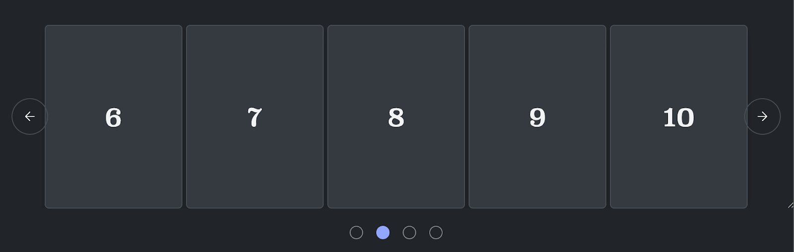
Single-item carousels

With single-item carousels, only one slide is fully visible and interactive at a time (for example, hero banners or slideshows).
Automatically paginated carousels
Automatically paginated carousels show "pages" of content, like a list of products or TV shows.
Multi-item carousels
In multi-item carousels, multiple items in the carousel are visible at once, but you can still scroll through them individually without pagination.
Each type of carousel has different accessibility considerations and best practices.
Single-item carousels
This is a classic slideshow. Only one child element is meant to be read at a time, though in many cases users will see a "peek" of the next or previous item to provide contextual clues about additional content. The goal is to ensure that only the centered, fully-visible slide is interactive.
Here's how to make it accessible, step-by-step.
Step 1: Enforce a single focus with scroll snapping
To guarantee that the scroll container always "snaps" to a slide, leaving no item awkwardly stuck in between, use CSS scroll snapping. This ensures that after a scroll, an item is perfectly "snapped" to its correct position, creating a clean user experience.
.carousel {
  scroll-snap-type: inline mandatory;
}
.item {
  scroll-snap-align: center;
}
Step 2: Announce the carousel and slide Changes
A user with a screen reader needs to know they've entered a carousel and when the slide changes. This requires a few ARIA attributes on the carousel container:
ARIA attribute |
Explanation |
|---|---|
role="region" |
Identify the carousel as a landmark region on the page, making it easier to navigate to. |
aria-label |
Give the region a descriptive name, like "Featured Products Slideshow". |
aria-live="polite" |
This is the magic ingredient. It tells screen readers to politely announce changes within this region, like when a new slide scrolls into view, without interrupting the user. |
Here's the HTML structure:
<div class="carousel" role="region" aria-label="Slideshow" aria-live="polite"> ... </div>
Step 3: Make only the visible slide interactive
This is critical for accessibility as it prevents users from accidentally
tabbing to buttons or links on off-screen slides. To achieve this, use the new
scroll-state container query and interactivity property.
First, make every slide item inert by default using interactivity: inert.
Then, use a scroll-state container query to target the slide that is currently
"snapped" in the viewport and set its content to interactivity: auto.
.item {
  container-type: scroll-state;
}
/* Make all content inside slides inert by default */
.item > * {
  interactivity: inert;
  /* When a slide is snapped inline, make its content interactive */
  @container scroll-state(snapped: inline) {
    > .content {
      interactivity: auto;
    }
  }
}
With this CSS, the browser automatically handles which items are focusable. No
more JavaScript needed to manage a tabindex. The scroll-state query makes all
slides other than the current slide inert.
Paginated carousels
This pattern is often used for galleries of products or choices where content is grouped into pages. Accessibility can be handled in two ways, depending on how you want to present the content.
A carousel with discrete pages
Use a container with role="region" with a single element with
role="tabpanel" inside it.
This tabpanel will update its content to reflect the active tab or page.
<div role="region" class="carousel" aria-label="Featured Products Carousel">
    <div role="tabpanel">
        <div class="item">Item 1</div>
        <div class="item">Item 2</div>
        ...
        <div class="item">Item n</div> </div>
    </div>
</div>
To manage interactivity, use a clever animation trick tied to the view()
timeline. This ensures the tab order only reaches currently visible items on
screen.
@keyframes interactive-when-visible {
  0% { interactivity: auto; }
}
.item {
  interactivity: inert;
  animation: interactive-when-visible steps(1);
  animation-timeline: view(inline);
}
A list of contents
If the content is fundamentally a list, use a <ul> element for the correct
semantics.
For example:
<div class="carousel" role="region" aria-label="Related Posts">
  <ul>
    <li><!-- Post 1 content --></li>
    <li><!-- Post 2 content --></li>
    <li><!-- Post 3 content --></li>
    <!-- ... -->
  </ul>
</div>
For this pattern, don't use the interactivity property to make off-screen content inert. Doing so would affect the item count announced by screen readers, so all content must remain in the accessibility tree.
Multi-item carousels
This pattern is for carousels where multiple child elements may be visible and readable at the same time. For example, a "related products" shelf on an ecommerce site.
These carousels behave differently depending on your answer to the following decision: do you guide the user's focus to one item at a time, or do you allow them to access all visible content freely?
Pattern 1: A single interactive a item among visible items
In this model, multiple items are visible, but only the primary or "current" item is interactive. The other visible items are inert. This pattern is useful for guiding a user through a set of items one by one.
To build this correctly, you should use the same accessibility pattern as the single-item carousel discussed earlier. This involves:
- Use a scroll-state container query to apply interactivity: inert to non-active items.
- Add enough padding around your items to ensure that every single item can be snapped to the primary position (for example, the center of the scrollport). This makes the one-by-one navigation model feel intentional and smooth.
Pattern 2: All visible items are interactive
If your goal is to allow users to freely interact with all visible items, the best practice is to ensure none of the content is inert.
For this pattern:
- Use a
<ul>element if the content is semantically a list, as this provides the correct context for screen reader users. - Don't use interactivity management (
interactivity: inert). All visible content should remain in the accessibility tree and be reachable using keyboard tabbing.
Wrapping up
CSS Overflow 5 lets you declaratively build common, interactive carousel patterns with fewer accessibility headaches. By combining semantic HTML, modern CSS like scroll-state and interactivity, and the right ARIA roles, you can create high performance, accessible experiences that are interactive at first paint.
Give these new APIs a try! As always, though these patterns and APIs are designed to make building interactive, fast and accessible components easier there is no substitute for full accessibility testing. You will always need to verify that your code is accessible, and works for your Baseline target.