

Published: March 5, 2026
The focusgroup HTML attribute is a proposed declarative way to add keyboard
arrow-key navigation to composite widgets such as toolbars, tablists, menus,
listboxes, etc. without writing any roving-tabindex JavaScript. One attribute
replaces hundreds of lines of boilerplate. We want your feedback before this
ships.
Try it out and give us your feedback
You can try focusgroup today in Chrome, Edge, and other Chromium browsers by
enabling it one of two ways:
- Local testing: In the browser, open the
about://flagspage and enable the Experimental Web Platform features flag. Or, launch the browser from the command line by using the--enable-blink-features=Focusgroupcommand line parameter. - Origin trial: Register for the focusgroup origin trial to test it on your site with real users.
Then explore the interactive demos to see every pattern in action.
We need your input. File a focusgroup issue to tell us what you think.
This is a cross-browser effort: the proposal originates from Microsoft through the OpenUI Community Group with strong support from Google. The API shape may change based on your feedback. Let's dive into the problem focusgroup solves and how the API works.
The problem: manual roving tabindex
If you've ever built a toolbar, tablist, menu, or listbox, you've written some version of this code. The ARIA Authoring Practices Guide (APG) recommends that composite widgets present a single Tab stop and let users move between items with arrow keys. This pattern is known as the "roving tabindex". Many UI frameworks reimplement this from scratch:
<div role="toolbar" aria-label="Text formatting" id="toolbar">
  <button type="button" tabindex="0">Bold</button>
  <button type="button" tabindex="-1">Italic</button>
  <button type="button" tabindex="-1">Underline</button>
  <button type="button" tabindex="-1">Strikethrough</button>
</div>
From here, developers need to use JavaScript that listens for arrow keys to move focus, and adjust the tabindex attribute for all elements. This is the simplified version. A production implementation also needs to handle:
- Writing mode and RTL: Adjust arrow key directions based on content direction.
- Last-focused memory: Restore focus to the previously active item when a user Tabs back in.
- Disabled and hidden items: Skip over them during navigation.
- Dynamic items: Update the roving index when items are added or removed.
Most UI libraries including React, Angular CDK, and Fluent UI each ship their own version of this logic. That's a lot of duplicated effort to get something that could be a platform primitive.
The solution: the focusgroup attribute
With focusgroup, the same toolbar becomes:
<div focusgroup="toolbar" aria-label="Text formatting">
  <button type="button">Bold</button>
  <button type="button">Italic</button>
  <button type="button">Underline</button>
  <button type="button">Strikethrough</button>
</div>
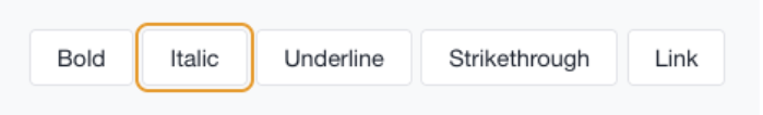
Try it live: Toolbar Pattern > Basic Toolbar. That's it. No JavaScript for arrow key navigation. No manual tabindex management. Here's what the browser now handles for you:
- Arrow key navigation: Navigate between items, while respecting writing mode and directionality.
- A single Tab stop: The browser collapses participating items into one
Tab stop automatically. Developers don't need to set
tabindex="-1"on non-active items. - Last-focused memory: When a user leaves the focusgroup and returns, focus is restored to the item they left.
- ARIA semantics: The browser supplies appropriate roles (like
role="toolbar") based on the behavior chosen when generic elements are used.
Developers keep only the logic unique to their features such as toggling pressed state, opening menus, managing selection, or any custom commands.
API overview
The focusgroup attribute takes a space-separated list of tokens. The first
token is always a behavior token that declares the widget pattern. Optional
modifier tokens follow: focusgroup="<behavior> [inline|block] [wrap] [nomemory]".
Behavior tokens
The behavior token is required (unless using none to opt out of an ancestor
focusgroup). It declares the composite widget pattern, ensuring that the right
roles can be inferred when not otherwise specified. The tokens follow the
patterns that are described in the
Aria Authoring Practices guide
and are listed in the following table:
| Behavior | APG pattern | Minimum container role (when applied) | Minimum child role (when applied) |
Default modifiers |
|---|---|---|---|---|
toolbar |
Toolbar | toolbar | (none) | inline |
tablist |
APG Tabs | tablist | tab | inline wrap |
radiogroup |
Radio Group | radiogroup | radio | (none) |
listbox |
Listbox | listbox | option | (none) |
menu |
Menu | menu | menuitem | block wrap |
menubar |
Menubar | menubar | menuitem | inline wrap |
none |
n/a | n/a | n/a | n/a |
See the explainer for full details on how role mapping works.
Axis restriction (inline and block)
If the chosen behavior doesn't have any default modifiers, all four arrow keys
work to move focus. You can restrict navigation to a single logical axis by
using the inline or block modifier:
inline: The focusgroup only responds to arrow keys on the inline axis, left and right in most English language contexts (horizontal, top to bottom).block: The focusgroup only responds to arrow keys on the block axis, up and down in most English language contexts (horizontal, top to bottom).
Axis restriction is aligned with CSS logical properties and automatically adapts to writing mode and direction.
Wrap-around navigation
By default, arrow key navigation stops at the edges of the focusgroup. Add the
wrap modifier to loop from the last item back to the first (and from the first
back to the last). If a behavior has wrap by default, use the nowrap modifier
to disable this behavior.
Try it live: Tablist Pattern > Horizontal Tablist with Wrapping. In that example, when focus is on the FAQ tab and the user presses the Right arrow key, focus wraps back to the Overview tab.
The focusgroupstart attribute
The focusgroupstart attribute marks which element receives focus when Tabbing
into a focusgroup for the first time (or every time when memory is disabled):
<div focusgroup="toolbar nomemory" aria-label="Entry point demo">
  <button type="button">First</button>
  <button type="button" focusgroupstart>Middle (Entry)</button>
  <button type="button">Last</button>
</div>
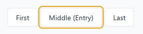
Both Tab and Shift+Tab land on "Middle (Entry)" because it has focusgroupstart
and memory is disabled with the nomemory modifier. Try it live:
Toolbar Pattern > Entry Point with focusgroupstart.
Disable memory (nomemory)
By default, focusgroups remember the last-focused item and restore it on
re-entry with Tab. For patterns where focus should always return to a fixed entry
point (like in the previous demo), use the nomemory modifier in the focusgroup
attribute to disable it.
This modifier can also be combined with programmatic movement of
focusgroupstart to give you full control over the item that is focused when
entering the group. Memory is cleared when the remembered element becomes
unavailable; for example, if it is removed, hidden, disabled, inert, or excluded
from the focusgroup.
Opt out (focusgroup="none")
Use focusgroup="none" to exclude an element and its subtree from an ancestor
focusgroup's arrow navigation. The opted-out element and its subtree remain
reachable using Tab, but arrow keys skip over them:
<div focusgroup="toolbar" aria-label="Segmented toolbar">
  <button type="button">New</button>
  <button type="button">Open</button>
  <button type="button">Save</button>
  <span focusgroup="none">
    <button type="button">Help</button>
    <button type="button">Shortcuts</button>
  </span>
  <button type="button">Close</button>
  <button type="button">Exit</button>
</div>
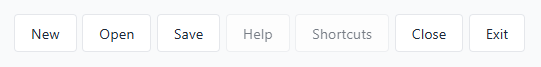
Using the right arrow key navigates to New, then Open, Save, Close, and Exit, skipping the Help and Shortcuts buttons entirely. But a user can still Tab into the help section to access these buttons. Try it live: Additional Concepts > Opt-Out Segments with focusgroup="none".
Common patterns
Tablist
A tab control with arrow key navigation between tabs.
<div focusgroup="tablist nomemory" aria-label="Sections">
  <button type="button" aria-selected="true" aria-controls="panel-overview" id="tab-overview" focusgroupstart>Overview</button>
  <button type="button" aria-selected="false" aria-controls="panel-features" id="tab-features">Features</button>
  <button type="button" aria-selected="false" aria-controls="panel-pricing" id="tab-pricing">Pricing</button>
  <button type="button" aria-selected="false" aria-controls="panel-faq" id="tab-faq">FAQ</button>
</div>
<div role="tabpanel" id="panel-overview" aria-labelledby="tab-overview" tabindex="0">...</div>
<div role="tabpanel" id="panel-features" aria-labelledby="tab-features" tabindex="0">...</div>
<div role="tabpanel" id="panel-pricing" aria-labelledby="tab-pricing" tabindex="0">...</div>
<div role="tabpanel" id="panel-faq" aria-labelledby="tab-faq" tabindex="0">...</div>
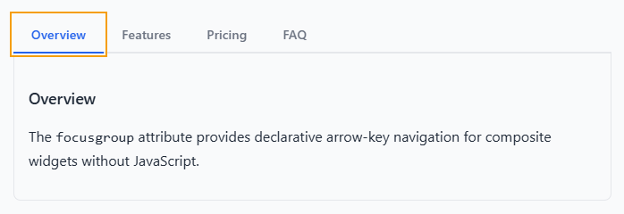
Try it live: Tablist Pattern > Horizontal Tablist with Wrapping.
What to notice:
- The
focusgroupstartattribute is on the selected tab, so focus always enters there. - The
nomemorymodifier ensures that even if the user had previously focused on a different tab, re-entry always goes to the selected tab. - The
inlinemodifier restricts arrow navigation to the left and right keys only. This matches the expected behavior outlined by the APG Tabs pattern. - The
wrapmodifier lets users use the arrow keys continuously through all tabs. - Developer code, omitted for brevity, handles the actual selection: updating
aria-selected, toggling panel visibility, and moving thefocusgroupstartattribute on selection change.
Menu and menubar
A simple vertical menu with up and down arrow navigation.
<div focusgroup="menu" aria-label="File actions" class="menu-vertical">
    <button type="button" class="menu-item">New</button>
    <button type="button" class="menu-item">Open…</button>
    <button type="button" class="menu-item">Save</button>
    <button type="button" class="menu-item">Exit</button>
</div>
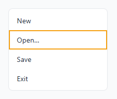
Try it live:
Menu and Menubar Pattern > Simple Vertical Menu.
With the block modifier, only up and down arrow keys navigate items. Left and
right arrow keys are free for behavior that you define (for example, opening
submenus). For a menubar with nested submenus, each level is an independent
focusgroup. Try it live:
Menu and Menubar pattern > Menubar with Popover Submenus
<ul role="menubar" focusgroup="menubar"
     aria-label="Application Menu" class="menubar">
    <li role="none">
        <button role="menuitem" type="button" class="menubar-item"
             aria-haspopup="menu" aria-expanded="false"
             popovertarget="filemenu">File</button>
        <ul role="menu" focusgroup="menu"
             id="filemenu" popover aria-label="File submenu" class="submenu">
            <li role="none"><button type="button" class="submenu-item"
                 autofocus>New</button></li>
            <li role="none"><button type="button" class="submenu-item">Open</button></li>
            <li role="none"><button type="button" class="submenu-item">Save</button></li>
        </ul>
    </li>
    <!-- More menu items... -->
</ul>
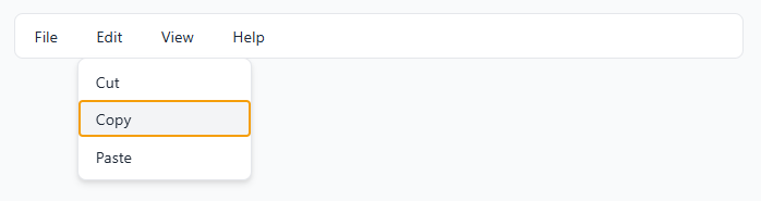
Try it live:
Menu and Menubar Pattern > Menubar with Popover Submenus.
While the menubar uses the inline modifier for left and right navigation, the
submenus use the block modifier for up and down navigation. Nested focusgroups
are completely independent so they don't interfere with each other.
Radiogroup
A custom radio group with arrow key navigation and full styling control.
<div focusgroup="radiogroup" aria-label="Favorite color">
  <span aria-checked="false" tabindex="0">Red</span>
  <span aria-checked="false" tabindex="0">Green</span>
  <span aria-checked="true" tabindex="0" focusgroupstart >Blue</span>
  <span aria-checked="false" tabindex="0">Purple</span>
</div>
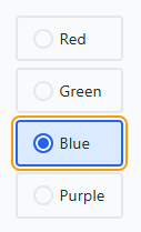
Try it live: Radio Group Pattern > Comparison: Native versus Focusgroup.
While the focusgroup attribute handles arrow key navigation; you must
implement the selection code. In this demo, JavaScript code manages the checked
state (by using the aria-checked attribute).
Key concepts
Focusgroup item participation
All sequentially focusable descendants of the element with focusgroup set
to a valid behavior are considered to participate in that focusgroup. This means
that elements with a negative tabindex are not considered, but natively
focusable elements such as <button> are, as well as elements where you
specified a non-negative tabindex.
Tab stop
You don't need to manage tabindex values. Even when multiple descendants
are naturally tabbable (for example, several <button> elements), focusgroup
collapses them into a single Tab stop. The browser handles which item is
tabbable at any given time. Try it live:
Toolbar Pattern > No tabindex Management Needed.
Last-focused memory
By default, when a user presses Tab to leave a focusgroup and later Tabs back
in, focus returns to the last-focused item. This is critical for large lists and
toolbars so users don't lose their place. Use the nomemory modifier to disable
this behavior when you want focus to always be restored to the first element, or
if you are using focusgroupstart, to control the initially focused element.
Nested focusgroups
Each focusgroup declaration creates an independent scope. A nested focusgroup automatically opts out of its ancestor's arrow navigation. Use Tab to move between focusgroups, and arrow keys to navigate within the current focusgroup. Try it live: Additional Concepts > Nested Focusgroups.
Shadow DOM support
Focusgroup applies across shadow DOM boundaries by default. A focusgroup that's
declared on a shadow host includes focusable elements inside that host's shadow
tree. If you want to opt-out, you can use focusgroup="none" inside your
component's shadow tree.
Key conflict handling
Some elements inside a focusgroup, like <input>, <textarea>, and other
controls use arrow keys for their own purposes. When there's a conflict between
the focusgroup's navigation keys and a native element's arrow key
behavior:
- Arrow keys are consumed by the interactive element (for example, for text cursor movement), and focusgroup does not interfere.
- Tab or Shift+Tab provides a default escape mechanism, allowing a user to use Tab navigation to "re-enter" the focusgroup.
These escape behaviors only apply when there is an actual key conflict;
non-conflicting axes are unaffected. You can also call preventDefault() on
keydown events to override the focusgroup's arrow key behavior for specific
elements. This means that you can include inputs and textareas inside a
focusgroup without breaking either behavior.
If you add key handlers to your own elements that are participating in a focusgroup, take care to provide a similar escape mechanism so users can access the rest of the group.
Deep descendant discovery
Focusgroup items don't need to be direct children of the focusgroup container.
The browser considers all sequentially focusable descendants (non-negative
tabindex) to participate in the focusgroup, unless they are inside a nested
focusgroup or opted-out with focusgroup="none".
<div focusgroup="toolbar" aria-label="Nested wrappers">
  <div>
    <span>
      <button type="button">Alpha</button>
    </span>
    <span>
      <button type="button">Beta</button>
    </span>
    <span>
      <button type="button">Gamma</button>
    </span>
  </div>
</div>
Arrow key navigation works even though the buttons are nested inside <div> and
<span> wrappers. There's no flat-list requirement, so wrapper elements for
styling are fine.
Try it live: Additional Concepts > Deep Descendants.
Integration with the reading-flow property
Both sequential (Tab) and directional (arrow key) navigation respect the CSS
reading-flow property when present, following the visual reading order rather
than the DOM source order.
This ensures that arrow key navigation matches the layout that users see on screen.
<div focusgroup="toolbar" aria-label="Visual order"
     style="display: flex; flex-direction: row-reverse; reading-flow: flex-visual;">
  <button type="button">A (DOM first)</button>
  <button type="button">B (DOM second)</button>
  <button type="button">C (DOM third)</button>
</div>
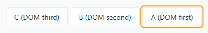
While the DOM order is A, B, C, the visual order is C, B, A because the layout
uses flex-direction: row-reverse. However, because the code also uses
reading-flow: flex-visual, the reading order is back to A, B, C, and
focusgroup matches this order.
Pressing Tab will first focus C, and pressing right will then focus B, then A. Try it live: Additional Concepts > CSS reading-flow Integration.
Accessibility
ARIA Role Inference
In a focusgroup, the behavior token is used by the browser to infer a minimum
role for both the container and its participating items. This means that when
the focusgroup attribute is set on an element that has a generic role, the
correct role, based on the chosen behavior, is applied. The element's
participating items that have a generic role, or buttons that don't have a role
you specified, will have their roles correspondingly inferred. For example, the
following HTML:
<div focusgroup="tablist">
  <button>Tab 1</button>
  <button>Tab 2</button>
  <button>Tab 3</button>
</div>
Creates the following accessibility tree, even though no roles were defined on the buttons:
+   tablist
  |
  +   tab
  |
  +   tab
  |
  +   tab
You can always control the behavior by setting the role directly.
Accessibility considerations
Take care to respect the behavior you chose when creating a focusgroup.
Focusgroup usage should be aligned as close as possible to the behavior you specified. This is important to ensure that users who rely on accessibility tools are able to navigate content and use custom controls.
While role inference provides good defaults, when using elements with non-generic roles, take care to ensure that they have the proper role set for the functionality they provide.
When using focusgroup, remember that users may need to be able to scroll with the arrow keys to view your content. There should always be a way for a keyboard user to be able to read and access the content on your page.
Feature detection
To start using focusgroup today, before it's fully supported across browsers, you can detect focusgroup support in JavaScript:
if ('focusgroup' in HTMLElement.prototype) {
  // focusgroup is supported.
} else {
  // fall back to manual roving tabindex.
}
Conclusion
The focusgroup attribute is progressing through standards bodies, and we're
actively building the prototype in Chromium and refining the API.
Try it out and file a focusgroup issue in the Open-UI GitHub issue tracker. We're especially interested in your opinions on the following:
- Does the API surface feel right for the patterns you build?
- Are there patterns or scenarios we're missing?
- Are there elements the focusgroup attribute shouldn't be allowed on?
- How does the accessibility story work for your use cases?
Thank you for helping make keyboard navigation on the web better!
Learn more
- Focusgroup Explainer
- Interactive Demos (source)
- WHATWG HTML Issue
- Open UI Focusgroup Issues
- ARIA Authoring Practices Guide
Thanks to Mason Freed, Sarah Higley, Scott O'Hara, and the rest of the Open-UI community for their help in bringing focusgroup back.