


Published: May 15, 2026
CSS gap decorations are available in Chrome and Edge starting in version 149. Style the gaps between grid, flexbox, and multi-column layouts without using borders or pseudo-elements. This feature was built in collaboration between the Microsoft Edge and Google Chrome teams.
The problem
Styling gaps between layout items has always required workarounds. Borders on individual items, pseudo-elements, background hacks. These approaches have costs:
- They depend on structure. Adding a visual separator means changing your markup or writing selectors for specific items.
- They interfere with accessibility. Extra DOM elements show up in the accessibility tree when they shouldn't.
- They're hard to maintain. Responsive layouts break the assumptions your gap styling was built on.
- They hurt performance. More DOM nodes, more layout work.
- They have poor authoring ergonomics. Complex geometric calculations were often needed to get things working correctly.
The column-rule property handles gap decorations for multi-column layouts, but grid and flexbox previously lacked equivalent functionality.
The solution
Grid and flexbox containers now accept column-rule. A new row-rule property handles horizontal gaps. These decorations are purely visual and don't affect existing layouts. If you use the column-rule property in multi-column layouts, existing behavior remains the same.
For example, here is a flex container with three panels using a list of styles for its column and row rules:
.flex-split {
  column-rule-width: 2px;
  column-rule-style: dashed, solid;
  column-rule-color: #d4d0c8;
}
As illustrated in this example, both row-rule and column-rule accept the
same shorthand for width, style, and color. Use the rule shorthand to set both
at once.
New properties
However, we didn't just bring column-rule to other layout modes and add the
row counterpart. We also introduced controls for fine-tuning your decorations:
how they break at intersections, how far they inset from gap edges, when they
appear relative to items, and how to vary styles across gaps. Rule width, color,
and insets are all animatable too.
The repeat() syntax
Gap decorations support repeat() for their width, style, and color values. This lets you vary decorations across gaps in short form, similar to the repeat() syntax used for track definitions in grid:
.settings-panel {
  row-rule: 1px solid #243352;
  row-rule-width: repeat(2, 1px), 4px;
}

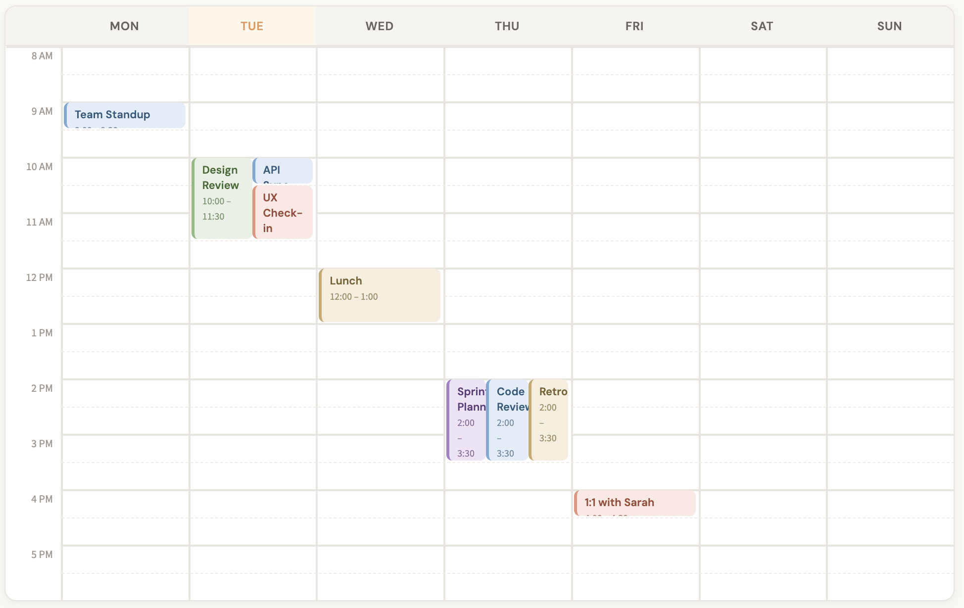
This gives the first two row gaps a 1px rule and the third a 4px rule, cycling if there are more gaps than values. You can also pass multiple values directly without repeat(). For example, alternating row rule styles for hour and half-hour boundaries in a calendar:
.calendar {
  row-rule-width: 2px, 1px;
  row-rule-style: solid, dashed;
  row-rule-color: #e8e4df, #f0ece7;
}
Control decoration breaks
The column-rule-break and row-rule-break properties control how decorations behave at gap intersections:
normal(default): Behavior depends on the type of container. More information is in the specification.none: Decorations run continuously through intersections.intersection: Decorations break where row and column gaps cross.
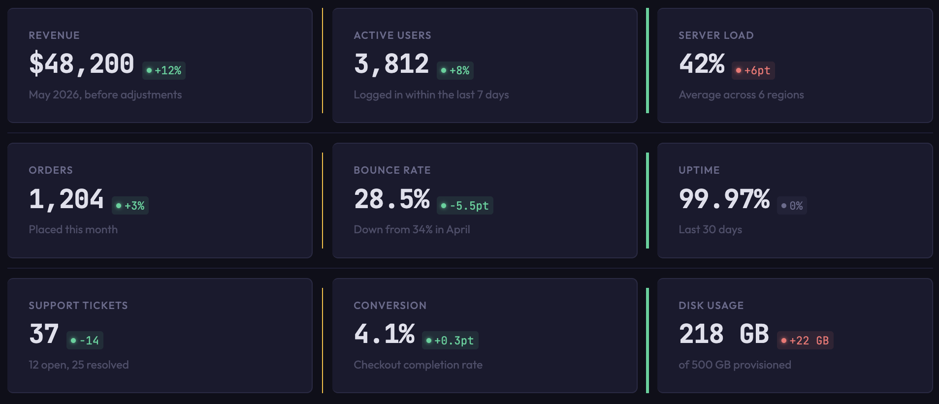
For example, if you set rule-break to intersection in a grid container, rules break at gap intersections rather than continuing through:
.dashboard {
  column-rule-style: solid;
  column-rule-color: #fbbf24, #34d399;
  column-rule-width: 1px, 3px;
  column-rule-break: intersection;
  row-rule: 1px solid #1e1e36;
}
If you set rule-break to none, the rules run continuously through intersections:
.grid {
  column-rule: 1px solid #5a9e9e;
  row-rule: 1px solid #c27a6b;
  rule-break: none;
}
You can try this value in the interactive playground.
Extend or shrink decorations
The column-rule-inset and row-rule-inset properties control how far decorations extend within a gap. You can set insets on all sides at once with the shorthand, or target insets asymmetrically with column-rule-inset-cap (for endpoints that have no crossing gaps) and column-rule-inset-junction (for endpoints that intersect with other gaps).
Values can be lengths, percentages, or the overlap-join keyword, which joins gap decorations into corners. For example, setting rule-inset to 5px shrinks all decorations inwards 5px:
.container {
  display: flex;
  flex-wrap: wrap;
  column-rule: 1px solid #2a2a45;
  column-rule-color: #60a5fa, #34d399, #a78bfa;
  rule-inset: 5px;
  row-rule: 1px solid #2a2a45;
}
Setting rule-inset-cap to 0px and rule-inset-junction to 10px gives
decorations that are flush at container edges but inset at intersections. The
dashboard demo shown earlier uses this approach, and the insets animate on
hover:
.dashboard {
  rule-inset-cap: 0px;
  rule-inset-junction: 10px;
  transition: rule-inset-junction 0.4s;
}
.dashboard:hover {
  rule-inset-junction: 0px;
}
Visibility
The column-rule-visibility-items and row-rule-visibility-items properties control when rules appear based on item adjacency:
normal(default): Depends on container type.all: Rules appear in every gap, even empty ones.around: Rules appear wherever there are one or more adjacent items.between: Rules appear only between two adjacent items.
The rule-visibility-items shorthand sets both at once.
Setting rule-visibility-items to between will show rules only between
adjacent items:
section {
  rule: 2px solid black;
  rule-visibility-items: between;
}
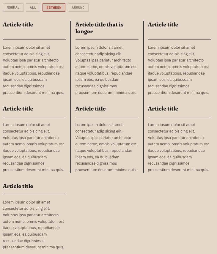
On the other hand, setting rule-visibility-items to all will show rules in
every gap, even those without adjacent items:
section {
  rule: 2px solid black;
  rule-visibility-items: all;
}
Toggle the value in the live demo to see the difference!
Animate decorations
Rule width, color, and insets are animatable. You can transition them on hover or any other state change. The dashboard demo shown earlier transitions rule colors and insets on hover:
.dashboard {
  column-rule-color: #fbbf24, #34d399;
  rule-inset-junction: 10px;
  transition: column-rule-color 0.4s, rule-inset-junction 0.4s;
}

.dashboard:hover {
  column-rule-color: #3b82f6, #3b82f6;
  rule-inset-junction: 0px;
}
Demos
All demos shown in this post are available at the Edge demo site.
The developer trial blog post includes several more demos, including an interactive playground, a burger menu, a notebook layout, and a magazine-style layout with a sudoku grid.
Changes since the developer trial
If you tried gap decorations during the developer trial (Chrome 139), note the following changes:
- The feature is available by default; no flags are needed.
- Some property names were updated to align with the latest specification (for example,
column-rule-outsetandrow-rule-outsetbecamecolumn-rule-insetandrow-rule-inset). - The
column-rule-visibility-itemsandrow-rule-visibility-itemsproperties were added. - Animation support was added.
Use gap decorations today
Gap decorations work in Chrome and Edge, starting with version 149. If your gap decorations are purely decorative, the feature is a progressive enhancement; in browsers without support, gaps render normally with no visible decorations. A polyfill is in development for browsers that don't yet have support.
File bugs at the Chromium issue tracker. For more background, see the CSS Gap Decorations specification.