

Published: Jun 12, 2020, Last updated: Sep 9, 2025
Looker Studio (formerly Data Studio) is a powerful data visualization tool that lets you build dashboards on top of big data sources, like the Chrome UX Report (CrUX). In this guide, learn how to create your own custom CrUX Dashboard to track an origin's user experience trends.

The CrUX Dashboard is built with a Looker Studio feature called Community Connectors. This connector is a pre-established link between the raw CrUX data on BigQuery and the visualizations of Looker Studio. It eliminates the need for users of the dashboard to write any queries or generate any charts. Everything is built for you; all you need is to provide an origin and a custom dashboard will be generated for you.
The default CrUX dashboard
CrUX has a default dashboard, which is maintained by the CrUX team. New metrics (for example INP) are added by the team and available the next time the dashboard is loaded.
Create a custom dashboard
Some users may want to customize the dashboard, in which case you can create your own copy of the default dashboard and change it as you see fit.
To create a custom dashboard, go to g.co/chromeuxdash. This will take you to the CrUX community connector page where you can provide the origin for which the dashboard will be generated. Note that first-time users may need to complete permission or marketing preference prompts.
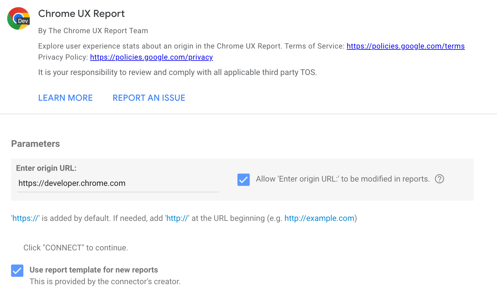
The text input field only accepts origins, not full URLs. For example:
https://developer.chrome.com
https://developer.chrome.com/docs/crux/guides/looker-studio-dashboard
If you omit the protocol, HTTPS is assumed. Subdomains matter, for example https://developers.google.com and https://www.google.com are considered to be different origins.
Some common issues with origins are providing the wrong protocol, for example http:// instead of https://, and omitting the subdomain when needed. Some websites include redirects, so if http://example.com redirects to https://www.example.com, then you should use the latter, which is the canonical version of the origin. As a rule of thumb, use whichever origin users see in the address bar.
By ticking checkbox, the origin will be included in the dashboard URL, which allows the same dashboard to be used for different origins by changing this URL parameter in the future so it is recommended to tick that.
Click the Connect button. If you ticked the checkbox, you will be asked to confirm this.
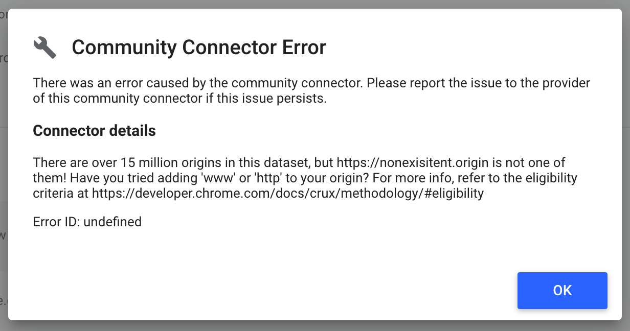
If your origin is not included in the CrUX dataset, you may get an error message like the one shown in the next diagram. There are over 15 million origins in the dataset, but the one you want may not have sufficient data to be included.
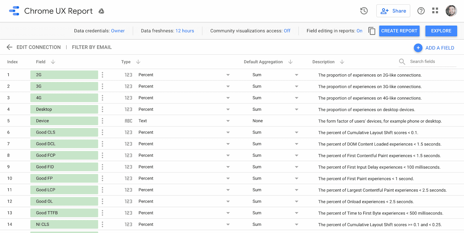
If the origin exists, you'll be taken to the schema page for the dashboard. This shows you all of the fields that are included: each effective connection type, each form factor, the month of the dataset release, the distribution of performance for each metric, and of course the name of the origin. There's nothing you need to do or change on this page, just click Create Report to continue.
Use the dashboard
Each dashboard comes with three types of pages:
- Core Web Vitals overview
- Metric performance
- User demographics
Each page includes a chart showing distributions over time for each available monthly release. As new datasets are released, you can refresh the dashboard to get the latest data.
The monthly datasets are released on the second Tuesday of every month. For example, the dataset consisting of user experience data from the month of May is released on the second Tuesday of June.
Core Web Vitals overview
The first page is an overview of the origin's monthly Core Web Vitals performance. These are the most important UX metrics that Google recommends you focus on.
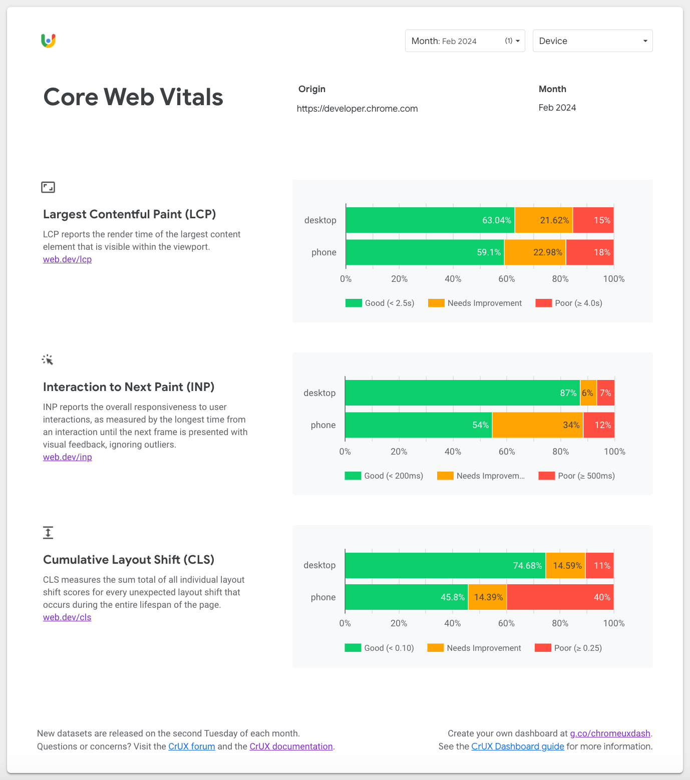
Use the Core Web Vitals page to understand how the origin is experienced by desktop and phone users. By default, the most recent month at the time you created the dashboard is selected. To change between older or newer monthly releases, use the Month filter at the top of the page.
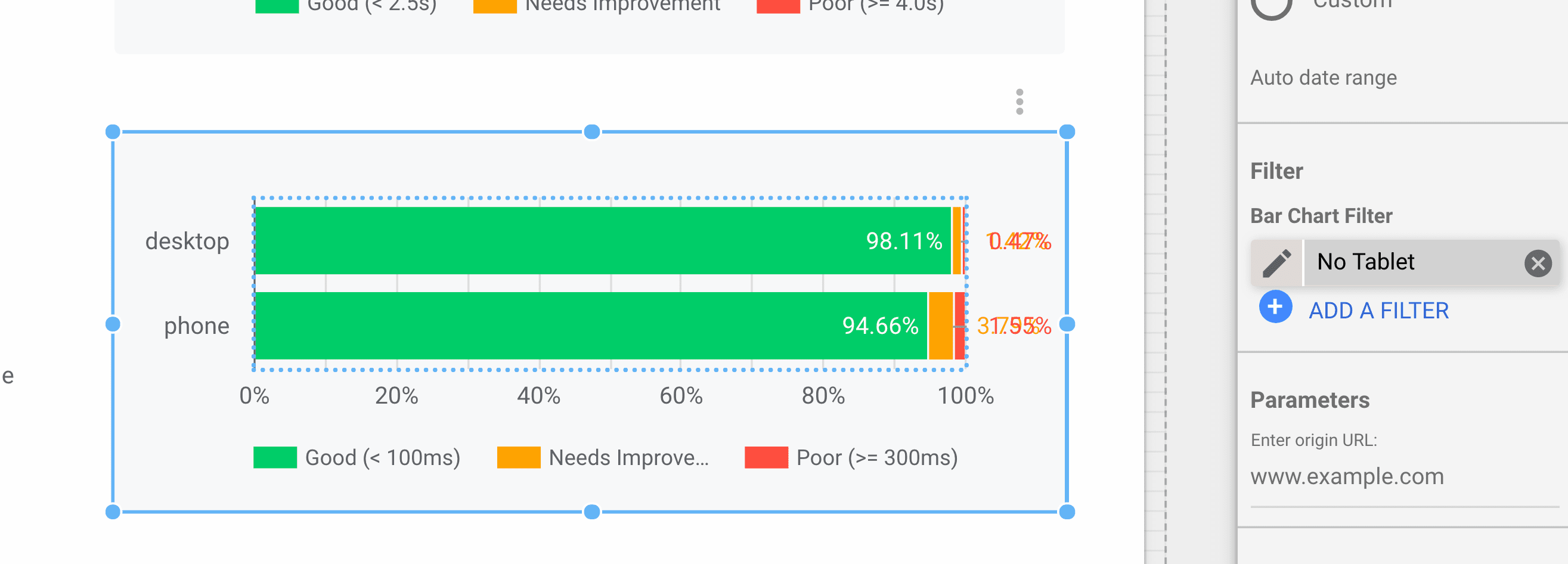
Note that tablet is omitted from these charts by default, but if needed you could remove the No Tablet filter in the bar chart configuration:
Metric performance
After the Core Web Vitals page, you'll find standalone pages for all metrics in the CrUX dataset.
Atop each page is the Device filter, which you can use to restrict the form factors included in the experience data. For example, you can drill down specifically into phone experiences. This setting persists across pages.
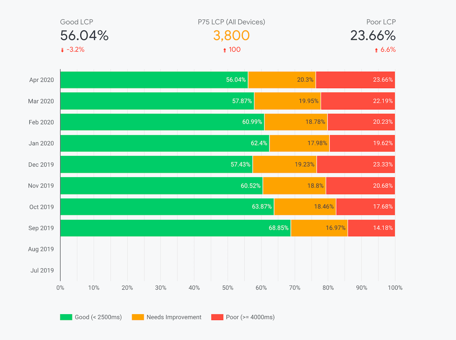
The primary visualizations on these pages are the monthly distributions of experiences categorized as "Good", "Needs Improvement", and "Poor". The color-coded legend below the chart indicates the range of experiences included in the category. For example, in the previous screenshot, you can see the percent of "good" Largest Contentful Paint (LCP) experiences fluctuating and getting slightly worse in recent months.
The most recent month's percentages of "good" and "poor" experiences are shown above the chart along with an indicator of the percent difference from the previous month. For this origin, "good" LCP experiences fell by 3.2% to 56.04% month-over-month.
Additionally, for metrics like LCP and other Core Web Vitals that provide explicit percentile recommendations, you'll find the "P75" metric between the "good" and "poor" percentages. This value corresponds to the origin's 75th percentile of user experiences. In other words, 75% of experiences are better than this value. One thing to note is that this applies to the overall distribution across all devices on the origin. Toggling specific devices with the Device filter won't recalculate the percentile.
Technical caveats about percentiles
Be aware that the percentile metrics are based on the histogram data from BigQuery, so the granularity will be coarse: 100ms for LCP, 25ms for INP, and 0.05 for CLS. In other words, a P75 LCP of 3800ms indicates that the true 75th percentile is somewhere between 3800ms and 3900ms.
Additionally, the BigQuery dataset uses a technique called "bin spreading" in which densities of user experiences are intrinsically grouped into very coarse bins of decreasing granularity. This allows us to include minute densities in the tail of the distribution without having to exceed four digits of precision. For example, LCP values less than 3 seconds are grouped into bins 200ms wide. Between 3 and 10 seconds, bins are 500ms wide. Beyond 10 seconds, bins are 5000ms wide... Rather than having bins of varying widths, bin spreading ensures that all bins are a constant 100ms wide (the greatest common divisor), and the distribution is linearly interpolated across each bin.
Corresponding P75 values in tools like PageSpeed Insights are not based on the public BigQuery dataset and are able to provide millisecond-precision values.
User demographics
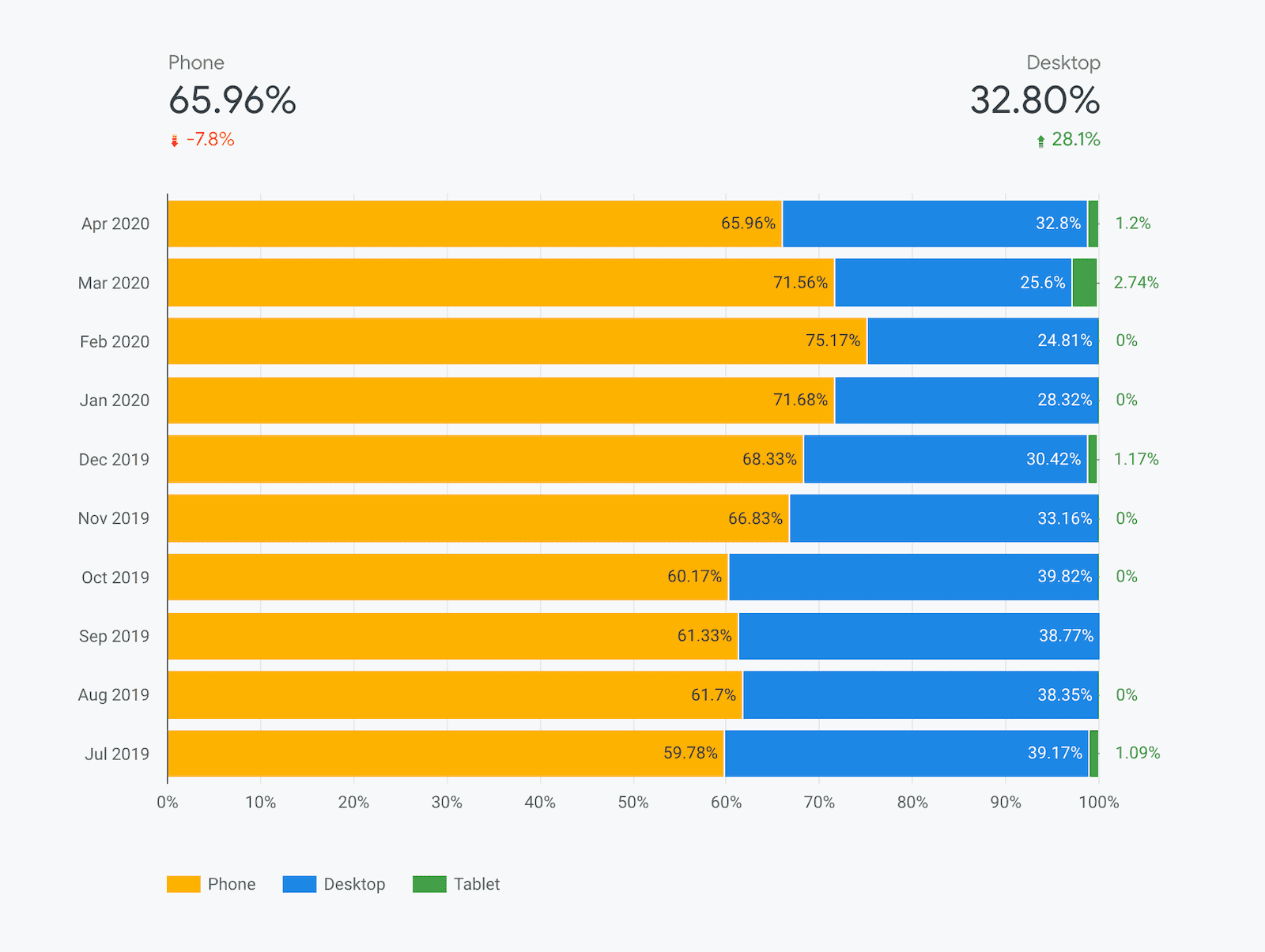
There are two dimensions included on the user demographic pages: devices and effective connection types (ECTs). These pages illustrate the distribution of page views across the entire origin for users in each demographic.
The device distribution page shows you the breakdown of phone, desktop, and tablet users over time. Many origins tend to have little to no tablet data so you'll often see "0%" hanging off the edge of the chart.
Similarly, the ECT distribution page shows you the breakdown of 4G, 3G, 2G, slow 2G, and offline experiences.
The distributions for these dimensions are calculated using segments of the First Contentful Paint (FCP) histogram data.
FAQ
These are some of the frequently asked questions about building CrUX dashboards on Looker Studio:
When would I use the CrUX Dashboard as opposed to other tools?
The CrUX Dashboard is based on the same underlying data available on BigQuery, but you don't need to write a single line of SQL to extract the data and you don't ever have to worry about exceeding any free quotas. Setting up a dashboard is quicker and easier than viewing querying the underling data, all of the visualizations are generated for you, and you have the control to share it with anyone you want.
Are there any limitations to using the CrUX Dashboard?
Being based on BigQuery means that the CrUX Dashboard inherits all of its limitations as well. It is restricted to origin-level data at monthly granularity.
The CrUX Dashboard also trades away some of the versatility of the raw data on BigQuery for simplicity and convenience. For example, metric distributions are only given as "good", "needs improvement", and "poor", as opposed to the full histograms. The CrUX Dashboard also provides data at a global level, while the BigQuery dataset lets you zoom in on particular countries.
Where can I learn more about Looker Studio?
Check out the Looker Studio features page for more info.