

Chrome has adapted to the Android tablet ecosystem by enabling desktop mode by default on premium tablets. This blog post explains what desktop mode is, and what developers need to know about providing high quality experiences on premium tablets.
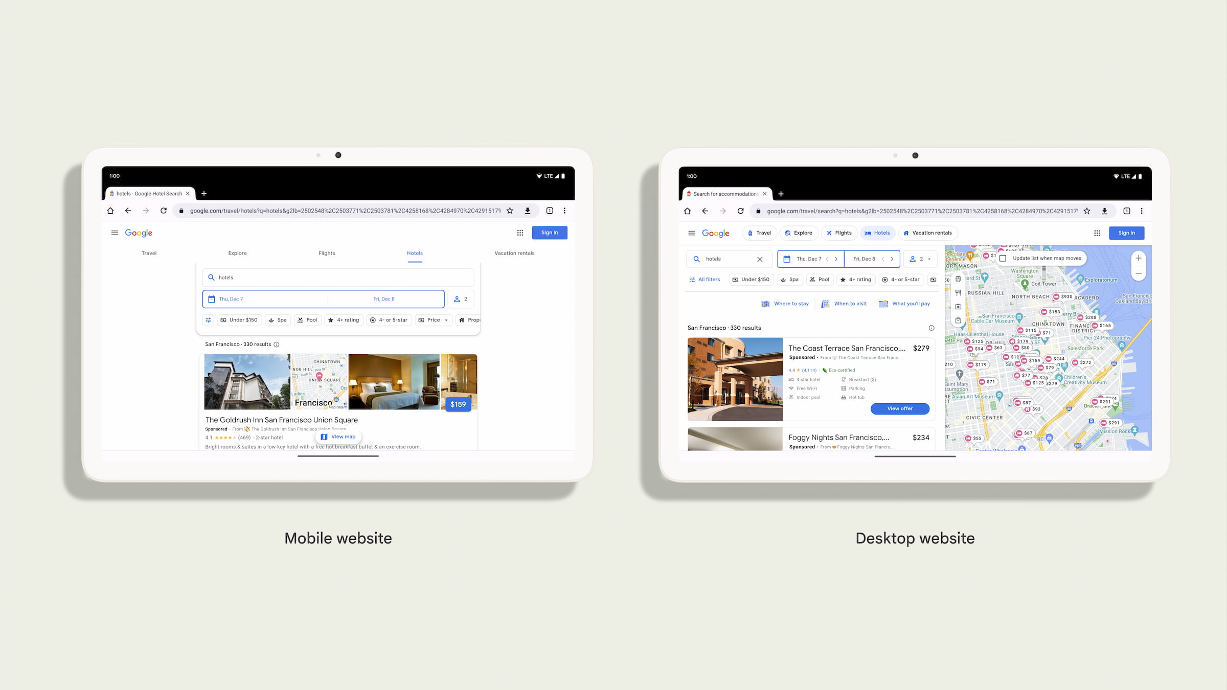
Websites need to adapt to a variety of screen sizes, form factors, input methods, and device capabilities. As an alternative to using responsive design techniques, web developers often look at the browser's User-Agent to serve different websites for mobile and desktop devices.
Historically, a mobile User-Agent is the default for Chrome on Android. In this mode, sites that are designed just for desktop (that is, there is no meta viewport) will display using a default fixed virtual viewport of 980px for comfortable reading on a variety of phone screens. For cases when the user wants to load just the desktop version of the site (because the site renders different versions of their site based on the User Agent), a user could enable the desktop mode settings which will change the User Agent to a desktop one, and force the viewport to be 980px.
As the Android tablet ecosystem has seen more large and powerful devices become readily available, we've found that the desktop website can often be a better experience than the mobile site. Mobile websites that were designed for small screens and low RAM don't always take advantage of the large screen and other powerful device capabilities. Therefore, for premium tablets, desktop mode is now the default.
With this change, the User-Agent will be a desktop User-Agent by default and will use a viewport that matches the window width and not use a default virtual viewport size of 980px.
Information for developers about desktop mode
Chrome users on Android can change desktop mode settings to request a desktop site or mobile site by default. This is not changing, so many users will already be familiar with how to change modes.

Chrome will request the desktop site by default on premium tablets (those with at least 10" display and 8GB of RAM). Web developers should make sure their website works well in desktop mode on tablets.
With this change to desktop mode by default, the default user-agent for the majority of your Android tablet users will change from the mobile version like:
Mozilla/5.0 (Linux; Android 10; K) AppleWebKit/537.36 (KHTML, like Gecko) Chrome/119.0.0.0 Safari/537.36
to a desktop version, like this:
Mozilla/5.0 (X11; Linux x86_64) AppleWebKit/537.36 (KHTML, like Gecko) Chrome/119.0.0.0 Safari/537.36
In addition, the SEC-CH-UA-MODEL and SEC-CH-UA-PLATFORM HTTP headers will no longer report "Pixel Tablet" and "Android", and instead will report "" and "Linux" respectively.
Test your websites for this change
With desktop mode becoming the default on premium tablets, it is a good time to confirm that all interactions with the desktop versions of your site work well for users with and without an attached physical keyboard, a touchscreen, mouse, or trackpad.
If you rely on the User Agent to detect if your users are using Android, for example, with Google Analytics, then we expect that this change may have an impact on your site. Additionally, because Desktop Chrome and Chrome on Android don't share all of the exact same Web Platform APIs, it's critical that you use feature detection before you use a device capability.
If you rely on the User Agent to offer your users to install your app, you might inadvertently offer to download a Linux binary. We recommend that you use a Web App Manifest along with the related_applications property. This will then use Chrome on Android's default mechanism for prompting the user to install your application.
You can test your website with desktop mode enabled and disabled by following these steps or alternatively you can use Chrome DevTools Device simulation and User-Agent overrides.