Sites that load fonts with font-display: swap often suffer from a layout shift (CLS) when the web font loads and is swapped with the fallback font.
You can prevent CLS by adjusting the dimensions of the fallback font to match that of the primary font. Properties such as size-adjust, ascent-override, descent-override, and line-gap-override in the @font-face rule can help override the metrics of a fallback font allowing developers more control over how fonts are displayed. You can read more about font-fallbacks and the override properties in this post. You can also see a working implementation of this technique in this demo.
This article explores how font size adjustments are implemented in the Next.js and Nuxt.js frameworks to generate the fallback font CSS and reduce the CLS. It also demonstrates how you can generate fallback fonts using cross-cutting tools such as Fontaine and Capsize.
Background
font-display: swap is generally used to prevent FOIT (Flash of invisible text) and to display contents faster on the screen. The value of swap tells the browser that text using the font should be displayed immediately using a system font and to replace the system font only when the custom font is ready.
The biggest issue with swap is the jarring effect, where the difference in character sizes of the two fonts results in screen content shifting around. This leads to poor CLS scores, especially for text-heavy websites.
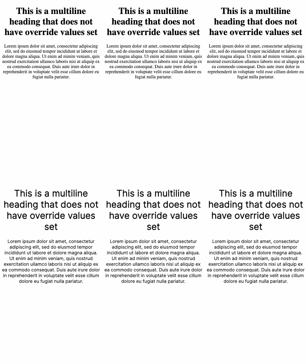
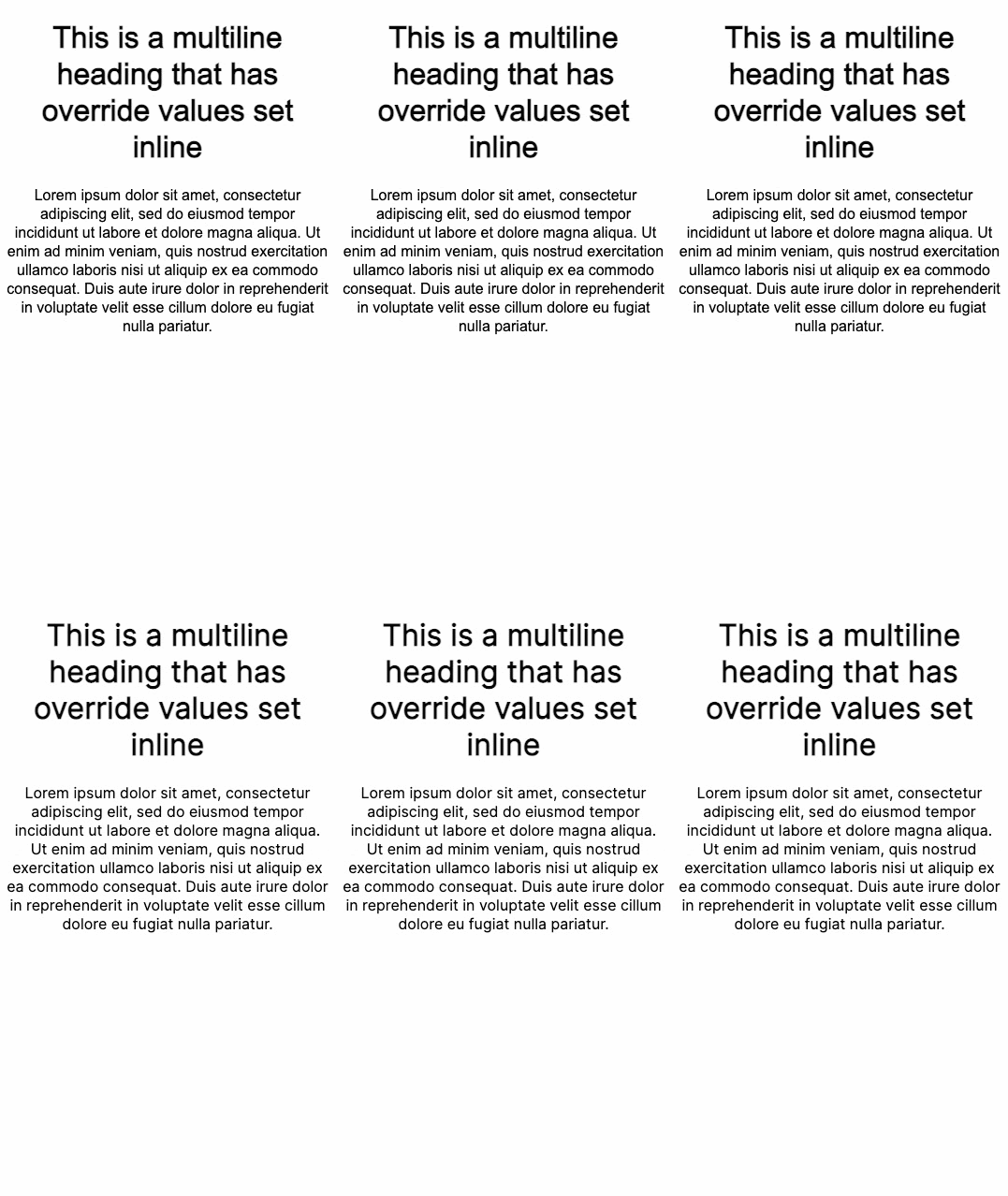
The following images show an example of the issue. The first image uses font-display: swap with no attempt to adjust the size of the fallback font. The second shows how adjusting the size using the CSS @font-face rule improves the loading experience.
Without adjusting font size
body {
  font-family: Inter, serif;
}

After adjusting font size
body {
  font-family: Inter, fallback-inter, serif;
  }

@font-face {
  font-family: "fallback-inter";
  ascent-override: 90.20%;
  descent-override: 22.48%;
  line-gap-override: 0.00%;
  size-adjust: 107.40%;
  src: local("Arial");
}

Adjusting the size of the fallback font can be an effective strategy for preventing font loading layout shift, but implementing the logic from scratch can be tricky, as described in this post about font fallbacks. Fortunately, several tooling options are already available to make this easier while developing apps.
How to optimize font fallbacks with Next.js
Next.js provides a built-in way to enable fallback font optimization. This feature is enabled by default when you load fonts using the @next/font component.
The @next/font component was introduced in Next.js version 13. The component provides an API to import Google Fonts or custom fonts into your pages and includes built-in automatic self-hosting of font files.
When used, the fallback font metrics are automatically calculated and injected into the CSS file.
For example, if you are using a Roboto font, you would typically define it in CSS as follows:
@font-face {
  font-family: 'Roboto';
  font-display: swap;
  src: url('/fonts/Roboto.woff2') format('woff2'), url('/fonts/Roboto.woff') format('woff');
  font-weight: 700;
}

body {
  font-family: Roboto;
}
To migrate to next/font:
Move the Roboto font declaration into your Javascript by importing the 'Roboto' function from 'next/font'. The function’s return value will be a class name you can leverage in your component template. Remember to add
display: swapto the configuration object to enable the feature.import { Roboto } from '@next/font/google'; const roboto = Roboto({ weight: '400', subsets: ['latin'], display: 'swap' // Using display swap automatically enables the feature })In your component, use the generated class name:
javascript
export default function RootLayout({ children }: {
  children: React.ReactNode;
}) {
  return (
    <html lang="en" className={roboto.className}>
    <body>{children}</body>
    </html>
  );
}
The adjustFontFallback config option:
For @next/font/google: A boolean value that sets whether an automatic fallback font should be used to reduce Cumulative Layout Shift. The default is true. Next.js automatically sets your fallback font to either Arial or Times New Roman depending on the font type (serif vs sans-serif respectively).
For @next/font/local: A string or boolean false value that sets whether an automatic fallback font should be used to reduce Cumulative Layout Shift. The possible values are Arial, Times New Roman, or false. The default is Arial. If you want to use a serif font, consider setting this value to Times New Roman.
Another option for Google fonts
If using the next/font component isn’t an option, another approach to use this feature with Google Fonts is via the optimizeFonts flag. Next.js has the optimizeFonts feature already enabled by default. This feature inlines the Google Font CSS in the HTML response. Further, you can enable the font fallbacks adjustment feature by setting the experimental.adjustFontFallbacksWithSizeAdjust flag in your next.config.js, as shown in the following snippet:
// In next.config.js
module.exports = {
 experimental: {
   adjustFontFallbacksWithSizeAdjust: true,
 },
}
Note: There is no plan to support this feature with the newly introduced app dir. In the long term, it’s ideal to use next/font.
How to adjust font fallbacks with Nuxt
@nuxtjs/fontaine is a module for the Nuxt.js framework that automatically calculates the fallback font metric values and generates the fallback @font-face CSS.
Enable the module by adding @nuxtjs/fontaine to your modules config:
import { defineNuxtConfig } from 'nuxt'

export default defineNuxtConfig({
  modules: ['@nuxtjs/fontaine'],
})
If you use Google Fonts or don't have a @font-face declaration for a font, you can declare them as additional options.
In most cases, the module can read the @font-face rules from your CSS and automatically infer the details such as the font-family, fallback font family, and display type.
If the font is defined in a place not discoverable by the module, you can pass the metrics info as shown in the following code snippet.
export default defineNuxtConfig({
  modules: ['@nuxtjs/fontaine'],
  fontMetrics: {
  fonts: ['Inter', { family: 'Some Custom Font', src: '/path/to/custom/font.woff2' }],
},
})
The module automatically scans your CSS to read the @font-face declarations and generates the fallback @font-face rules.
@font-face {
  font-family: 'Roboto';
  font-display: swap;
  src: url('/fonts/Roboto.woff2') format('woff2'), url('/fonts/Roboto.woff') format('woff');
  font-weight: 700;
}
/* This will be generated. */
@font-face {
  font-family: 'Roboto override';
  src: local('BlinkMacSystemFont'), local('Segoe UI'), local('Roboto'), local('Helvetica Neue'),
    local('Arial'), local('Noto Sans');
  ascent-override: 92.7734375%;
  descent-override: 24.4140625%;
  line-gap-override: 0%;
}
You can now use Roboto override as the fallback font in your CSS, as shown in the following example
:root {
  font-family: 'Roboto';
  /* This becomes */
  font-family: 'Roboto', 'Roboto override';
}
Generating the CSS yourself
Standalone libraries can also help you generate the CSS for fallback font size adjustments.
Using Fontaine library
If you are not using Nuxt or Next.js, you can use Fontaine. Fontaine is the underlying library powering @nuxtjs/fontaine. You can use this library in your project to automatically inject fallback font CSS using Vite or Webpack plugins.
Imagine you have a Roboto font defined in the CSS file:
@font-face {
  font-family: 'Roboto';
  font-display: swap;
  src: url('/fonts/Roboto.woff2') format('woff2'), url('/fonts/Roboto.woff') format('woff');
  font-weight: 700;
}
Fontaine provides Vite and Webpack transformers to plug into the build chain easily, enable the plugin as shown in the following JavaScript.
import { FontaineTransform } from 'fontaine'

const options = {
  fallbacks: ['BlinkMacSystemFont', 'Segoe UI', 'Helvetica Neue', 'Arial', 'Noto Sans'],
  // You may need to resolve assets like `/fonts/Roboto.woff2` to a particular directory
  resolvePath: (id) => 'file:///path/to/public/dir' + id,
  // overrideName: (originalName) => `${name} override`
  // sourcemap: false
}
If you're using Vite, add the plugin like this:
javascript
// Vite
export default {
  plugins: [FontaineTransform.vite(options)]
}
If using Webpack, enable it as follows:
// Webpack
export default {
  plugins: [FontaineTransform.webpack(options)]
}
The module will automatically scan your files to modify the @font-face rules:
css
@font-face {
  font-family: 'Roboto';
  font-display: swap;
  src: url('/fonts/Roboto.woff2') format('woff2'), url('/fonts/Roboto.woff') format('woff');
  font-weight: 700;
}
/* This will be generated. */
@font-face {
  font-family: 'Roboto override';
  src: local('BlinkMacSystemFont'), local('Segoe UI'), local('Roboto'), local('Helvetica Neue'),
    local('Arial'), local('Noto Sans');
  ascent-override: 92.7734375%;
  descent-override: 24.4140625%;
  line-gap-override: 0%;
}
You can now use Roboto override as your fallback font in CSS.
css
:root {
  font-family: 'Roboto';
  /* This becomes */
  font-family: 'Roboto', 'Roboto override';
}
Using the Capsize library
If you're not using Next.js, Nuxt, Webpack, or Vite, another option is to use the Capsize library to generate the fallback CSS.
New createFontStack api
The API is part of the @capsize/core package called createFontStack, which accepts an array of font metrics in the same order as you would specify your font stack (the font-family property).
You can refer to the documentation on using Capsize here.
Example
Consider the following example: The desired web font is Lobster, falling back to Helvetica Neue and then Arial. In CSS, font-family: Lobster, 'Helvetica Neue', Arial.
Import createFontStack from the core package:
import { createFontStack } from '@capsizecss/core';Import the font metrics for each of the desired fonts (see Font Metrics above):
javascript
import lobster from '@capsizecss/metrics/lobster';
import helveticaNeue from '@capsizecss/metrics/helveticaNeue';
import arial from '@capsizecss/metrics/arial';`
Create your font stack, passing the metrics as an array, using the same order as you would via the font-family CSS property.
javascript
const { fontFamily, fontFaces } = createFontStack([
  lobster,
  helveticaNeue,
  arial,
]);
This returns the following:
{
  fontFamily: Lobster, 'Lobster Fallback: Helvetica Neue', 'Lobster Fallback: Arial',
  fontFaces: [
    {
      '@font-face' {
      'font-family': '"Lobster Fallback: Helvetica Neue"';
      src: local('Helvetica Neue');
      'ascent-override': '115.1741%';
      'descent-override': '28.7935%';
      'size-adjust': '86.8251%';
      }
     '@font-face' {
       'font-family': '"Lobster Fallback: Arial"';
       src: local('Arial');
       'ascent-override': 113.5679%;
       'descent-override': 28.392%;
       'size-adjust': 88.053%;
     }
   }
 ]
}
You must add the fontFamily and fontFaces code to your CSS. The following code shows how to implement it in a CSS style sheet, or within a <style> block.
<style type="text/css">
  .heading {
    font-family:
  }


</style>
This will produce the following CSS:
.heading {
  font-family: Lobster, 'Lobster Fallback: Helvetica Neue',
    'Lobster Fallback: Arial';
}

@font-face {
  font-family: 'Lobster Fallback: Helvetica Neue';
  src: local('Helvetica Neue');
  ascent-override: 115.1741%;
  descent-override: 28.7935%;
  size-adjust: 86.8251%;
}
@font-face {
  font-family: 'Lobster Fallback: Arial';
  src: local('Arial');
  ascent-override: 113.5679%;
  descent-override: 28.392%;
  size-adjust: 88.053%;
}
You can also use the @capsize/metrics package to calculate the override values, and apply them to the CSS yourself.
const fontMetrics = require(`@capsizecss/metrics/inter`);
const fallbackFontMetrics = require(`@capsizecss/metrics/arial`);
const mainFontAvgWidth = fontMetrics.xAvgWidth / fontMetrics.unitsPerEm;
const fallbackFontAvgWidth = fallbackFontMetrics.xAvgWidth / fallbackFontMetrics.unitsPerEm;
let sizeAdjust = mainFontAvgWidth / fallbackFontAvgWidth;
let ascent = fontMetrics.ascent / (unitsPerEm * fontMetrics.sizeAdjust));
let descent = fontMetrics.descent / (unitsPerEm * fontMetrics.sizeAdjust));
let lineGap = fontMetrics.lineGap / (unitsPerEm * fontMetrics.sizeAdjust));

