


Discover new workflows in this comprehensive reference of Chrome DevTools features related to viewing and changing CSS.
See View and change CSS to learn the basics.
Select an element
The Elements panel of DevTools lets you view or change the CSS of one element at a time.

On the screenshot, the h1 element that's highlighted blue in the DOM Tree is the selected element.
To the right, the element's styles are shown in the Styles tab. To the left, the element is
highlighted in the viewport, but only because the mouse is hovering over it in the DOM
Tree.
See View an element's CSS for a tutorial.
There are many ways to select an element:
- In your viewport, right-click the element and select Inspect.
- In DevTools, click Select an element
 or press Command+Shift+C (Mac) or
Control+Shift+C (Windows, Linux), and then click the element in
the viewport.
or press Command+Shift+C (Mac) or
Control+Shift+C (Windows, Linux), and then click the element in
the viewport. - In DevTools, click the element in the DOM Tree.
- In DevTools, run a query like
document.querySelector('p')in the Console, right-click the result, and then select Reveal in Elements panel.
View CSS
Use the Elements > Styles and Computed tabs to view CSS rules and diagnose CSS issues.
Navigate with links
The Styles tab displays links in various places to various other places, including but not limited to:
- Next to CSS rules, to style sheets and CSS sources. Such links open the Sources panel. If the style sheet is minified, see Make a minified file readable.
- In the Inherited from ... sections, to parent elements.
- In
var()calls, to custom property declarations. - In
animationshorthand properties, to@keyframes. - Learn more links in documentation tooltips.
- And more.
Here are some of them highlighted:

Links may be styled differently. If you're not sure if something is a link, try clicking it to find out.
View tooltips with CSS documentation, specificity, and custom property values
Elements > Styles shows tooltips with useful information when you hover over specific elements.
View CSS documentation
To see a tooltip with a short CSS description, hover over the property name in the Styles tab.
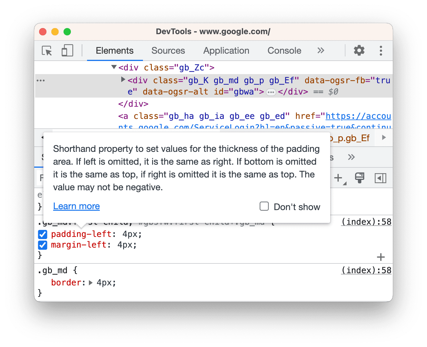
Click Learn more to go to an MDN CSS Reference on this property.
To turn the tooltips off, check  Don't show.
To turn them back on, check  Settings > Preferences > Elements >
  Show CSS documentation tooltip.
View selector specificity
Hover over a selector to see a tooltip with its specificity weight.

View the values of custom properties
Hover over a --custom-property to see its value in a tooltip.

View invalid, overridden, inactive, and other CSS
The Styles tab recognizes many kinds of CSS issues and highlights them in different ways.
See Understand CSS in the Styles tab.
View only the CSS that's actually applied to an element
The Styles tab shows you all of the rules that apply to an element, including declarations that have been overridden. When you're not interested in overridden declarations, use the Computed tab to view only the CSS that's actually being applied to an element.
- Select an element.
- Go to the Computed tab in the Elements panel.

Check the Show All checkbox to see all properties.
See Understand CSS in the Computed tab.
View CSS properties in alphabetical order
Use the Computed tab. See View only the CSS that's actually applied to an element.
View inherited CSS properties
Check the Show All checkbox in the Computed tab. See View only the CSS that's actually applied to an element.
Alternatively, scroll the Styles tab and find sections named Inherited from <element_name>.

View CSS at-rules
At-rules are CSS statements that let you control CSS behavior. Elements > Styles shows the following at-rules in dedicated sections:
View @property at-rules
The @property CSS at-rule lets you define CSS custom properties explicitly and register them in a style sheet without running any JavaScript.
Hover over the name of such property in the Styles tab, to see a tooltip with the property's value, descriptors, and a link to its registration in the collapsible @property section at the bottom of the Styles tab.
To edit an @property rule, double-click its name or value.
View @supports at-rules
The Styles tab shows you the @supports CSS at-rules if they are applied to an element. For example, inspect the following element:

If your browser supports the lab() function, the element is green, otherwise it's purple.
View @scope at-rules
The Styles tab shows you CSS @scope at-rules if they are applied to an element.
The new @scope at-rules are a part of the CSS Cascading and Inheritance Level 6 specification. These rules allow you to scope CSS styles, in other words, explicitly apply styles to specific elements.
View the @scope rule in the following preview:
- Inspect the text on the card in the preview.
- On the Styles tab, find the
@scoperule.

In this example, the @scope rule overrides the global CSS background-color declaration for all <p> elements inside elements with a card class.
To edit the @scope rule, double-click it.
View @font-palette-values at-rules
The @font-palette-values CSS at-rule lets you customize the default values of the font-palette property. Elements > Styles shows this at-rule in a dedicated section.
View the @font-palette-values section in the next preview:
- Inspect the second line of text in the preview.
- In Styles, find the
@font-palette-valuessection.

In this example, the --New font palette values override the default ones of the colored font.
To edit your custom values, double-click them.
View @position-try at-rules
The @position-try CSS rule along with the position-try-options property lets you define alternative anchor positions for elements. To learn more, see Introducing the CSS anchor positioning API.
Elements > Styles resolves and links the following:
position-try-optionsproperty values to a dedicated@position-try --namesection.position-anchorproperty values andanchor()arguments to the corresponding elements withpopovertargetattributes.
Inspect the position-try-options values and @position-try sections in the next preview:
popover- In the preview, open the submenu, that is, click YOUR ACCOUNT then STOREFRONT.
- Inspect the element with
id="submenu"in the preview. - In Styles, find the
position-try-optionsproperty and click its--bottomvalue. The Styles tab takes you to the corresponding@position-trysection. - Click the
position-anchorvalue link or the sameanchor()arguments. The Elements panel selects the element with the correspondingpopovertargetattribute and the Styles tab shows the element's CSS.

To edit values, double-click them.
View an element's box model
To view the box model of an element, go to the Styles tab and click the  Show sidebar button in the action bar.

To change a value, double-click on it.
Search and filter an element's CSS
Use the Filter box on the Styles and Computed tabs to search for specific CSS properties or values.

To also search inherited properties in the Computed tab, check the Show All checkbox.

To navigate the Computed tab, group the filtered properties in collapsible categories by checking Group.

Emulate a focused page
If you switch focus from the page to DevTools, some overlay elements automatically hide if they are triggered by focus. For example, drop-down lists, menus, or date pickers. The Emulate a focused page option lets you debug such an element as if it is in focus.
Try emulating a focused page on this demo page:
- Focus the input element. Another element appears under it.
- Open DevTools. The DevTools window is now in focus instead of the page, so the element disappears again.
- In Elements > Styles, click :hov, check Emulate a focused page, and make sure the input element is selected. You can now inspect the element under it.

You can also find the same option on the Rendering panel.
To discover more ways to freeze an element, see Freeze screen and inspect disappearing elements.
Toggle a pseudo-class
To toggle a pseudo-class:
- Select an element.
- On the Elements panel, go to the Styles tab.
- Click :hov.
- Check the pseudo-class that you want to turn on.

In this example, you can see that DevTools applies the background-color declaration to the element, even though the element is not actually hovered over.
The Styles tab shows the following pseudo-classes for all elements:
Additionally, some elements may have their own pseudo-classes. When you select such an element, the Styles tab shows a Force specific element state section that you can expand and turn on pseudo-classes specific to the element.

See Add a pseudostate to a class for an interactive tutorial.
View inherited highlight pseudo-elements
Pseudo-elements let you style specific parts of elements. Highlight pseudo-elements are document portions with a "selected" status and they are styled as "highlighted" to indicate this status to the user. For example, such pseudo-elements are ::selection, ::spelling-error, ::grammar-error, and ::highlight.
As mentioned in the specification, when multiple styles conflict, cascade determines the winning style.
To better understand the inheritance and priority of the rules, you can view the inherited highlight pseudo-elements:
-
I inherited the style of my parent's highlight pseudo-element. Select me!
Select a portion of the text above.
In the Styles tab, scroll down to find the
Inherited from ::selection pseudo of...section.

View cascade layers
Cascade layers enable more explicit control of your CSS files to prevent style-specificity conflicts. This is useful for large codebases, design systems, and when managing third-party styles in applications.
To view cascade layers, inspect the next element and open Elements > Styles.
In the Styles tab, view the 3 cascade layers and their styles: page, component and base.

To view the layer order, click the layer name or the  Toggle CSS layers view button.
The page layer has the highest specificity, therefore the element's background is green.
View a page in print mode
To view a page in print mode:
- Open the Command Menu.
- Start typing
Renderingand selectShow Rendering. - For the Emulate CSS Media drop-down, select print.
View used and unused CSS with the Coverage tab
The Coverage tab shows you what CSS a page actually uses.
- Press Command+Shift+P (Mac) or Control+Shift+P (Windows, Linux, ChromeOS) while DevTools is in focus to open the Command Menu.
Start typing
coverage.
Select Show Coverage. The Coverage tab appears.

Click
 Reload.
The page reloads and the Coverage tab provides an overview of how much CSS (and JavaScript) is
used from each file that the browser loads.
Reload.
The page reloads and the Coverage tab provides an overview of how much CSS (and JavaScript) is
used from each file that the browser loads.
Green represents used CSS. Red represents unused CSS.
Click a CSS file to see a line-by-line breakdown of what CSS it uses in the preview above.

On the screenshot, lines 55 to 57 and 65 to 67 of
devsite-google-blue.cssare unused, whereas lines 59 to 63 are used.
Force print preview mode
See Force DevTools Into Print Preview Mode.
Copy CSS
From a single drop-down menu in the Styles tab, you can copy separate CSS rules, declarations, properties, values
Additionally, you can copy CSS properties in JavaScript syntax. This option is handy if you're using CSS-in-JS libraries.
To copy CSS:
- Select an element.
- In the Elements > Styles tab, right-click a CSS property.

Select one of the following options from the drop-down menu:
- Copy declaration. Copies the property and its value in CSS syntax:
css property: value; - Copy property. Copies only the
propertyname. - Copy value. Copies only the
value. - Copy rule. Copies the entire CSS rule:
css selector[, selector] { property: value; property: value; ... } - Copy declaration as JS. Copies the property and its value in JavaScript syntax:
js propertyInCamelCase: 'value' - Copy all declarations. Copies all properties and their values in the CSS rule:
css
property: value;
property: value;
...
Copy all declarations as JS. Copies all properties and their values in JavaScript syntax: ```js propertyInCamelCase: 'value', propertyInCamelCase: 'value', ...
Copy all CSS changes. Copies the changes you make in the Styles tab across all declarations.
View computed value. Takes you to the Computed tab.
- Copy declaration. Copies the property and its value in CSS syntax:
Change CSS
This section lists all the ways you can change CSS in Elements > Styles.
Additionally, you can:
Add a CSS declaration to an element
Since the order of declarations affects how an element is styled, you can add declarations in different ways:
- Add a inline declaration. Equivalent to adding a
styleattribute to the element's HTML. - Add a declaration to a style rule.
What workflow should you use? For most scenarios, you probably want to use the inline declaration workflow. Inline declarations have higher specificity than external ones, so the inline workflow ensures that the changes take effect in the element as you'd expect. See Selector Types for more on specificity.
If you're debugging an element's styles and you need to specifically test what happens when a declaration is defined in different places, use the other workflow.
Add an inline declaration
To add an inline declaration:
- Select an element.
- In the Styles tab, click between the brackets of the element.style section. The cursor focuses, allowing you to enter text.
- Enter a property name and press Enter.
Enter a valid value for that property and press Enter. In the DOM Tree, you can see that a
styleattribute has been added to the element.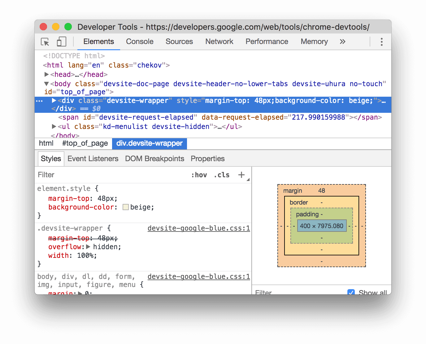
On the screenshot, the
margin-topandbackground-colorproperties have been applied to the selected element. In the DOM Tree you can see the declarations reflected in the element'sstyleattribute.
Add a declaration to a style rule
To add a declaration to an existing style rule:
- Select an element.
- In the Styles tab, click between the brackets of the style rule to which you want to add the declaration. The cursor focuses, allowing you to enter text.
- Enter a property name and press Enter.
- Enter a valid value for that property and press Enter.

On the screenshot, a style rule gets the new border-bottom-style:groove declaration.
Change a declaration name or value
Double-click a declaration's name or value to change it. See Change enumerable values with keyboard shortcuts for shortcuts for quickly incrementing or decrementing a value by 0.1, 1, 10, or 100 units.
Change enumerable values with keyboard shortcuts
While editing an enumerable value of a declaration, for example, font-size, you can use the following keyboard shortcuts to increment the value by a fixed amount:
- Option+Up (Mac) or Alt+Up (Windows, Linux) to increment by 0.1.
- Up to change the value by 1, or by 0.1 if the current value is between -1 and 1.
- Shift+Up to increment by 10.
- Shift+Command+Up (Mac) or Control+Shift+Page Up (Windows, Linux) to increment the value by 100.
Decrementing also works. Just replace each instance of Up mentioned earlier with Down.
Change length values
You can use your pointer to change any property with length, such as width, height, padding, margin, or border.
To change the length unit:
- Hover over the unit name and notice that it's underlined.
Click the unit name to select a unit from the drop-down.
To change the length value:
- Hover over the unit value and notice that your pointer changes to a horizontal double-headed arrow.
Drag horizontally to increase or decrease the value.
To adjust the value by 10, hold Shift when dragging.
Add a class to an element
To add a class to an element:
- Select the element in the DOM Tree.
- Click .cls.
- Enter the name of the class in the Add New Class box.
- Press Enter.

Emulate light and dark theme preferences and enable automatic dark mode
To toggle automatic dark mode or emulate the user's preference of light or dark themes:
- On the Elements > Styles tab, click
 Toggle common rendering emulations.
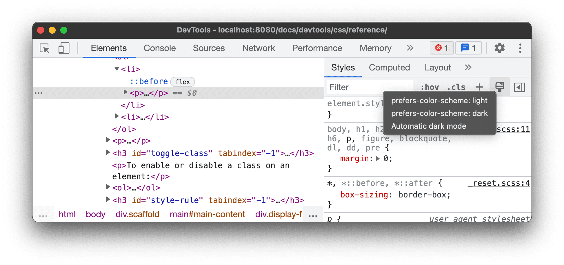
Select one of the following from the drop-down list:
- prefers-color-scheme: light. Indicates that the user prefers the light theme.
- prefers-color-scheme: dark. Indicates that the user prefers the dark theme.
- Automatic dark mode. Displays your page in dark mode even if you didn't implement it. Additionally, sets
prefers-color-schemetodarkautomatically.
This drop-down is a shortcut for Emulate CSS media feature prefers-color-scheme and Enable automatic dark mode options of the Rendering tab.
Toggle a class
To enable or disable a class on an element:
- Select the element in the DOM Tree.
- Open the Element Classes section. See Add a class to an element. Below the Add New Class box are all of the classes that are being applied to this element.
- Toggle the checkbox next to the class that you want to enable or disable.
Add a style rule
To add a new style rule:
- Select an element.
- Click New Style Rule
 . DevTools inserts a
new rule beneath the element.style rule.
. DevTools inserts a
new rule beneath the element.style rule.

On the screenshot, DevTools adds the h1.devsite-page-title style rule after clicking New Style Rule.
Choose which style sheet to add a rule to
When adding a new style rule, click and hold New Style Rule
 to choose which style sheet
to add the style rule to.
to choose which style sheet
to add the style rule to.

Toggle a declaration
To toggle a single declaration on or off:
- Select an element.
- In the Styles tab, hover over the rule that defines the declaration. Checkboxes appear next to each declaration.
- Check or clear the checkbox next to the declaration. When you clear a declaration, DevTools crosses it out to indicate that it's no longer active.

On the screenshot, the color property for the currently-selected element is toggled off.
Edit the ::view-transition pseudo-elements during an animation
See the corresponding section in Animations.
For more information, see Smooth and simple transitions with the View Transitions API.
Align grid items and their content with the Grid Editor
See the corresponding section in Inspect CSS grid.
Change colors with the Color Picker
See Inspect and debug HD and non-HD colors with the Color Picker.
Change angle value with the Angle Clock
The Angle Clock provides a GUI for changing <angle>s in CSS property values.
To open the Angle Clock:
- Select an element with angle declaration.
In the Styles tab, find the
transformorbackgrounddeclaration that you want to change. Click the Angle Preview box next to the angle value.
The small clocks to the left of
-5degand0.25turnare the angle previews.Click the preview to open the Angle Clock.

Change the angle value by clicking on the Angle Clock circle or scroll your mouse to increase / decrease the angle value by 1.
There are more keyboard shortcuts to change the angle value. Find out more in the Styles pane keyboard shortcuts.
Change box and text shadows with the Shadow Editor
The Shadow Editor provides a GUI for changing text-shadow and box-shadow CSS declarations.
To change shadows with the Shadow Editor:
Select an element with a shadow declaration. For example, select the next element.
In the Styles tab, find a shadow
 icon next to the
 text-shadoworbox-shadowdeclaration.
Click the shadow icon to open the Shadow editor.

Change the shadow properties:
- Type (only for
box-shadow). Pick Outset or Inset. - X and Y offsets. Drag the blue dot or specify values.
- Blur. Drag the slider or specify a value.
- Spread (only for
box-shadow). Drag the slider or specify a value.
- Type (only for
Observe the changes applied to the element.
Edit animation and transition timings with the Easing Editor
The Easing Editor provides a GUI for changing the values of transition-timing-function and animation-timing-function.
To open the Easing Editor:
- Select an element with a timing function declaration, like the
<body>element on this page. - In the Styles tab, find the purple
 icon next to the
 transition-timing-function,animation-timing-functiondeclarations, or thetransitionshorthand property.
- Click the icon to open the Easing Editor:

Use presets to adjust timings
To adjust timings with a click, use the presets in the Easing Editor:
- In the Easing Editor, to set a keyword value, click one of the picker buttons:
- linear

- ease-in-out

- ease-in

- ease-out

- linear
In the Presets switcher, click
 or
or  buttons to pick one of the following presets:
- Linear presets:
elastic,bounce, oremphasized. - Cubic Bezier presets:
- Linear presets:
| Timing keyword | Preset | Cubic Bezier |
|---|---|---|
| ease-in-out | In Out, Sine | cubic-bezier(0.45, 0.05, 0.55, 0.95) |
| In Out, Quadratic | cubic-bezier(0.46, 0.03, 0.52, 0.96) |
|
| In Out, Cubic | cubic-bezier(0.65, 0.05, 0.36, 1) |
|
| Fast Out, Slow In | cubic-bezier(0.4, 0, 0.2, 1) |
|
| In Out, Back | cubic-bezier(0.68, -0.55, 0.27, 1.55) |
|
| ease-in | In, Sine | cubic-bezier(0.47, 0, 0.75, 0.72) |
| In, Quadratic | cubic-bezier(0.55, 0.09, 0.68, 0.53) |
|
| In, Cubic | cubic-bezier(0.55, 0.06, 0.68, 0.19) |
|
| In, Back | cubic-bezier(0.6, -0.28, 0.74, 0.05) |
|
| Fast Out, Linear In | cubic-bezier(0.4, 0, 1, 1) |
|
| ease-out | Out, Sine | cubic-bezier(0.39, 0.58, 0.57, 1) |
| Out, Quadratic | cubic-bezier(0.25, 0.46, 0.45, 0.94) |
|
| Out, Cubic | cubic-bezier(0.22, 0.61, 0.36, 1) |
|
| Linear Out, Slow In | cubic-bezier(0, 0, 0.2, 1) |
|
| Out, Back | cubic-bezier(0.18, 0.89, 0.32, 1.28) |
Configure custom timings
To set custom values for timing functions, use the control points on the lines:
For linear functions, click anywhere on the line to add a control point and drag it. Double-click to remove the point.

For Cubic Bezier functions, drag one of the control points.

Any change triggers a ball animation in the Preview at the top of editor.
(Experimental) Copy CSS changes
With this experiment enabled, the Styles tab highlights your CSS changes in green.
To copy a single CSS declaration change, hover over the highlighted declaration and click the  Copy button.

To copy all CSS changes across declarations at once, right-click on any declaration and select Copy all CSS changes.

Additionally, you can track changes you make with the Changes tab.