
This is a catalog of user interface elements available in extensions. Each entry contains:
- An image of the element (if applicable).
- A description of what it's for.
- Related interface elements (if applicable).
- Links to implementation instructions and code samples.
These elements are different ways of invoking extension features. You're not required to implement all of them. In fact, some use cases might not use any of them. For example, a link shorter could act on the displayed URL using a keyboard shortcut and put the shortened link into the clipboard programmatically.
Actions
An action is what happens when a user clicks the action icon for your extension. An action can either invoke an extension feature using the Action API or open a popup that lets users invoke multiple extension features. Tell users what the action does using a tooltip.
To learn to build an action, see Implement an action, or examine the action samples.
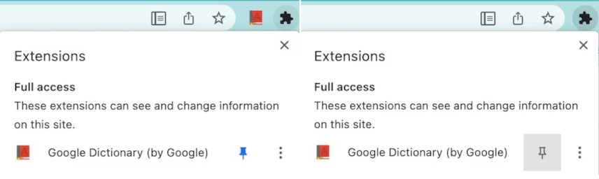
Action icons
An extension requires at least one icon to represent it. Users click the icon to invoke an action, whether that action invokes an extension feature using the Action API or opens a popup.
You can also add a label, here called a 'badge', to the icon to communicate such things as extension state or that actions are required by the user.
To learn to build an action, see Implement an action, or examine the action samples.
Badges
Badges are bits of formatted text placed on top of the action icon to indicate such things as extension state or that actions are required by the user. You can set the text of the badge by calling chrome.action.setBadgeText() and the banner color by calling chrome.action.setBadgeBackgroundColor().

To learn to build an action, see Implement an action, or the Drink water sample.
Commands
Commands are key combinations that invoke an extension feature. Define key combinations in the manifest.json file and respond to them using the Commands API.
To learn to implement a command, see the API reference, or the chrome.commands sample.
Context menu
A context menu appears for the alternate click (frequently called the right click) of a mouse. Define context menus using the Context Menus API.

To learn to implement a context menu, see the context menu samples.
Omnibox
You can interact with users using the Chrome omnibox. When a user enters extension-defined keywords in the omnibox, your extension controls what the user sees in the omnibox. Define keywords in the manifest.json and respond to them using the Omnibox API.

To learn to override the omnibox, see Trigger actions from the omnibox, or the quick API reference sample.
Override pages
An extension can override one of these built-in Chrome pages:
- History
- New tab
- Bookmarks

To learn to override Chrome pages, see Override Chrome pages, or the override sample.
Popups
A popup is an action that displays a window letting users invoke multiple extension features. Popups can be opened if the user clicks the action icon, via a keyboard shortcut or by calling chrome.action.openPopup().

To learn to build a popup, see, Add a popup. You can also download a step through one of the action samples.
Side panels
A side panel lets users invoke extension features alongside web pages (see the image). A side panel can attach to a single tab or to a whole window. A side panel is controlled using the Side Panel API.

To learn to build a side panel, see the side panel use cases, or examine the side panel samples.
Tooltips
A tooltip is a way to show, when a user hovers a mouse over your action icon, what your extension's action does. By default, the tooltip displays the name of the extension.

To learn to add a tooltip, use the "default_title" member of the manifest files "action" key.
DevTools
You can add custom panels (what tabs are called in DevTools) to DevTools using the DevTools Panels API. Other DevTools APIs let you monitor windows and network traffic. You can also customize the DevTools recorder panel. Chrome DevTools' own Lighthouse panel started life as a DevTools extension.
Notifications
Post messages to a user's system tray using either the extensions Notifications API or the web platforms Notifications API.

To learn to use notifications, see Notify users.
Themes
A theme is a special kind of extension that changes the way the browser looks. Themes are packaged like regular extensions, but they don't contain JavaScript or HTML code.

To learn to build a theme, see What are themes?.
Other ways of interacting with users
This section describes other ways that your extension can interact with users. Although not strictly needed for a basic extension, they can be important parts of your extension. For many users, some of these features are absolutely essential to using the extension.
Accessibility
For many users, accessibility literally is the user interface, and its features can often be useful to those who don't need accessibility as a primary means of interacting with your extension. Learn the basics of making your extension accessible.
Internationalization
Speak to users in their own language. Learn to internationalize the interface.