

Toggle various overlays and speed up DOM tree navigation with this comprehensive reference of badges in the Elements panel.
Show or hide badges
To show or hide certain badges:
- Open DevTools.
- Right-click an element in the DOM tree and check one or several badges in the Badge settings sub-menu.
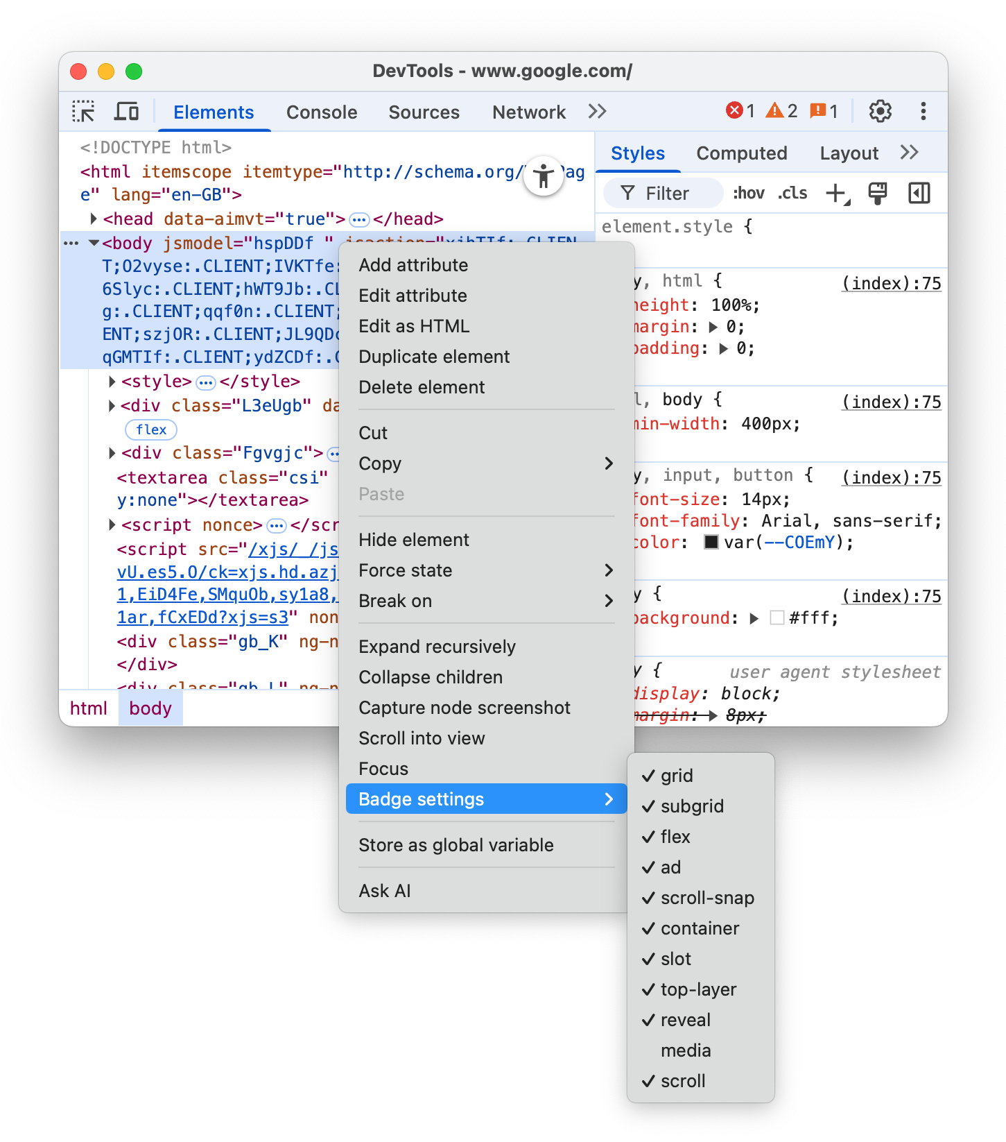
The Elements panel shows the selected badges next to the appropriate elements in the DOM tree. The next sections explain every badge.
View-source
The view-source badge is next to the <html> tag at the root of the HTML page. Click it to view the source of your page in the Sources panel.
This badge provides an alternative workflow to the View Page Source option in Chrome's page context (right-click) menu:
- In Chrome, right-click > Inspect a page.
- In the Elements panel, click the
view-sourcebadge next to the<html>tag. - Inspect the page source in the Sources panel.
Grid
An HTML element is a grid container if its display CSS property is set to grid or inline-grid. Such elements have grid badges next to them that toggle the corresponding overlays.
Toggle the overlay on the following preview:
- Inspect the element in the preview.
- In the DOM tree, click the
gridbadge next to the element and observe the overlay.

The overlay shows columns, rows, their numbers, and gaps.
To learn how to debug grid layout, see Inspect CSS grid.
Subgrid
A subgrid is a nested grid that uses the same tracks as its parent grid. An element is a subgrid container if one or both of its grid-template-columns, grid-template-rows properties are set to subgrid. Such elements have subgrid badges next to them that toggle the corresponding overlays.
Toggle the overlay on the following preview:
- Inspect the element in the preview.
- In the DOM tree, click the
subgridbadge next to the element and observe the overlay.

The overlay shows columns, rows, their numbers, and gaps of a subgrid.
Flex
An HTML element is a flex container if its display CSS property is set to flex or inline-flex. Such elements have flex badges next to them that toggle the corresponding overlays.
Toggle the overlay on the following preview:
- Inspect the element in the preview.
- In the DOM tree, click the
flexbadge next to the element and observe the overlay.

The overlay shows child element positions.
To learn how to debug flex layouts, see Inspect and debug CSS flexbox.
Ad
DevTools can detect some ad frames and tag them. Such frames have ad badges next to them.
Discover an ad in the following preview:
- Inspect the element in the preview.
- In the DOM tree, find an element with the
adbadge next to it.
The ad badge is not clickable but if you hover over it, you will see a tooltip that provides context on why the element was identified as an ad, such as:
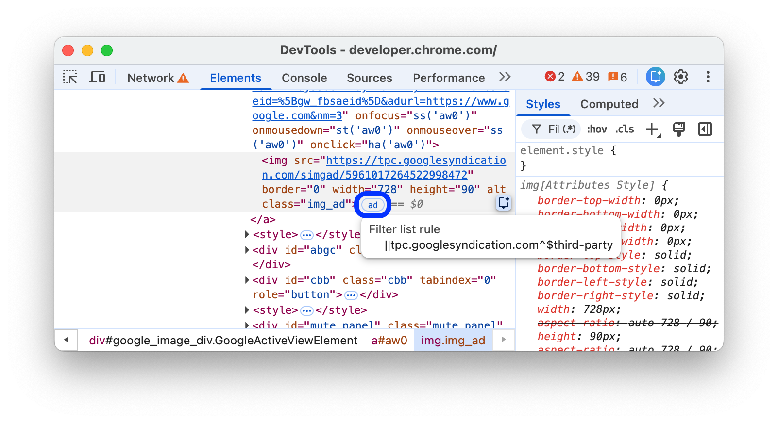
- Script ancestry: Which scripts were involved in creating the element.
- Filter list rules: The specific rule from a filter list (for example,
EasyList) that matched the element or the resource it loaded.
You can also use the Rendering tab to highlight ad frames in red.
Scroll
An HTML element is a scroll container if its overflow CSS property is set to scroll, or auto when there's enough content to cause overflow. Such elements have scroll badges next to them.

Scroll-snap
Scroll containers can have CSS properties that configure snap points. Such elements have scroll-snap badges next to them that toggle the corresponding overlays.
Toggle the overlay on the following preview:
- Inspect the element in the preview.
- In the DOM tree, click the
scroll-snapbadge next to the element. - Try scrolling the element to the right and observe the overlay.

The overlay shows element positions and snap points.
Container
An HTML element is a container if it has the container-type CSS property. Such elements have container badges next to them that toggle the corresponding overlays.
Toggle the overlay on the following preview:
- Inspect the element in the preview.
- In the DOM tree, click the
containerbadge next to the element. - Try resizing the element by dragging its bottom-right corner and observe the layout change and overlay.

The overlay shows child element positions.
To learn how to debug container queries, see Inspect and debug CSS container queries.
Slot
The <slot> HTML element is a placeholder that you can fill with your own content. Together with the <template> element, <slot> lets you create separate DOM trees and present them together. Slot content elements have slot badges next to them that serve as links to the corresponding slots.
Discover the slot badge in the following preview:
- Inspect the element in the preview.
- In the DOM tree, click the
slotbadge next to the element to locate the corresponding slot.
- Get back to the slot's content by clicking the
revealbadge.
Top-layer
This badge helps you understand the concept of the top layer and visualize it. The top layer renders content on top of all other layers, regardless of z-index. When you open a <dialog> element using the .showModal() method, the browser puts it into the top layer.
To help you visualize top layer elements, the Elements panel adds a #top-layer container to the DOM tree after the closing </html> tag.
Top layer elements have top-layer (N) badges next to them, where N is the element's index number. The badges are links to the corresponding elements in the #top-layer container.
Discover the top-layer (N) badge in the following preview:
- In the preview, click Open dialog.
- Inspect the dialog.
- In the DOM tree, click the
top-layer (1)badge next to the<dialog>element. The Elements panel takes you to the corresponding element in the#top-layercontainer after the closing</html>tag.
- Get back to the
<dialog>element by clicking therevealbadge next to the element or its::backdrop.
Media
The media badge is turned off by default. When turned on, it appears next to <audio> and <video> elements. Click this badge to open the Media panel and debug your media.
For more information, see Debug media players with the Media panel.
Popover
A popover is any element with a popover attribute, and is useful for a wide range of interactive patterns, including tooltips, alerts, toasts and more. Such elements have popover badges next to them.
This badge toggles a top-layer badge next to it that links to the corresponding elements in the #top-layer container.
Discover the popover badge in the following preview:
- In the preview, click TOGGLE POPOVER.
- Inspect the popover that appears.
In the DOM tree, click the
popoverbadge next to the<div popover>element. The Elements panel shows youtop-layerbadge.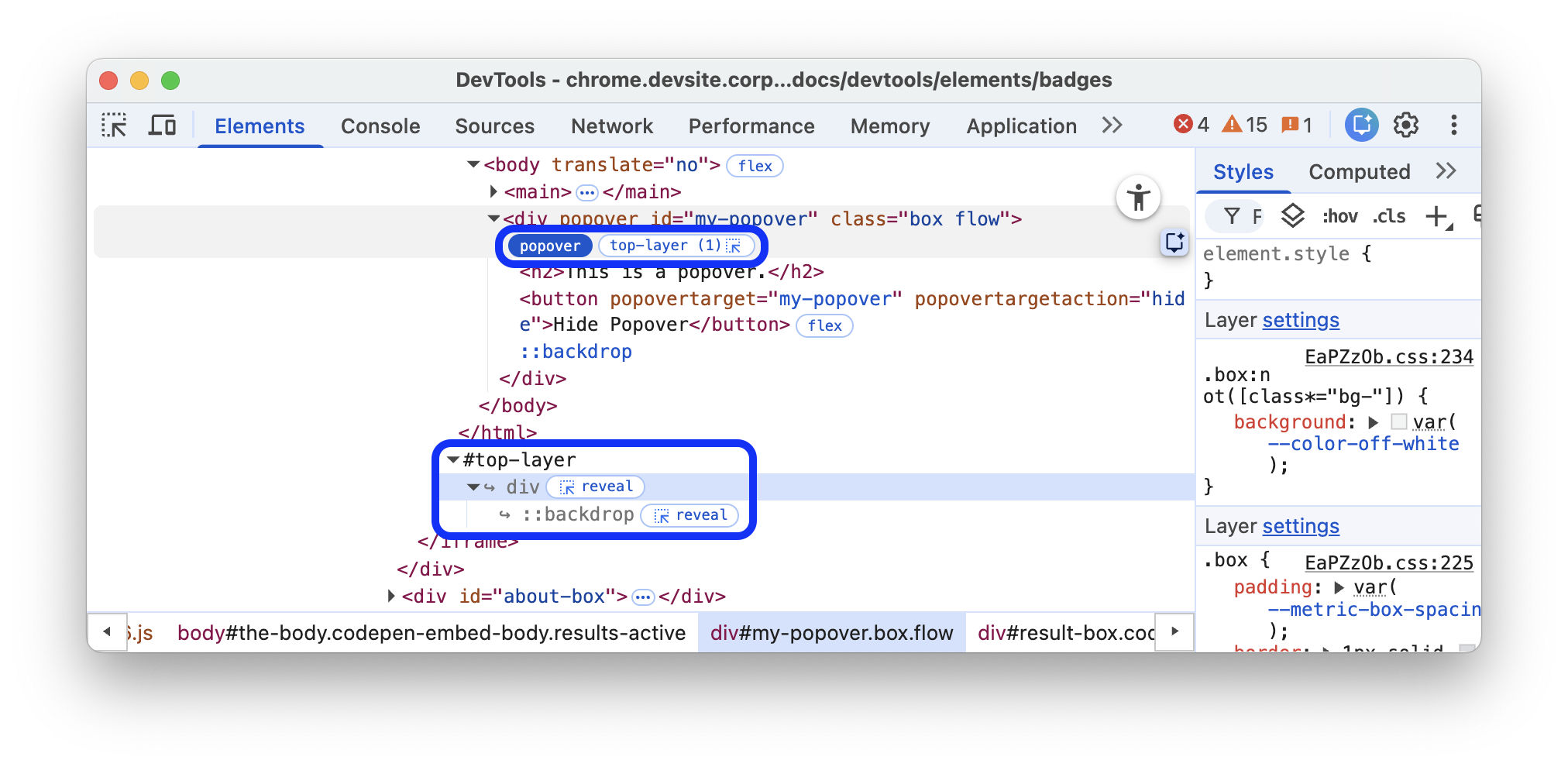
Follow the steps in the `Top layer section.
To learn more, see also https://web.dev/learn/css/popover-and-dialog.
Starting-style
The@starting-style rule defines the initial styles on an element before it's rendered on the page. This is required for elements that animate in from display: none, as they need a state from which to animate in. Such elements have starting-style badges next to them.
This badge toggles the styles in the @starting-style rule, so you can see the animation in action.
Discover the starting-style badge in the following preview:
- In the preview, click OPEN POPOVER.
- Inspect the popover that appears.
In the DOM tree, toggle the
starting-stylebadge next to the<div popover>element.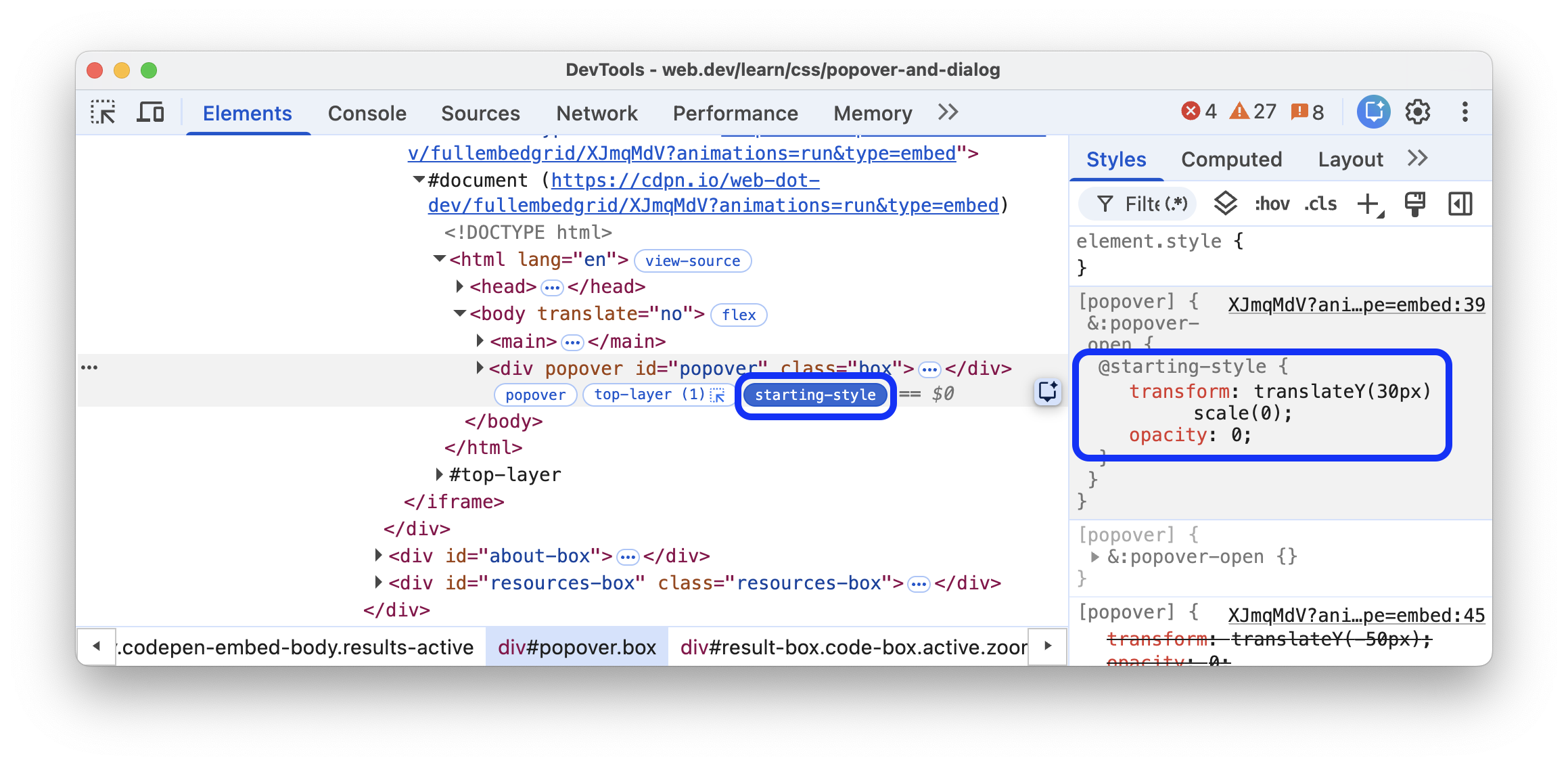
Observe the animation in action and the styles being applied in the Elements > Styles tab.
To learn more, see also Animating popovers.